ok. i’ll admit it. i haven’t read Ulysses yet. sadly, there are a lot of important books in that category, but i have a particular excuse for this one. Ulysses is daunting for me. for starters, it’s pretty much been at or in contention for the top spot in the canonstakes for as long as i can remember, but more importantly, I’m very sure that if i just go at the text by itself i’ll feel helpless, knowing that i’m only grasping a small, and possibly even least interesting, bit of the whole. so i’m waiting for my dream edition, the highlights of which include:
• a beautifully rendered text, perhaps even with help and guidance of a master typographer.
• a low-footprint interface that the reader can dismiss at will, leaving only the text on the page with all buttons etc. hidden from view. since the book will have copious annotations, it’s important that the reader can hide and reveal whichever graphic indicators indicate the presence of annotation.
• a complete audio version. ideally this might be a recording done with the best actors specifically for this edition, but it could also be assembled from readings done over the years. in any case key passages should be represented by multiple readings. and of course the text and readings should be tied to each other, allowing you to read and listen at the same time.
• a thorough word and phrase glossary with a snappy and intuitive mechanism for getting to it directly from the text.
• the explanation of references -? literary, linguistical, historical, personal, social, political. ideally each of these categories would be represented in some unique way, so that readers can turn specific layers on or off at will. these annotations will be comprised of text, audio, and/or video.
• close readings of key passages by experts from multiple interesting viewpoints.
• for these last two, i’m sure i want there to be a mechanism for people to question and challenge the original authors and each other. the genius of the wikipedia for me is that by revealing the back and forth of an article as it evolves, it brings us closer to the truth -? or at least improves our understanding of the complexity of the factors underlying the subect at hand. so, we’ll need a good way, which i imagine will involve some form of benevolent moderation, of enabling a conversation to emerge in the myriad margins of the work. enabling comments that refer to multiple points in the expanded text is crucial to get beyond the constraints of current commenting schemes which tend to restrict you to paragraph, page or whole.
thoughts -? objections, agreements, additions, subtractions?
Monthly Archives: July 2007
commentpress update
The release of CommentPress has made for exciting times here at the institute (the feedback has also been very encouraging). But as with any piece of software, CommentPress will need constant tending, and with quick succession upgrades, we hope to address the most crucial issues – starting with the first major update, CommentPress version 1.1.
This is a very important update, so everyone is encouraged to upgrade as soon as possible.
For a complete list of the changes, check out the CommentPress download page.
ithaka report on scholarly publishing
From a first skim and browsing of initial responses, the new report from the non-profit scholarly technologies research group Ithaka, “University Publishing in a Digital Age,” seems like a breath of fresh air. The Institute was one of the many stops along the way for the Ithaka team, which included the brilliant Laura Brown, former director of Oxford University Press in the States, and we’re glad to see Gamer Theory is referenced as an important experiment with the monograph form.
A good summary of the report and a roundup of notable reactions (all positive) in the academic community is up on Inside Higher Ed. Recommendations center around better coordination among presses on combining services, tools and infrastructure for digital scholarship. They also advocate closer integration of presses with the infrastructure and scholarly life of their host universities, especially the library systems, who have much to offer in the area of digital communications. This is something we’ve argued for a long time and it’s encouraging to see this put forth in what will no doubt be an influential document in the field.
One area that, from my initial reading, is not siginificatnly dealt with is the evolution of scholarly authority (peer review, institutional warrants etc.) and the emergence of alternative models for its production. Kathleen Fitzpatrick ponders this on the MediaCommons blog:
The report calls universities to task for their failures to recognize the ways that digital modes of communication are reshaping the ways that scholarly communication takes place, resulting in, as they say, “a scholarly publishing industry that many in the university community find to be increasingly out of step with the important values of the academy.”
Perhaps I’ll find this when I read the full report, but it seems to me that the inverse is perversely true as well, that the stated “important values of the academy” -? those that have us clinging to established models of authority as embodied in traditional publishing structures -? are increasingly out of step with the ways scholarly communication actually takes place today, and the new modes of authority that the digital makes possible. This is the gap that MediaCommons hopes to bridge, not just updating the scholarly publishing industry, but updating the ways that academic assessments of authority are conducted.
horseless carriages
The “horseless carriage” is a metaphor that’s often used when talking about reading in a screen environment. Offhand, I don’t know where this metaphor started (McLuhan probably had a hand in it). The idea is basic but important: thinking about the automobile as a “horseless carriage” blinds one to what an automobile can do that a carriage can’t do. Metaphors carry historical deadweight.
Last year the Noguchi Museum had an exhibition on collaborations between Isamu Noguchi and Buckminster Fuller which featured video of Fuller’s Dymaxion car. Through the wonder of Youtube, you can watch it now:
One of Fuller’s main innovations with the Dymaxion car was to move the steering from the front – as is the case when you’re steering horses from a carriage – to the rear, which mechanically makes more sense. This video of the Dymaxion car is revelatory: we have so much trouble parallel parking because automotive engineers unthinkingly followed old models.
CommentPress 1.0
At long last, we are pleased to release CommentPress, a free, open source theme for the WordPress blog engine designed to allow paragraph-by-paragraph commenting in the margins of a text. To download it and get it running in your WordPress installation, go to our dedicated CommentPress site. There you’ll find everything you need to get started. This 1.0 release represents the most basic out-of-the-box version of the theme. Expect many improvements and new features in the days and weeks ahead (some as soon as tomorrow). We could have kept refining it for another week but we felt that the time was well past due to get it out in the world and to let the community development cycles begin. So here it is:
/commentpress/ »
This little tool is the happy byproduct of a year and a half spent hacking WordPress to see whether a popular net-native publishing form, the blog, which, most would agree, is very good at covering the present moment in pithy, conversational bursts but lousy at handling larger, slow-developing works requiring more than chronological organization – ?whether this form might be refashioned to enable social interaction around long-form texts. Out of this emerged a series of publishing experiments loosely grouped under the heading “networked books.” The first of these, McKenzie Wark’s GAM3R 7H30RY 1.1, was a wildly inventive text whose aphoristic style and modular structure lent it readily to “chunking” into digestible units for online discussion. This is how it ended up looking:
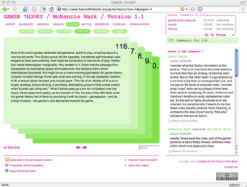
In the course of our tinkering, we achieved one small but important innovation. Placing the comments next to rather than below the text turned out to be a powerful subversion of the discussion hierarchy of blogs, transforming the page into a visual representation of dialog, and re-imagining the book itself as a conversation. Several readers remarked that it was no longer solely the author speaking, but the book as a whole (author and reader, in concert).
Toying with the placement of comments was relatively easy to do with Gamer Theory because of its unusual mathematical structure (25 paragraphs per chapter, 250 words or lessper paragraph), but the question remained of how this format could be applied to expository texts of more variable shapes and sizes. The breakthrough came with Mitchell Stephens’ paper, The Holy of Holies: On the Constituents of Emptiness. The solution we found was to have the comment area move with you in the right hand column as you scrolled down the page, changing its contents depending on which paragraph in the left hand column you selected. This format was inspired in part by a WordPress commenting system developed by Jack Slocum and by the Free Software Foundation’s site for community review of drafts of the GNU General Public License. Drawing on these terrific examples, we at last managed to construct a template that might eventually be exported as a simple toolset applicable to any text.
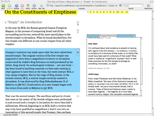
Ever since “Holy of Holies,” people have been clamoring for us to release CommentPress as a plugin so they could start playing with it, improving it and customizing it for more specialized purposes. Now it’s finally here, with a cleaned-up codebase and a simpler interface, and we can’t wait to see how people start putting it to use. We can imagine a number of possibilities:
-? scholarly contexts: working papers, conferences, annotation projects, journals, collaborative glosses
-? educational: virtual classroom discussion around readings, study groups
-? journalism/public advocacy/networked democracy: social assessment and public dissection of government or corporate documents, cutting through opaque language and spin (like our version of the Iraq Study Group Report, or a copy of the federal budget, or a Walmart press release)
-? creative writing: workshopping story drafts, collaborative storytelling
-? recreational: social reading, book clubs
Once again, there are dozens of little details we want to improve, and no end of features we would love to see developed. Our greatest hope for CommentPress is that it take on a life of its own in the larger community. Who knows, it could provide a base for something far more ambitious.
An important last thought, however. While CommentPress presents exciting possibilities for social reading and writing on the Web, it is still very much bound by its technical origins, the blog. This presents significant limitations both in the flexibility of document structures and in the range of media that can be employed in writing and response. Sure, even in the current, ultra-basic version, there’s no reason a CommentPress document can’t incorporate image, video and sound embeds, but they must be fit into the narrow and brittle textual template dictated by the blog.
All of which is to say that we do not view CommentPress or whatever might grow out of it as an end goal but rather as a step along the way. In fact, this and all of the experiments mentioned above were undertaken in large part as field research for Sophie, and they have had a tremendous impact on its development. While there is still much work to be done, the ultimate goal of the Sophie project is to make a tool that handles all the social network interactions (and more) that CommentPress does but within a far more fluid and easy-to-use composition/reading space where media can mix freely. That’s the larger prize. For the moment though, let’s keep hacking the blog to within an inch of its life and seeing what we can discover.
A million thanks go out to our phenomenal corps of first-run testers, particularly Kathleen Fitzpatrick, Karen Schneider, Manan Ahmed, Tom Keays, Luke Rodgers, Peter Brantley and Shana Kimball, for all the thoughtful and technically detailed feedback they’ve showered upon us over the past few days. Thanks to you guys, we’re getting this out of the gate on solid legs and our minds are now churning with ideas for future development.
Here is a chronology of CommentPress projects leading up to the open source release (July 25, 2007):
GAM3R 7H30RY 1.1 by McKenzie Wark (launched May 22, 2006)
The Holy of Holies: On the Constituents of Emptiness by Mitchell Stephens (December 6, 2006)
The Iraq Study Group Report with Lapham’s Quarterly (December 21, 2006)
The President’s Address to the Nation, January 10th, 2007 with Lapham’s Quarterly (together, the Address and the ISG Report comprised Operation Iraqi Quagmire) (January 10, 2007)
The Future of Learning Institutions in a Digital Age with HASTAC (Humanities, Arts, Science, and Technology Advanced Collaboratory) (January 17, 2007)
Scholarly Publishing in the Age of the Internet by Kathleen Fitzpatrick, published at MediaCommons (March 30, 2007)
(All the above are best viewed in Firefox. The new release works in all major browsers and we’re continuing to work on compatibility.)
cascading phrases
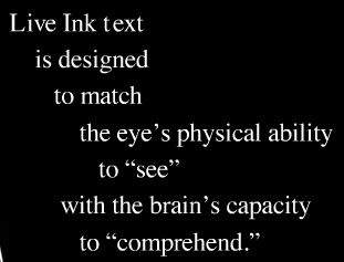
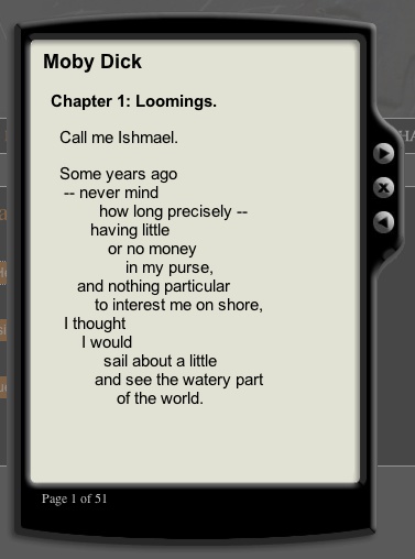
Live Ink is an alternative approach to presenting texts in screen environments, arranging them in series of cascading phrases to increase readability (I saw this a couple of years ago at an educational publishing conference but it was brought to my attention again on Information Aesthetics). Live Ink was developed by brothers Stan and Randall Walker, both medical doctors (Stan an ophthalmologist), who over time became interested in the problems, especially among the young, of reading from computer displays. In their words:
Here’a screenshot of their sample reader with chapter 1 of Moby-Dick:
Thoughts?
edit the galaxy
Galaxiki is “a new kind of wiki based community portal that allows its members to edit stars, planets and moons in a virtual galaxy, creating an entire fictional world online.” The site uses primarily public domain NASA photography.
Millions of stars, planets, moons, pulsars and black holes can be explored using an intuitive 2D map. The site software manages most of the physical properties and behaviours of the solar systems, from orbits to the chemical composition of planetary atmospheres. Some planets offer conditions that may allow life – the idea behind Galaxiki is that community members can create fictional life forms and write about their histories on their planets….For only USD 12.- (or EUR 10.-) you can purchase your own solar system that only you can edit.
darker side of youtube
There’s a good piece in Slate by Nick Douglas, a writer and video blogger out of San Francisco, that casts YouTube as the Hollywood of web video – ?purveyor of bite-sized crap with mass appeal, while the smaller, more innovative “independents” (the Groupers, Vimeos and blip.tvs) struggle in its shadow. YouTube’s dominance, Douglas argues, leads viewers to expect less of a fledgeling cultural arena that could become the leading edge of filmmaking but instead has been made synonymous with shallow, momentary titillation.
Douglas’ critique is on target, and it’s vital to keep questioning the so-called diversity of the mega-aggregators who increasingly dominate the Web, but I wonder whether serious video producers really ought to be looking to YouTube and its competitors as the ultimate venue. As promotional and browsing sites they work well, but a networked, non-Web video client like Miro could be a better forum for challenging work.
the open library
 A little while back I was musing on the possibility of a People’s Card Catalog, a public access clearinghouse of information on all the world’s books to rival Google’s gated preserve. Well thanks to the Internet Archive and its offshoot the Open Content Alliance, it looks like we might now have it – ?or at least the initial building blocks. On Monday they launched a demo version of the Open Library, a grand project that aims to build a universally accessible and publicly editable directory of all books: one wiki page per book, integrating publisher and library catalogs, metadata, reader reviews, links to retailers and relevant Web content, and a menu of editions in multiple formats, both digital and print.
Imagine a library that collected all the world’s information about all the world’s books and made it available for everyone to view and update. We’re building that library.
The official opening of Open Library isn’t scheduled till October, but they’ve put out the demo now to prove this is more than vaporware and to solicit feedback and rally support. If all goes well, it’s conceivable that this could become the main destination on the Web for people looking for information in and about books: a Wikipedia for libraries. On presentation of public domain texts, they already have Google beat, even with recent upgrades to the GBS system including a plain text viewing option. The Open Library provides TXT, PDF, DjVu (a high-res visual document browser), and its own custom-built Book Viewer tool, a digital page-flip interface that presents scanned public domain books in facing pages that the reader can leaf through, search and (eventually) magnify.
Page turning interfaces have been something of a fad recently, appearing first in the British Library’s Turning the Pages manuscript preservation program (specifically cited as inspiration for the OL Book Viewer) and later proliferating across all manner of digital magazines, comics and brochures (often through companies that you can pay to convert a PDF into a sexy virtual object complete with drag-able page corners that writhe when tickled with a mouse, and a paper-like rustling sound every time a page is turned).
This sort of reenactment of paper functionality is perhaps too literal, opting for imitation rather than innovation, but it does offer some advantages. Having a fixed frame for reading is a relief in the constantly scrolling space of the Web browser, and there are some decent navigation tools that gesture toward the ways we browse paper. To either side of the open area of a book are thin vertical lines denoting the edges of the surrounding pages. Dragging the mouse over the edges brings up scrolling page numbers in a small pop-up. Clicking on any of these takes you quickly and directly to that part of the book. Searching is also neat. Type a query and the book is suddenly interleaved with yellow tabs, with keywords highlighted on the page, like so:
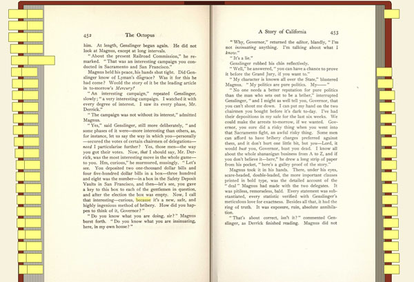
But nice as this looks, functionality is sacrificed for the sake of fetishism. Sticky tabs are certainly a cool feature, but not when they’re at the expense of a straightforward list of search returns showing keywords in their sentence context. These sorts of references to the feel and functionality of the paper book are no doubt comforting to readers stepping tentatively into the digital library, but there’s something that feels disjointed about reading this way: that this is a representation of a book but not a book itself. It is a book avatar. I’ve never understood the appeal of those Second Life libraries where you must guide your virtual self to a virtual shelf, take hold of the virtual book, and then open it up on a virtual table. This strikes me as a failure of imagination, not to mention tedious. Each action is in a sense done twice: you operate a browser within which you operate a book; you move the hand that moves the hand that moves the page. Is this perhaps one too many layers of mediation to actually be able to process the book’s contents? Don’t get me wrong, the Book Viewer and everything the Open Library is doing is a laudable start (cause for celebration in fact), but in the long run we need interfaces that deal with texts as native digital objects while respecting the originals.
What may be more interesting than any of the technology previews is a longish development document outlining ambitious plans for building the Open Library user interface. This covers everything from metadata standards and wiki templates to tagging and OCR proofreading to search and browsing strategies, plus a well thought-out list of user scenarios. Clearly, they’re thinking very hard about every conceivable element of this project, including the sorts of things we frequently focus on here such as the networked aspects of texts. Acolytes of Ted Nelson will be excited to learn that a transclusion feature is in the works: a tool for embedding passages from texts into other texts that automatically track back to the source (hypertext copy-and-pasting). They’re also thinking about collaborative filtering tools like shared annotations, bookmarking and user-defined collections. All very very good, but it will take time.
Building an open source library catalog is a mammoth undertaking and will rely on millions of hours of volunteer labor, and like Wikipedia it has its fair share of built-in contradictions. Jessamyn West of librarian.net put it succinctly:
It’s a weird juxtaposition, the idea of authority and the idea of a collaborative project that anyone can work on and modify.
But the only realistic alternative may well be the library that Google is building, a proprietary database full of low-quality digital copies, a semi-accessible public domain prohibitively difficult to use or repurpose outside the Google reading room, a balkanized landscape of partner libraries and institutions left in its wake, each clutching their small slice of the digitized pie while the whole belongs only to Google, all of it geared ultimately not to readers, researchers and citizens but to consumers. Construed more broadly to include not just books but web pages, videos, images, maps etc., the Google library is a place built by us but not owned by us. We create and upload much of the content, we hand-make the links and run the search queries that program the Google brain. But all of this is captured and funneled into Google dollars and AdSense. If passive labor can build something so powerful, what might active, voluntary labor be able to achieve? Open Library aims to find out.
outages
Apologies to everyone who has had difficulty viewing our sites today. We’ve determined that the problem lies not with our server but with Time Warner. Apparently, sites are viewable through different ISPs but Time Warner/Roadrunner appears to be undergoing some sort of maintenance that prevents them from resolving our URLs. We thought this might just be a New York problem but recently got a message from someone in North Carolina that they’re experiencing the same thing. If you’re reading this now it probably means you are unaffected.
A paranoid thought did occur to me: is this momentary glitch a preview of a post net neutrality world in which less privileged, non-premium sites like ours get the shaft?
Hopefully this will all pass soon.
Update: it seems to have passed.
