The field of information visualization is cluttered with works that claim to illuminate but in fact obscure. These are what Brad Paley calls “write-only” visualizations. If you put information in but don’t get any out, says Paley, the visualization has failed, no matter how much it dazzles. Brad discusses these matters with the zeal of a spiritual seeker. Just this Monday, he gave a master class in visualization on two laptops, four easels, and four wall screens at the Institute’s second “Monkeybook” evening at our favorite video venue in Brooklyn, Monkeytown. It was a scintillating performance that left the audience in a collective state of synaptic arrest.
Jesse took some photos:
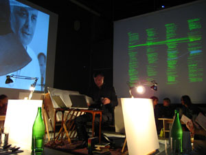
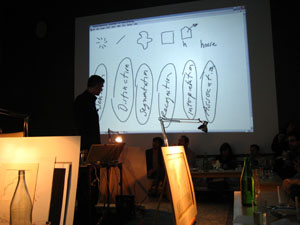
We stand at a crucial juncture, Brad says, where we must marshal knowledge from the relevant disciplines — design, the arts, cognitive science, engineering — in order to build tools and interfaces that will help us make sense of the huge masses of information that have been dumped upon us with the advent of computer networks. All the shallow efforts passing as meaning, each pretty piece of infoporn that obfuscates as it titillates, is a drag on this purpose, and a muddying of the principles of “cognitive engineering” that must be honed and mastered if we are to keep a grip on the world.
With this eloquent gospel still echoing in my brain, I turned my gaze the next day to a new project out of IBM’s Visual Communication Lab that analyzes individuals’ editing histories in Wikipedia. This was produced by the same team of researchers (including the brilliant Fernanda Viegas) that built the well known History Flow, an elegant technique for visualizing the revision histories of Wikipedia articles — a program which, I think it’s fair to say, would rate favorably on the Paley scale of readability and illumination. Their latest effort, called “Chromograms,” hones in the activities of individual Wikipedia editors.
The IBM team is interested generally in understanding the dynamics of peer to peer labor on the internet. They’ve focused on Wikipedia in particular because it provides such rich and transparent records of its production — each individual edit logged, many of them discussed and contextualized through contributors’ commentary. This is a juicy heap of data that, if placed under the right set of lenses, might help make sense of the massively peer-produced palimpsest that is the world’s largest encyclopedia, and, in turn, reveal something about other related endeavors.
Their question was simple: how do the most dedicated Wikipedia contributors divvy up their labor? In other words, when someone says, “I edit Wikipedia,” what precisely do they mean? Are they writing actual copy? Fact checking? Fixing typos and syntactical errors? Categorizing? Adding images? Adding internal links? External ones? Bringing pages into line with Wikipedia style and citation standards? Reverting vandalism?
All of the above, of course. But how it breaks down across contributors, and how those contributors organize and pace their work, is still largely a mystery. Chromograms shed a bit of light.
For their study, the IBM team took the edit histories of Wikipedia administrators: users to whom the community has granted access to the technical backend and who have special privileges to protect and delete pages, and to block unruly users. Admins are among the most active contributors to Wikipedia, some averaging as many as 100 edits per day, and are responsible more than any other single group for the site’s day-to-day maintenance and governance.
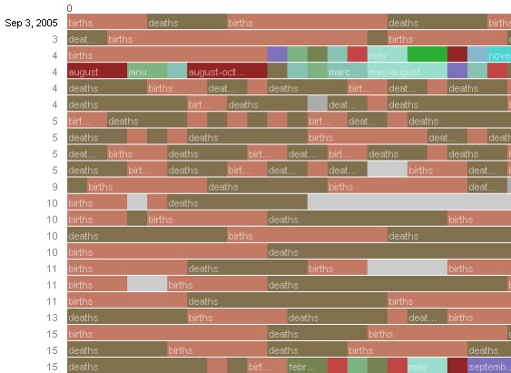
What the researches essentially did was run through the edit histories with a fine-toothed, color-coded comb. A chromogram consists of multiple rows of colored tiles, each tile representing a single edit. The color of the tile corresponds with the first letter of the text in the edit, or in the case of “comment chromograms,” the first letter of the user’s description of their edit. Colors run through the alphabet, starting with numbers 1-10 in hues of gray and then running through the ROYGBIV spectrum, A (red) to violet (Z).

It’s a simple system, and one that seems arbitrary at first, but it accomplishes the important task of visually separating editorial actions, and making evident certain patterns in editors’ workflow.
Much was gleaned about the way admins divide their time. Acvitity often occurs in bursts, they found, either in response to specific events such as vandalism, or in steady, methodical tackling of nitpicky, often repetitive, tasks — catching typos, fixing wiki syntax, labeling images etc. Here’s a detail of a chromogram depicting an administrator’s repeated entry of birth and death information on a year page:
The team found that this sort of systematic labor was often guided by lists, either to-do lists in Wikiprojects, or lists of information in articles (a list of naval ships, say). Other times, an editing spree simply works progressively through the alphabet. The way to tell? Look for rainbows. Since the color spectrum runs A to Z, rainbow patterned chromograms depict these sorts of alphabetically ordered tasks. As in here:

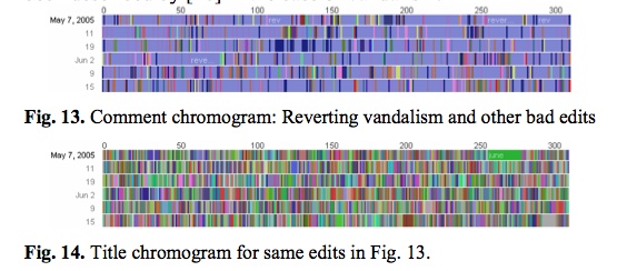
This next pair of images is almost moving. The top one shows one administrator’s crusade against a bout of vandalism. Appropriately, he’s got the blues, blue corresponding with “r” for “revert.” The bottom image shows the same edit history but by article title. The result? A rainbow. Vandalism from A to Z.
Chromograms is just one tool that sheds light on a particular sort of editing activity in Wikipedia — the fussy, tedious labors of love that keep the vast engine running smoothly. Visualizing these histories goes some distance toward explaining how the distributed method of Wikipedia editing turns out to be so efficient (for a far more detailed account of what the IBM team learned, it’s worth reading this pdf). The chromogram technique is probably too crude to reveal much about the sorts of editing that more directly impact the substance of Wikipedia articles, but it might be a good stepping stone.
Learning how to read all the layers of Wikipedia is necessarily a mammoth undertaking that will require many tools, visualizations being just one of them. High-quality, detailed ethnographies are another thing that could greatly increase our understanding. Does anyone know of anything good in this area?
if:book
A Project of the Institute for the Future of the Book

Detailed ethnographies: that would be great. On the self-promotion front, I’m starting a 6-month project working with Penguin’s wikinovel – “A Million Penguins” in October which will attempt to reconstruct some of the authors’ intentions after the fact. It will be something akin to an ethnography after the fact; i.e. I’m bringing an ethnographic sensitivity to how I hope to interview and interact with the authors and the trails they have left behind. Thanks, therefore, for blogging about this visualiser. It’s thoroughly intriguing.
I’m totally with you (or Brad) that it will take a combination of disciplines to help us make sense of increasing amounts of complex information. If:book’s networked book is an interesting step in the direction of new tools for visualizing interactions, along with the stuff coming out of IBM research.
But how is visual thesaurus shallow infoporn, while Brad’s Map of Science is not? I’m turned off by design snobbery like “principles of cognitive engineering.”
Currently testing sophie for the Dutch MacFan magazine as an open source tool to produce one’s own multimedia ebooks. It all sounds very interesting and it has a lot of challenging features that donot demand an difficult learningcurve. What is most needed now is a reader and a seperate author development tool.
People that are interested in developing, can contact?
As a bookdesigner I think Sophie is an interesting tool to develop extras for an accompanying CD or DVD with material and catalogues and biographies and other goodies. It is not too difficult and can be easily integrated in the present workflow.
and don’t forget the video:
http://web.futureofthebook.org/itinplace/archives/2007/05/monkey_boy_types_and_scribbles_.html