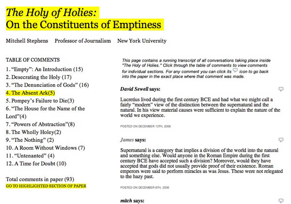
Yesterday Bud Parr made the following suggestion regarding the design of Mitch Stephens’ networked paper, “The Holy of Holies”:
I think the site would benefit from something right up front highlighting the most recent exchange of comments and/or what’s getting the most attention in terms of comments.
It just so happens that we’ve been cooking up something that does more or less what he describes: a simple meta comment page, or “table of comments,” displaying a running transcript of all the conversations in the site filtered by section. You can get to it from a link on the front page next to the total comment count for the paper (as of this writing there are 93).
It’s an interesting way to get into the text: through what people are saying about it. Any other ideas of how something like this could work?


I think it’s a great idea, and it would benefit from some increased organization of the comments (something that you’re probably already working on).
E.g. When you open up the table of comments page, all the comments for the first paragraph could be organized together (dashed border?) and ditto for the rest, with some sort of small note/graphic indicating that these comments are referring to paragraph 1.
Also, if there ended up being a lot of comments, the current format could get unwieldy. What you could do is instead of having the chapter titles listed along the left, put them across the top, and then allow the comments to take up a greater percentage of the page width, maybe alternating background colour of each comment between gray and white, or adding background colour to post headings to mark one off from the next–more of a forum-style layout.
i’d like to discuss issues like this
in a general manner, and not merely
in reaction to the examples that are
being developed by your institute,
as they are announced on your blog.
the same with sophie. it strikes me that
its “open source” nature doesn’t seem to
mean that you are sharing your code (or
your thoughts, which are even more valuable
since i’m not using the same language as you)
while you’re developing it, which is odd.
but i guess “open source” means different
things to different people. it’s all good.
if you know of such a general discussion,
or are willing to develop one, please do
let me know about it… thanks.
otherwise, i’ll be off in my own sandbox,
making my own examples. but it seems to me
that discussion and collaboration could be
more fruitful than segmented efforts…
-bowerbird
p.s. or maybe i’m the only other programmer
slash artist who is interested in this stuff…
I am a bit bewildered with bowerbird. Why not mind the store and begin building editorial features at If:Book? The pop-ups of topics are really scattered for those of us aligned with issues of the future of the book. As a result the streaming scroll only provides one or two hooks per week that can build a thread. Isn’t this apparent? Then just as the thread moves toward insight and resolution it is displaced off the screen with no real “paratext” or “table of comments” to keep in view. Participation is also fragmented by the strict linear march of contributions…little team work is encouraged. And we need to learn more about progressions of thinking at the center. Is If:Book just a monitor or is it an incubator?