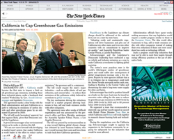
Those of us who are lucky enough to be wired have sadly come to appreciate the impossibility of reading, seeing, hearing, experiencing even a small fraction of just the new entries to the web each day. (yikes, some days it’s even hard just to keep up with a favorite blog). god knows we don’t need more pundits, but we are desperate for reliable filters which can recommend the direction of our attention. Denis Dutton, a philosophy prof in New Zealand started Arts & Letters Daily in 1998. every day since, he (and presumably by now a small staff) have recommended several essays and articles that they think are worth looking at. Unlike a blog however which favors the last entry, Denis’ original design favored short blurbs so that the reader can scan a large number of entries (from several days) fairly quickly. if you don’t know Arts & Letters Daily, it’s worth a look. If you do know it, send Denis and present owner (Chronicle of Higher Education) some fan mail.
Monthly Archives: September 2006
carbon and silver
 Carbon and Silver is a small show of Walker Evans‘ 1935-36 photographs at the UBS gallery in New York. The purpose of this exhibit is to compare printing technologies. It focuses primarily on ink-jet prints in relation to gelatin silver prints, with a small sample of books side by side with their digitally printed counterparts, revealing how lithography literally pales next to the crispness of the digital.
The show invites meditations on the “authenticity” of reproductions, especially in a medium such as photography, in itself based upon printing technology. In this show it is quite difficult to discern the original from the copy, and one questions, as Baudrillard would have it, to which point the copy has come to replace the original.
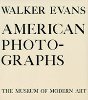 Most of the prints exhibited at the UBS belong to Evans’ body of work documenting the effect of the Great Depression on rural families for the Farm Security Administration in 1935-36. As a photographer, he was not particularly interested in producing his own prints as his main interest was to record information. These photographs were originally printed by the FSA as visual evidence reinforcing the New Deal.
Evans’ own interpretation of them appeared in American Photographs, the book that accompanied his exhibition at the Museum of Modern art (the first one-man photography show ever mounted by a major museum.) John T. Hill says in this exhibition’s catalogue that Evans “scrupulously controlled corrections of the printing plates, and using this process as an extension of his darkroom became a habit.” The interesting thing is that he understood that the book has a permanence that the exhibition does not.
Evans’ photographs have such crispness that they lend themselves to reproduction, even when the print is less than perfect. As a master of his medium he was absolutely aware of the difficulties of rendering full tonal scale in a black and white print. The ink-jet prints in this show are so remarkably close to their gelatin silver sisters that the viewer has to go back and forth from print to print in order to discern any possible difference. Evans loved the detail that an enlarged print brings out and the enlarged digital prints in this exhibition certainly do that.
Hill sums up the advantages of technology without denigrating the magnificence of the original process:
All new media affect voice and timbre. A greater tonal scale and more precise control of values are the two most significant tools offered by digital technology. The information so difficult to maintain in the dark and light ends of the scale using gelatin silver materials is now printable. Gelatin silver has been replaced by carbon black pigments laid onto archival paper. The music is the same; certain subtle notes are now heard more clearly.
mckenzie wark interview in halo
This interview with McKenzie Wark was conducted inside an online version of the Halo 2 video game as part of the upcoming fourth episode of This Spartan Life, “a talk show in gamespace.” Many thanks to Chris Burke and the TSL team for doing such a fantastic job. Click the image to play (it’s a little under 14 minutes):
From the interview, here’s McKenzie on collaborating with readers inside his book:
“It sort of brings out what writing always is anyway, which is that, in a sense, you’re always the DJ of other people’s thoughts and ideas, and this just makes that manifest.”
Also see this interesting thread in the GAM3R 7H30RY forum from a while back — a discussion between McKenzie and Chris about “glitching” and other forms of trifling or hacking within the game (the bread and butter of machinima filmmakers), and whether this can lead to real freedom. There’s a moment later on in the video where the debate gets wonderfully concretized in the physical landscape of the game world.
We “shot” the footage back in August at Chris’s studio in Brooklyn. I managed to snap a couple of hazy pictures with my camera phone:
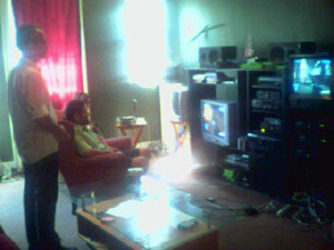
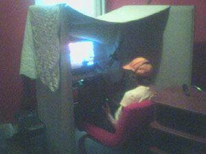
On the left you see the room where Chris and the two camera operators have their consoles. On the right is McKenzie in his own little cave. Everything is recorded through video feeds running out of the Xboxes. Ken and Chris talk over headsets and move around the game environment while the two “cameras” follow behind (the cameras are just the perspectives of the other two gamers). The chaos during Ken’s reading at the end is the work of other online gamers from around the country — TSL groupies who like helping out with shoots and generally raising hell. Seeing Chris try to coordinate this rambunctious crew long distance was highly entertaining.
(If you haven’t seen it, also check out This Spartan Life’s interview with Bob from their first episode. A real treat.)
phony reader
 What to say about this thing? After multiple delays, it’s finally out, and in time for the holidays. David Rothman, as usual, has provided exhaustive and entertaining coverage over at Teleread (here, here and here), and points to noteworthy reviews elsewhere.
It’s no secret that our focus here at the Institute isn’t on the kind of ebooks that simply transfer printed texts to the screen. We’re much more interested in the new kinds of reading and writing that become possible in a digital, network environment. But even measuring Sony’s new device against its own rather pedestrian goals — replicating the print reading experience for the screen with digital enhancements — I still have to say that the Reader fails. Here are the main reasons why:
1) Replicating the print reading experience?
E-ink is definitely different than reading off of an LCD screen. The page looks much more organic and is very gentle on the eyes, though the resolution is still nowhere near that of ink on paper. Still, e-ink is undeniably an advance and it’s exciting to imagine where it might lead.
Other elements of print reading are conjured less successfully, most significantly, the book as a “random access” medium. Random access means that the reader has control over their place in the book, and over the rate and direction at which they move through it. The Sony Reader greatly diminishes this control. Though it does allow you to leave bookmarks, it’s very difficult to jump from place to place unless those places have been intentionally marked. The numbered buttons (1 through 10) directly below the screen offer offer only the crudest browsing capability, allowing you to jump 10, 20, 30 percent etc. through the text.
Another thing affecting readability is that action of flipping pages is slowed down significantly by the rearrangement of the e-ink particles, producing a brief but disorienting flash every time you change your place. Another important element of print reading is the ability to make annotations, and on the Sony Reader this is disabled entirely. In fact, there are no inputs on the device at all — no keyboard, no stylus — apart from the basic navigation buttons. So, to sum up, the Sony Reader is really only intended for straight-ahead reading. Browsing, flipping and note-taking, which, if you ask me, are pretty important parts of reading a book, are disadvantaged.
2) Digital enhancements?
Ok, so the Sony Reader doesn’t do such a great job at replicating print reading, but the benefits of having your books in digital form more than make up for that, right? Sadly, wrong. The most obvious advantage of going digital is storage capacity, the ability to store an entire library on a single device. But the Sony Reader comes with a piddling 64 megabytes of memory. 64! It seems a manufacturer would have to go out of its way these days to make a card that small. The new iPod Shuffle is barely bigger than a quarter and they start at one gigabyte. Sony says that 64 MB will store approximately 80 books, but throw a few images and audio files in there, and this will dramatically decrease.
So, storage stinks, but electronic text has other advantages. Searchability, for example. True! But the Sony Reader software doesn’t allow you to search texts (!!!). I’d guess that this is due to the afore-mentioned time lags of turning pages in e-ink, and how that would slow down browsing through search results. And again, there’s the matter of no inputs — keyboard or stylus — to enter the search queries in the first place.
Fine. Then how about internet connectivity? Sorry. There’s none. Well then what about pulling syndicated content from the web for offline reading, i.e. RSS? You can do this, but only barely. Right now on the Sony Connect store, there are feeds available from about ten popular blogs and news sources. Why so few? Well, they plan to expand that soon, but apparently there are tricky issues with reformatting the feeds for the Reader, so they’re building up this service piecemeal, without letting web publishers post their feeds directly. Last night, I attended a press event that Sony held at the W Hotel at Union Square, NYC, where I got to play around with one of the devices hooked up to the online store. I loaded a couple of news feeds onto my Reader and took a look. Pretty ghastly. Everything is dumped into one big, barely formatted file, where it’s not terribly clear where one entry ends and another begins. Unrendered characters float here and there. They’ve got a long way to go on this one.
Which leads us to the fundamental problem with the Sony Reader, or with any roughly equivalent specialized e-reading device: the system is proprietary. Read David Rothman’s post for the technical nuances of this, but the basic fact is that the Sony Reader will only allow you to read ebooks that have been formatted and DRMed specifically for the Sony Reader. To be fair, it will let you upload Microsoft Word documents and unencrypted PDFs, but for any more complex, consciously designed electronic book, you’ve got to go through Sony via the Sony Connect store. Sony not only thinks that it can get away with this lock-in strategy but that, taking its cue from the iPod/iTunes dynamo, this is precisely the formula for success. But the iPod analogy is wrong for a number of reasons, biggest among them that books and music are very different things. I’ll address this in another post shortly.
I’ve said it before and I’ll say it again: ebooks are a dead end. Will it be convenient some day to be able to read print books digitally? Certainly. Will the Sony Reader find a niche? Maybe (but Sony Ericsson’s phones look far more dynamic than this feeble device). Is this the future of reading and writing? I don’t think so. Ebooks and their specialized hardware are a red herring in a much bigger and more mysterious plot that is still unfolding.
See also:
– phony reader 2: the ipod fallacy
– phony bookstore
– an open letter to claire israel
google to scan spanish library books
 The Complutense University of Madrid is the latest library to join Google’s digitization project, offering public domain works from its collection of more than 3 million volumes. Most of the books to be scanned will be in Spanish, as well as other European languages (read more in Reuters , or at the Biblioteca Complutense (en espagnol)). I also recently came across news that Google is seeking commercial partnerships with english-language publishers in India.
While celebrating the fact that these books will be online (and presumably downloadable in Google’s shoddy, unsearchable PDF editions), we should consider some of the dynamics underlying the migration of the world’s libraries and publishing houses to the supposedly placeless place we inhabit, the web.
No doubt, Google’s scanners are aquiring an increasingly global reach, but digitization is a double-edged process. Think about the scanner. A photographic technology, it captures images and freezes states. What Google is doing is essentially photographing the world’s libraries and preparing the ultimate slideshow of human knowledge, the sequence and combination of the slides to be determined each time by the queries of each reader.
But perhaps Google’s scanners, in their dutifully accurate way, are in effect cloning existing arrangements of knowledge, preserving cultural trade deficits, and reinforcing the flow of knowledge power — all things we should be questioning at a time when new technologies have the potential to jigger old equations.
With Complutense on board, we see a familiar pyramid taking shape. Spanish takes its place below English in the global language hierarchy. Others will soon follow, completing this facsimile of the existing order.
the good life: part 1
The Van Alen Institute has organized an exhibition that explores new design and use of public space for recreation. The exhibition displays innovative designs for reimagined and reclaimed public spaces from various architects and urban planners. The projects are organized into five categories: The Connected City, the Cultural City, the 24-Hour City, the Fun City, and the Healthy City. As part of the exhibition, the Van Alen Institute has been holding weekly panel discussions about designing public space from international and local (NYC) perspectives. The participants have been high level partners in some of the most widely regarded architecture firms in NYC and the world. The questions and discussions afterwards, however, have proved to be the most interesting part; there have been questions about autonomy and conformity in public space, and how much of the new public space has been designed for safety, but little else. They have become ‘non-spaces’, and fail to support public needs for engagement, relaxation, and health.
This week their discussion will move away from the architectural and planning and into new technology. It will be interesting to see how technology supports and influences ideas of connectedness in a public place; while the value of connecting to others from a private, isolated space seems obvious, doing so from a public place seems less common and less intuitive than face-to-face interaction. The panel, including Christina Ray (responsible for the Conflux Festival ) and Nick Fortugno (Come Out & Play Festival), will present and discuss “The Wired City” at 6:30 pm on Wednesday, Sep. 27.
two copyright manifestos out of britain
The British Academy:
“…the copyright system may in important respects be impeding, rather than stimulating, the production of new ideas and new scholarship in the humanities and social sciences.”
The British Library:
“Existing legislation urgently needs to be updated, though the manner in which this is achieved has the potential to nurture or curtail the development of new kinds of creativity and new models of public and private sector value.”
backwards into the future
Reading Christine Boese’s anticipatory critique of the new NY Times Reader, I was reminded of something I saw last winter in Seoul at Chosun Ilbo, which is pretty much the Korean equivalent of The New York Times. Off the main lobby, the newspaper has set up an exhibition space called the “Media Lab,” where the latest prototypes from the paper’s digital technology wing are on public display. A sneak peak at the future of news.
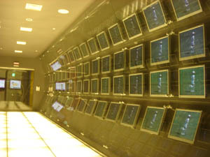
While there, I taped a demo that shows a new reading interface they’ve developed called “T-Paper,” which was supposedly slated for release this year (though I haven’t heard anything about it since). Strolling through the gallery, I found it running across a range of devices, from large flat-screen televisions to laptops, to Sony PSPs, to tiny pocket assistants. Here’s the wall display:
My first reaction was much like Chris’s: “a ‘horseless carriage’ retrenchment” — porting the artifact of the broadsheet newspaper into a digital environment. I have to admit, though, that I was slightly seduced by the zoom interface, which reminded me of this proof of a similar concept by the late interface pioneer Jef Raskin. It’s especially impressive to see it done with video. Though the Times Reader doesn’t sport anything as fancy as this, a commenter named Kevin (who I can only assume works for the Times — or Microsoft) insists that it will have much of the reader-driven functionality we would hope for (including the ability to share comments and annotations with other readers), in spite of the fact that it will be, as Chris puts it, “a walled garden.”
Kevin also refers to usability studies that suggest the Times Reader helps users “retain more information and read for longer periods.” I’ll buy longer periods — I always read more of the paper when I have it in print, and this new device certainly replicates much of the experience of print reading, while incorporating some nice new features. But still, are these proprietary, bound devices really going to replace newspapers? It seems doubtful when news consumption is such a multi-sourced affair these days (though to some extent that’s an illusion). A device that allows readers to design their news menu seems more the ticket. Maybe the Times should be thinking more in terms of branded software than proprietary hardware. Make the best news reader on the web, prominently featuring Times content, but allowing users to customize their reading experience. Keep it open and plugged in. Let the Times be your gateway to more than just the Times.
Chosun Ilbo’s vision seemed similarly constrained. As much as they tried to create a futuristic atmosphere with their Media Lab, much of the technology on display seemed, like the Times Reader, to be stuck in old mindsets — fixated more on the digital apotheosis of their product than on really grappling with the realities of the new media environment.  T-Paper also reminded of another museum piece, the British Museum’s “Turning the Pages,” which remounts famous old manuscripts like DaVinci’s journals in a fancy page-turning interface. A while back, Sally Northmore wrote a nice piece for if:book pondering this strange print-digital artifact, and what it means to electronically replicate the turning of a page. All of this recalls Marshall McLuhan’s famous observation in The Medium is the Massage:
“When faced with a totally new situation, we tend always to attach ourselves to the objects, to the flavor of the most recent past. We look at the present through a rear-view mirror. We march backwards into the future…”
Much of the disoreintation I felt while in Korea came from this feeling of time pulling in different directions. A society saturated in technology, far more wired than ours, Korea rushes headlong into the future, yet at the same time digs its heels obstinately into the past. At the end of the Korean War, Seoul was a bombed-out pit of some half million people. Now it’s a sprawling megalopolis of over 20 million, and though many centuries-old, it feels streamlined and new. There’s no “old city” in any real sense. Shiny glass towers and enormous shopping centers loom over the streets, pedestrian shopping lanes explode into jungles of neon, tiny alleys teem with life like fissures in a coral reef, and a vast network of subways rumbles beneath. And yet this dynamic scene — the swirl of steaming tripe vendors and blinking electronics — is periodically interrupted by a medieval gate or pagoda, a historic remainder sitting tranquilly amid the churn of modern life.


Spend an afternoon walking through Seoul and you’ll see the full pageant of the local techno-culture. Cell phones are clearly several generations further evolved than anything we have here in the States. People seem to be doing just about everything with their mobile devices: playing games, watching TV, surfing the web. I even saw one woman on a train using her phone’s video camera as a pocket mirror to fix her make-up. Young men spend hours tucked away in smoky, windowless internet cafes known as “PC Bangs,” playing multi-player online games that involve a quarter of the citizenry. At the same time, you are frequently reminded of Korea’s abiding infatuation with printing, paper crafts and calligraphy: stores sumptuously arrayed with handmade paper hung on racks, prodigiously plumed ink brushes hanging like icicles from the ceiling, and delicate little rice paper journals piled neatly on the shelves.

Mountains also serve to anchor swift-moving Seoul in time. 70 percent of the Korean peninsula is mountainous and the Seoul region is no exception. Sitting in the heart of downtown is the petite Namsan peak, surrounded by one of the city’s best-loved parks and sporting at its summit Seoul’s most recognizable landmark, Seoul Tower, a rocket ship awaiting blastoff. Facing Namsan, the snow-streaked Bugaksan peak rises over one of Seoul’s central boulevards, an avenue running through what feels like the Korean equivalent of Rockefeller Plaza, past City Hall, the big newspaper offices, the Ubiquitous Dream Hall and the Ministry of Reunification, leading to the Gyeongbok Palace, and beyond that the Presidential “Blue House,” nestled in Bugaksan’s shade.


Framed by the mountain, presiding over the unending traffic of Hyundais, Kias, Daewoos, and Samsungs, is an imposing statue of Admiral Yi, the famous military leader who in the late 16th century dealt a humiliating blow to the Japanese navy with the most advanced technology of his time: a fleet of armor-plated, smoke-breathing “turtle boats.”
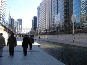

Much of Seoul’s past lies beneath the modern streets, and occasionally something is unearthed and restored (or reinvented). Announced by a waterfall perpendicular to the grand boulevard is the Cheonggyecheon, an ancient stream running through the heart of the city into the countryside beyond, and which until very recently was covered over by an elevated highway. Last year, the city demolished the roadway, uncovered the stream and built a lovely sunken path alongside it cutting quietly through six miles of the city’s bustle. If you’ve ever been to Paris and walked directly along the Seine on the lower walkways, you can sort of picture this, though the Cheonggyecheon is no Seine — a small stream and a fairly narrow trench. But walking there, with the tops of buildings peeking over, an improbable calm steals over you in the heart of town.
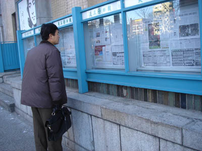

And because this reminiscence began with newspapers, take a look at these pictures. A few blocks from the waterfalls that reintroduce the Cheonggyecheon to the city after all these years, the very same newspapers that pride themselves on publishing at the cutting edge of technology still mount their daily editions, page by page, in glass cases on the street for all to read.
play the city
Urban gaming is growing in popularity in correlation with the ascendance of mobile devices. Many current games depend on an email or text messaging enabled phone; some of the latest are digital scavenger hunts where the camera phone is the weapon of choice. This weekend at the Come Out & Play Festival, hosted by EyeBeam, you’ll have a chance to play some of the newest games in your own back alley. While not all urban games require tech—some are just about taking advantage of the unique density of the urban environment—the games at CO&P are almost uniformly tech enabled, using mobile phones or projectors or even visits to Second Life as aspects of gameplay.
The Come Out & Play Festival is a street games fesitval dedicated to exploring new styles of games and play.The festival will feature games from the creators of I love bees, PacManhattan, Conqwest, Big Urban Game and more.From massive multi-player walk-in events to scavenger hunts to public play performances, the festival will give players and the public the chance to take part in a variety of different games. Come rediscover the city around you through play.Why street games? Why a street games festival, you ask? Fair questions. Well, we like innovative use of public space. We like games which make people interact in new ways. We like games that alter your perception of your surroundings. But most importantly, we think games are great way to have fun.
Like the Conflux Festival, Come Out & Play encourages us to use our shared urban spaces differently, unlimited by the conventions of that space. But rather than approach it from the perspective of an individual remaking the rules of public engagement, CO&P encourages a game mentality, where the individual (or team) works within a different set of highly prescriptive rules. These rules aren’t the usual rules of public space, which is what makes it fun. But they are the rules of the game, and they cannot be broken if you want to continue to participate. Urban gaming has some root in the thinking of the Situationists—particularly the notion of public, anarchic play—so it seems especially ironic that the play is so structured. Still, I anticipate all the regulations in the world won’t kill the fun this weekend, and the faint whiff of activism will add a pleasant flavor to the proceedings. I’m especially looking forward to Cruel 2 B Kind (if I can just figure out how to get my phone to use email), and the enormous Space Invaders projection (it uses the side of a building as the screen and your body as the defender ship).
NYTimes reader
[editor’s note: The New York Times released a new software reader. It is Windows only. No Mac compatibility at this time. We asked Christine Boese, of serendipit-e.com, to post her thoughts on the matter.]
I got this off another news clip service I’m on…
NYT Finally Creates a Readable Online Newspaper (Slate)
Jack Shafer: About six months ago, I canceled my New York Times subscription because I had found the newspaper’s redesigned Web site to be superior to the print Times. I’ve now abandoned the Web version for the New York Times Reader, a new computer edition that has entered general beta release.
I went around to try to sign up for it and get a look. I couldn’t, because the Times IT dept overlooked making its beta available for Macs. I scanned through the screenshots, tho, and the comments on the blog preview of features, sneek peek #1 and #2.
Jack Shafer isn’t exactly an expert in interactive design, so I don’t know if his endorsement means anything other than, "Gee whiz, here’s a neato new thing!".
My initial impressions are that it looks like the International Herald Tribune
with a horizontal orientation I just can’t stand (the Herald Tribune often requires horizontal scrolling, and it’s far easier to read the printable version of stories). Yes, I see there is a narrow screen screenshot, but I’m thinking more about the text flow nightmares this design must cause.
But I think I have bigger reservations about the entire concept behind the Times Reader beta.
Here’s just a summary of questions I’d want answered, if I were actually able to test the beta:
- How is re-creating a facsimile of a print newspaper online a step forward for interactive media? Is it really, or is it just a kind of "horseless carriage" retrenchment? Shafer talks about some non-print-like pages that tell you what you’ve read or haven’t read, to assist browsing and search, but notes that the archives are thin. I wonder if the Times "Most Popular" feature makes the cut.
- Code. The big deal here is that it uses Microsoft .NET and advancers on Vista technology. I smell a walled garden. Is this XML-compatible? RSS-enabled? Is it even in HTML code that can be easily copied and pasted? (Shafer’s piece says it can be, but I want to see for myself) W3 validated? Does its content management system have permalinks? How do bookmarks work?
- Hyperlinks. Will the text accomodate them? Will the Times use them? Or by anchoring themselves firmly in a "reader" technology, perhaps a completely web-independent application, is the Times trying to go beyond simply a code-walled garden and also create a strong CONTENT walled garden as well? Is this a variant of TimesSelect on speed?
- Audience. Presumably the Times has some research that shows a need to court its paper-bound print-loving audience to its online products by making the online products more like the print products.
- Usability and Design. I’ve already mentioned the Mac incompatiblity. What other usability and design issues are present in this Times Reader technology? I’ll leave that to people who actually get use it.
But my question about audience is this: is there a REASON to make heroic efforts to lure print readers online? Isn’t the bigger issue trying to keep print readers attached to print, so that the ad-driven print editions don’t have to go the way of the dinosaur? The online news audience is already massive, and (Pew, Poynter) studies show that during the recent wars, large numbers of people were turning away from traditional news providers and outlets to seek out other sources of information, particularly international information, on the Internet and with news feed readers (RSS/Atom).
So in a competitive online news landscape, the Times makes a strategic turn to become more like its print product? And this will lure large numbers of online news readers back exclusively to the Times exactly HOW? Especially if it is a walled garden that doesn’t integrate well into the Blogosphere or in RSS news feed readers?
People like Terry Heaton and other media consultants (Heaton has a terrific blog, if you haven’t found it yet) are going out and telling traditional news media outlets that they have to move more strongly into an environment of UNBOUND media, to make their products more maleable for an unbound Internet environment. It appears the Times is not a company that has purchased Heaton’s services lately.
From the screenshots I’ve seen, there seems to be very little functionality or interactive user-customizable features at all. I don’t know. Color me stupid, but my gut reaction is that this is nothing more than another variant of the exact PDF version of the paper that the Times put out, only perhaps with better text searching features and dynamic text flow (meaning I’d bet it is XML-based instead of PDF-based, only with some custom-built or Microsoft-blessed walled garden DTD).
You know, for the money the Times spent on this (and the experienced journalists the Times Group laid off this past year), I’d have thought the best use of resources for a big media company would be to develop a really KILLER RSS feed reader, one that finally gets over the usability threshold that keeps feed readers in "Blinking 12-land" for most casual Internet users.
I mean, I know there are a lot of good feed readers out there (I favor Bloglines myself), but have any of you tried to convert non-techie co-workers into using a feed reader lately? I can’t for the LIFE of me figure out why there’s so much resistance to something so purely wonderful and empowering, something I believe is clearly the killer app on par with the first Mosaic browser in 1993. But because feed readers caught on bottom up instead of top down, there’s not only usability problems for the broadest audiences, there’s also a void at the top of the technology industry, by companies that fail to catch on to the RSS vision, mainly because they didn’t think it up themselves.


