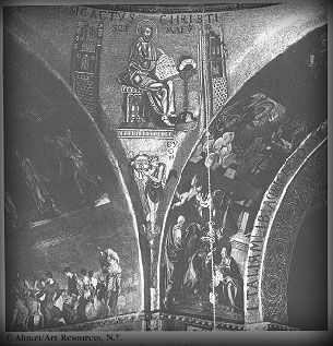
One of the great conceptual jumps of the late evolutionary biologist Stephen Jay Gould (with the equally brilliant, if lesser known, Richard Lewontin) was the idea of the spandrel. In “The Spandrels of San Marco and the Panglossian Paradigm”, they wondered about how the spandrels – in architecture, the roughly triangular area between two perpendicular arches – in the cathedral of San Marco in Venice came to be. Looking at how the spandrels are decorated now, they reasoned, you might imagine that they had been designed to feature prominently in the architecture. But this is not necessarily so from an architectural standpoint: if you want to have perpendicular arches, you have to have spandrels between them. Nobody ever wants spandrels by themselves; they’re a side product. Once you have them, of course, you can decorate them as much as you like.
Analogously, Gould and Lewontin reasoned, you could explain many biological features in the same way: a feature may continue to exist in an organism simply because there’s no reason to take it away. One shouldn’t expect features to have functions: they can simply do things (or not) because they’re there. Male nipples are the canonical example of this: there’s no reason for males to have them, but there’s no compelling reason not to have them. So they’re there.
I’ve been thinking for a while about the problem of pages on the screen. We have pages in a book because they make sense there: pages are the easiest way to divide up a long text into hand-sized chunks. Pages on the screen (as they exist in a PDF, say) seem to me to be something of a spandrel: there’s no physical reason that we need to divide text up into hand-sized chunks on a screen. We don’t always: look at the way a webpage scrolls. But what’s worried me is the paucity of the metaphors being used – note the verb “scroll” – against the tabula rasa that computers present.
Looking at a Flash demonstration (8Mb, but very much worth clicking or downloading) of the late Jef Raskin‘s Archy system suggests a way out of the problem. Here we have a two-dimensional space filling the frame of the browser. But this isn’t a two-dimensional space like that of a sheet of paper. The possibility of zooming in to create an infinite plane takes advantage of the virtual environment in a way that a piece of paper cannot. What if you had a novel in a space like this?
This is exciting to me because it’s active design – trying to change the metaphor – instead of being a side effect of trying to re-implement old ideas in a new context.

I, too, have been thinking about the problem of pages on the screen.
One of the crucial differences between a spandrel and a page is that a spandrel is a necessary by-product — as you say, if one makes arches, one makes spandrels. The page, whether in the codex or on the screen, is not produced as a result of creating something else. Indeed, the main point of moving from the scroll to the codex format was to create physical pages that would aid other modes of reading (such as flipping around in a text or between texts, comparing different passages).
The problem with pages on the screen, as you mention, is that it is an importation of a metaphor from a different medium . . . but I don’t think that these pages are a by-product of creating something else. It may be useful to think about this problem in terms of modes of reading. That is, how are different modes of reading related to the different arrangements of text and image — for instance, are modes of reading generated by/inspiration for these physical arrangements of text and image?
The scroll format is good for long, sustained, linear reading; the codex format helps the reader move efficiently around a text; . . . and the digital display? I think once we figure out what its best properties are, we can start arranging text and image in ways that exploit the advantages of digital technology. And I’m pretty sure that the mode(s) of reading that are best suited for the digital medium are not the same as the ones best-suited for the scroll or for the codex.
Hi Dan —
Raskin’s demonstration reminds me of a designer’s site I came across last fall, sofake.com. The zoom function reappears, and it’s pretty clever in terms of navigating through a work/site/piece. It still insists on simulating more than two dimensions.
I disagree that the page on the screen is solely a transferred metaphor from the book medium. It would be equally likely to think of the book page itself as a metaphor for a human face. In this sense it’s an analog of a conversational partner. The cognitive hard-wiring of the human brain lends itself to certain heuristic methods. The experience of seeing and holding the book in beginning reading classes personifies the medium. The child is already acquiring abstract thinking so he or she faces the book and tries to understand the meanings/language of another person’s avatar, i.e. each page correlative with the average size of a human face. The transfer to the screen could then be just a continuation of this ‘format (…the definition of book size).’ A continuously scrolling text therefore lacks this metonymical resonance. If it were read sideways, it might be more akin to the endless horizon scan. Just some very late thoughts to a four-year old thread!