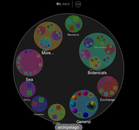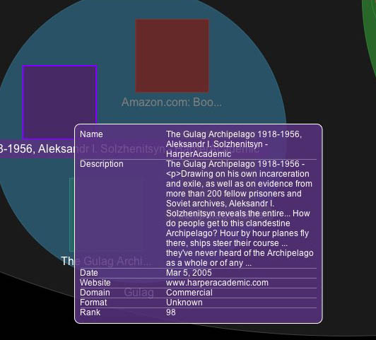

When you search the web on Google or Yahoo, your results come up in a stack – a long scroll unfurling at your feet. Ranking is what makes the whole thing work – the most relevant, or most linked-to, items are placed near the top, and more often than not, you get what you’re looking for. Few really bother to sort through the rest of the pile, even though valuable stuff could be buried there (and what if you don’t know exactly what you’re looking for?). Clustered search takes a different appproach, breaking up results into useful categories and themes, enabling users to penetrate the stack more quickly (see Clusty, or its parent Vivisimo). It’s an interesting compromise with top-down shelf-based hierarchies. Clustered search doesn’t impose categories on you from the get-go, rather, it applies them as needed – building shelves on the fly. Grokker, a Yahoo-powered “visual” search engine, takes it a step further, arranging clusters into archipelagos of information, “giving you the ability to explore any subject far beyond the obvious.” Each category is represented by a circle, containing site links (appearing as squares) or smaller circles (subcategories). Above is my archipelago for… “archipelago.” It brings up top level clusters for “botanicals” (Archipelago Botanicals produces a popular line of soaps, lotions and scented candles), “Hawaiian,” “Sea,” “Gulag,” and others. Drag over a site and a nice summary pops up (see righthand image above) – much more readable than the hodge podge you get in Google.
Link to NY Times article on Grokker.
Story about Vivisimo clustering search tool built specially for navigating the massive EU constitution.
if:book
A Project of the Institute for the Future of the Book
