April 10, 2006
Cultura: a glimpse at the future of the student generated textbook

Cultura is an methodology for foreign language learning created by Gilberte Furstenberg, Sabine Levet, Shoggy Waryn, and was first implemented at MIT.
The premise of Cultura is to provide an authentic learning experience by supporting student discussion and interaction between two foreign language classes, where each class is studying the other's native tongue in their respective countries. Thus, a french class in the US partners with an English class in France. Although immersion is the best method of learning a foreign language, spending extended time in a foreign country is generally not feasible for the vast majority of students. Offering student authentic experiences in their language of study is a clear second choice to immersion, but can still greatly assist the learning process.
Students first answer a series of questionnaires, which have formats such as word association, sentence completion, and fill in the blank. The students discuss the responses to the questionnaire in bulletin boards. Teachers use both the answered questionnaires and the discussion boards in their classroom. Interestingly, the students are directed to write in their native language. Although this may seems counter intuitive, the creators found through experimentation that the communication was much more meaningful in their own language. Student read in their language of study, and teacher lead in-class discussions in the foreign language. Therefore, Cultura provides ample opportunity for students to practice the other language. The founders allow anyone to use their methodology, however, they do request that teachers contact them so that they may track its usage. They have also made available past examples for teachers who do not have access to partnering schools.
Cultura not only creates motivation for learning, it actually creates an actual text for learning. Further, access to their contemporaries offer an experience of authenticity that is impossible to provide in traditional textbooks learning, partially due to the typical life cycle and generalization nature of textbooks. Further, students have an opportunity to ask questions and explore the culture of their partnering students in a way that was rarely available before now. In the most successful implementations of Cultura, students ask questions about not only language usage, but also on newly perceived understanding of cultural differences.
Cultura, in a way, creates an open source textbook. The students create their own cultural foreign language textbooks with a level of that authenticity that traditional authors cannot match. It transforms the entire idea of what a textbook can be and how it is written. Cultura does not rely on complicated technology. Although Cultura is only feasible with the advent of the web, it is not about the technology. The technology itself is quite simple, online surveys and discussion boards have been used since the early days of the internet. Often, digital textbooks are loaded with technical wizardry that obfuscates the learning, as seen in certain studies. Different technologies can be used from hand coded html pages to CGI scripts. In fact, one could use off the shelf and often free services, such as survey monkey and yahoo groups, or the course management systems, such as Sakai or Blackboard that many institutions now use. Cultura hints that the next generation of textbooks and learning environments that will challenge what the textbook will look like, who will author it, and how it will utilize the network.
Posted by ray cha at 5:04 PM
January 6, 2006
Narrative Structure and Medium: "The Red Planet" and the Future of the Educational DVD-ROM
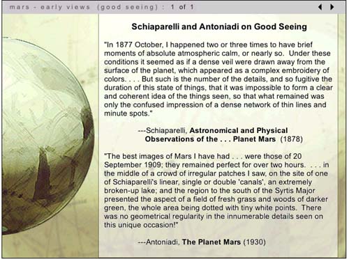
As we've noted before in Next/Text, a key question in considering the future of the digital textbook is whether the text should be delivered to the user via the web or on a disc. In the 1990s -- when Voyage pioneered the development of the educational CD-ROM -- the choice was clear: accessing video and audio was far too difficult to make developing web content worthwhile.
Since the demise of Voyager, however, the production of disc-based educational material has gradually decreased, and it has become less clear that ROM discs are the medium of choice for delivering "thick" multimedia content. As some of the examples we've written about (especially the WebCT film course and the MIT Biology class) demonstrate, streaming video can be easily integrated into online instructional material: there's still much room for improvement, but it's clear that online video and audio delivery will only improve over time.
So what is the future of the disc-based educational text? The question seems especially relevant now that the recent industry debate over the formats of next-generation DVDs has provoked more than a few technology analysts to wonder aloud whether discs themselves are a doomed delivery medium. I'm not completely convinced by these arguments, as I feel that, as far as educational media are concerned, there may still be good reasons to put things on disc. In what follows, I'll be weighing the pros and cons of scholarly work on DVD-ROM through a discussion of The Red Planet, a DVD-ROM project published in 2001 by the University of Pennsylvania Press.
The Red Planet is the first publication in Penn's Mariner 10 Series, a publishing venture that represents the first attempt by a university press to publish scholarly work on DVD-ROM. The titles chosen for this Penn series are interdisciplinary studies that blend what C.P. Snow might call the "two cultures" of science and the humanities; each also includes a wide range of textual, visual and audio resources. Thus far, in addition to The Red Planet, Penn has published a volume on humanistic approaches to medicine; a physics text, "The Gravity Project," is forthcoming.
Interestingly, The Red Planet has its roots in an unsuccesful venture in online education: project co-author Robert Markely was first approached to do a series of video interviews to be embedded in a web course about science fiction. When that project fell through in 1997, Markley realized that such interviews would be an ideal first step towards creating a digital scholarly text that explored the roles Mars has played in 19th and 20th century astronomy, literature and speculative thought. Teaming up with multimedia designer/theorists Helen Burgess (also a co-author for Biofutures, a DVD-ROM-in-progress that I've previously discussed) Harrison Higgs and Michele Kendrick, Markley approached Penn with his idea for the project.
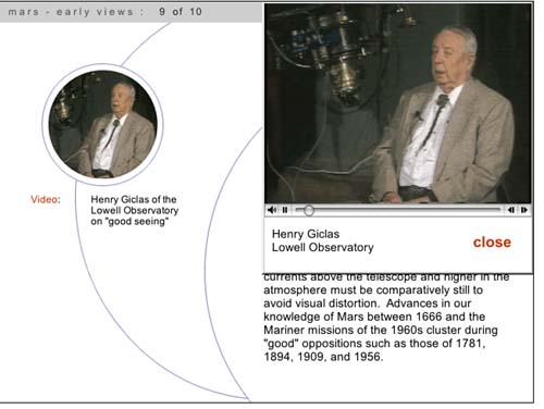
After getting the go-ahead from Penn -- and substantial funding from West Virgina University and Washington State University -- the group spent more than four years completing the project. Markley wrote a 200-page monograph on cultural and scientific approaches to Mars divided into nine chapters -- Early Views; The Canals of Mars; The War of the Worlds; Dying Planet; Red and Dead; Missions to Mars; Ancient Floods; Dreams of Terraforming, and Life On Mars. He and others in the group in the group then interviewed science fiction writers including Kim Stanley Robinson, cultural critics such as N. Katherine Hayles and a diverse group of major scientific figures including Richard Zare, Carol Stoker, Christopher McKay and Henry Giclas (the Giclas interview is pictured below). They also assembled hundreds of current and archival photos, quotations from scientific and literary texts, dozens of clips from science fiction films, and an impressive array of diagrams explaining key concepts in astronomy. And to complement the DVD-ROM project, they authored a website with educational resources, a timeline, and updatable discussions of debates about Mars exploration.
The success of The Red Planet stems from the fact that all of this multimedia does not serve simply to gloss on Markley's monograph: it changes Markley's own authoring process as well. As Markely points out in a chapter he wrote on the project for a book titled Eloquent Images, his main challenge was to create a work that was scholarly enough to be considered worthy by tenure committees, a requirement that has been a serious hurdle to the willingness of academics to invest time and effort in the creation of digital scholarly work. "The majority of commercial educational software treats content as a given," Markley wrote, "reified as information that has to be encoded within a programming language and designed in such a way as to enhance its usuability." To Markley, moving beyond this "usable information" paradigm, involved more than just foregrounding the text: it meant that the designers should make a significant contribution to the intellectual shape of the project that extended beyond usability issues and promoted them to the status of co-authors.
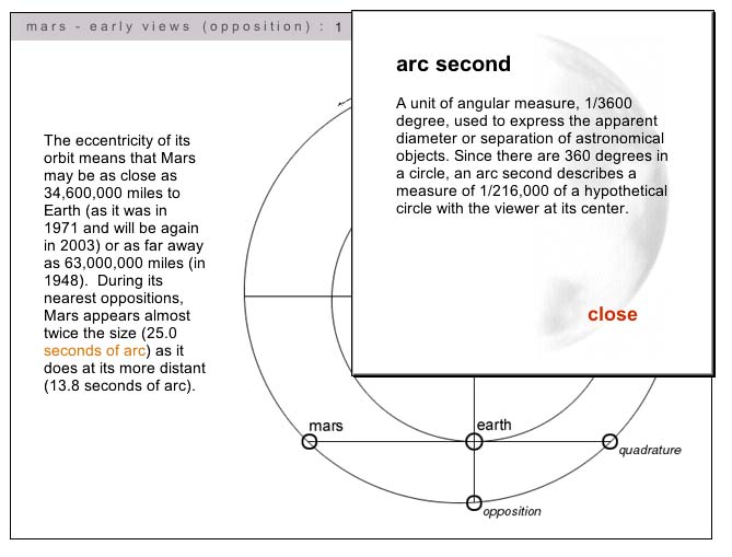
With this in mind, Markley and his co-authors worked collaboratively to develop a navigation structure for the project that reflected both scholarly and pedagogical concerns. The resulting interface eschews the hypertext structures of many web-based projects and relies instead on a chronological narrative structure that the authors felt best maintained the integrity of the scholarly text. In other words, hyperlinks don't move the user around inside the central text, but rather lead to film clips or selections of explanatory material (such as the diagram illustrating the term 'arc second,' pictured below).
The structure of The Red Planet thus resembles, in some ways, the structure of Columbia University's Gutenberg-e publications: if the reader chooses, they can read straight through the text and ignore the linked explanations and supporting material. For the most part, video interviews open on seperate pages and launch automatically (the screenshot above actually shows an exception to this), but the reader can always use the forward navigation key to advance the narrative.
The Red Planet demonstrates that this text-centric approach to digital scholarly work need not come at the expense of the quality of multimedia integrated into the project. From the beginning, Markley and his collaborators wanted The Red Planet to be a standout in terms of both the amount and the quality of supporting media. This, in turn, determined their choice of medium: in writing grant proposals to fund the development of the project, Markley stressed the importance of using DVD-ROM instead of CD-ROM to construct the volume. At the time The Red Planet was produced, the disc was able to hold about six times more data than a traditional CD-ROM; it was also able to read this data about seven times faster, meaning that the video segments played much more smoothly and were of far higher quality. As Markely wrote in his chapter for Eloquent Images, "video on CD-ROM is a pixilated, impressionistic oddity: on DVD-ROM, video begins to achieve something of the semiotic verisimilitude we associate with film."
The DVD-ROM format also allows The Red Planet'sdesigners to incorporate much longer video clips into their project: interviews are up to five minutes in length, and video clips are the maximum length allowable under fair use. In the case of the interviews, the longer interviews allow for detailed explorations of the question at hand: in the case of the film clips, the expansiveness of the selections gives the viewer a sense that they are experiencing a portion of the actual film rather than a snapshot.
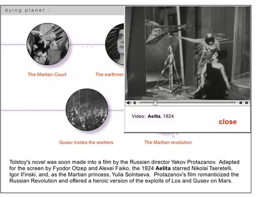
Still, though the videos are high quality, they are not full screen (as shown by the screenshot above, which shows a page that features a series of clips from the 1924 Russian film Aelita). The limited size of the clips is one of a series of tradeoffs Markley and his team found they had to make when confronted with their own limited budgets and realistic pricing expectations for their DVD-ROM. In his chapter for Eloquent Images, Markley writes:
In authoring The Red Planet, we were caught in an ongoing process of having to decide what we could afford in time, money and labor to live up to our grant application claims that DVD ROM could do what neither CD Rom nor the web could manage: integrate hours of high-quality video into a scholarly multimedia project. At the same time, we had to engineer downward the minimum requirements of RAM, operating systems, monitor resolutions, etc to avoid pricing our project out of the mainstream educational market.
Markley's point is an important one: DVD-ROMs have the potential to deliver amazing multimedia content, but that is simply the capacity of the medium. A successful DVD-ROM author not only has to find the time, money, and skill to produce the project; they also have to operate within the constraints of a market which is increasingly accustomed to getting educational content online for free. In the end, The Red Planet was probably more successful at the former than the latter: as a example of the genre, it is exceptional both in content and design, yet the disc has yet to find the wide audience of both scholars and Mars enthusiasts that its authors had hoped it would find.
Looking at The Red Planet and reading Markley's theorization of the work done by his team, I'm impressed by their very self-reflective effort to author a major project over several years in the midst of a rapidly shifting new media landscape. I'm convinced by Markley's argument claims in Eloquent Images that the DVD-ROM format allows multimedia authors to create projects that are more narrative-centered, and thus also, perhaps, more scholarly and more acceptable to the legitimating bodies of academia. At the same time, I'm unsure what will happen to the market for such work: either we will see a critical mass of DVD-ROMS emerge that will create a critical mass of reader/users, or the format will atrophy as the web becomes more and more the preferred method of distribution. Markley himself is aware of the uncertain future of projects such as his own: while making the case for The Red Planet as the best fit between form, content and medium, he also notes that the project is less "a model to be emulated" as much as it is "a historical document, a means to think through the scholarly and professional legitimation of video and visual information."
So should scholars persist in authoring in the medium? I think so, as long as they take a clear-eyed view of its advantages and pitfalls, and as long as they realize -- as Markley and his team did all along -- that while the time and effort spent on a DVD-ROM project is greater than the time spent on a traditional academic monograph, the audience might ultimately be more limited. Not always: a project such as the Biofutures DVD (discussed in an earlier post), which has been developed with a very specific pedagogical aim, might find a more extensive academic audience even if it doesn't find a non-academic one. The same might be said for Medicine and Humanistic Understanding, the newest title in the Mariner 10 series. The key is finding a way to create a new media object that is stable enough to allow users to take advantages of its merits both now and in the foreseeable future.
Posted by lisa lynch at 2:37 PM
December 29, 2005
"The American Film" -- Using WebCT To Author Digital Texts
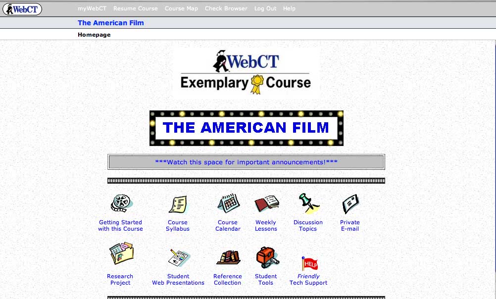
Over the past few years, more and more professors have begun using course management software such as WebCT or Blackboard (and, increasingly, the non-commercial and open-source Sakai) to organize their syllabi, place assignments online, and create online forums for class discussion. In some cases, WebCT courses are designed so comprehensively that they come to resemble digital course texts, including a substantial amount of original pedagogical material. One example of this is The American Film, a course taught by Thomas Valasek at Raritan Valley Community College that has been recognized this year as an Exemplary Course by in an annual WebCT competition (a description of the class and guest access are available here through the WebCT site).
Valasek, who uses WebCT as a distance-learning platform, has incorporated his own lectures and film analyses into the site, and included relevant film clips which are annotated by his own voiceover narration. This means that students are able to access unique content through the site, instead of using WebCT merely as a portal to download information authored elsewhere. It also means that Valasek has managed to create an online-only film course that give students the feeling of being present when the professor is walking them through scenes of a film -- perhaps the most important part of a lecture-based film class.
The American Film introduces students to American cinema through a discussion of the narrative and visual style of Hollywood movies. After a section on the culture of Hollywood (centered around the film The Player), and on narrative and visual style in film (centered respectively on American Beauty and On The Waterfront), Valasek focuses on four popular film genres: romantic comedy, the western, science fiction, and film noir. Students are expected to watch a series of films on their own and to use the lectures and discussions on the course site as a launching point for their own research projects. In each case, Valasek pairs a classic example of the genre with a contemporary adaptation, with the expectation that students might be able to draw on their familiarity with the more recent film to help with their interpretations of the older work.
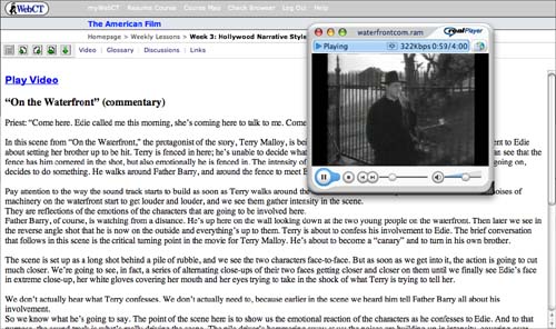
An example of Valasek's voiceover work can be found in his discussion of the crucial scene from On The Waterfront when the priest Father Barry tries to convince Terry Malloy, the films protagonist, to confess to his fiancee that he had helped organize a mob hit on his own brother. As the clip plays, Valasek's narration asks us to pay attention the metaphorical use of a high metal fence in the background: "Terry is fenced in here; he's unable to decide what he wants to do and what the right thing to do is. We can see that the fence has him cornered in the shot, but also emotionally he is fenced in."
As the scene shifts, Valasek continues to describe in detail both the visual and aural techniques used by Kazan to convey emotional intensity, making sure that his voiceover keeps pace with the film itself:
The scene is set up as a long shot behind a pile of rubble, and we see the two characters face-to-face. But as soon as we get into it, the action is going to cut much closer. We're going to see, in fact, a series of alternating close-ups of their two faces getting closer and closer on them until we finally see Edie's face in extreme close-up, her white gloves covering her mouth and her eyes trying to take in the shock of what Terry is trying to tell her...The point of the scene here is to show us the emotional reaction of the characters as he confesses to Edie. And to that purpose, the sound track is what's really driving the scene. The pile driver's hammering away at us; the noises are building up in intensity, covering over their words, drowning out everything that they say, but adding this powerful emotional overlay to the scene.
Valasek's clips are about three minutes long -- ample, but still within the boudaries of fair use -- and students can choose to watch them with or without Valesek's voiceovers. They can also read the transcripts of Valasek's comments seperately from watching the clip.
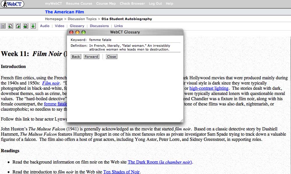
Additional features of the site include a hyperlinked glossary of film terms (pictured above), linked assignments, and an online forum in which students analyze the films they watch -- a necessary addition, since class discussion takes place entirely online.
At present, the primary limitations of The American Film seem to be those of WebCT itself. As a piece of software, WebCT is designed more for efficacy than elegance, and the clunky interface can be headache-producing: it's also the case that students who have all of their classes on the platform sometimes experience "WebCT blur," the feeling that all of their courses are seeping together. Of course, Valasek could move past these limitations by developing the multimedia content on this site even further; instead of embedding it in a WebCT platform, he could potentially create a DVD with his film analyses and discussion for broader use as an introductory film text. I'm curious as to whether anyone working in WebCT has considered the fact that they, like Valasek, are already well on the way to producing a digital textbook. Now that such labor-intensive multimedia learning objects are being created with increasingly frequency for course-specific situations, there needs to be more conversation about how to "free" such scholarly effort for broader academic use.
Posted by lisa lynch at 1:24 PM
Learning from the Simulated Fruit Fly
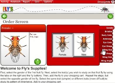
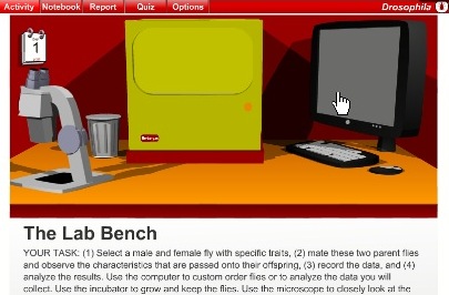
The Virtual Courseware Project creates interactive, online simulations for the life and earth sciences on their sciencecourseware.org site, including Drosophila. Taking its name from the fruit fly used in genetics research, Drosophila uses the classic fruit fly example to teach basic genetic concepts. Using an inquiry-based approach, students begin by ordering flies with certain attributes, such as gender, eye color and wing angle. Then, in the "lab bench" screen below, students mate male and female flies with certain attributes and observe which characteristics get passed along to their offspring. Then, they report their findings. These steps are designed to also teach the scientific method, which include making observations, formulating hypothesis, creating experiments, analyzing results, and writing up findings. Finally, students also get assessed on their learning.
A comment submitted by a teacher using Drospohila explained how this module was helpful in conjunction with experiments using real fruit flies. Working with both the real and the virtual may be the ideal. On one hand, the minor inconsistencies that result from real-life experiments can be an important part of the learning process, and virtual experiments don't allow for such inconsistencies. On the other hand, simulations offer the ability to repeat experiments many times to ensure understanding for class discussions or exams. In the real world, repeating experiments is often time or cost prohibitive.

I appreciate the structured learning aspects of these lessons, especially the assessment feature. Too often, learning modules leave out the any assessment. Even ungraded assessment allows students to an opportunity to make sure they understand concepts or prepare questions for class. The site also includes how their materials meet the standard requirements for each state in the US. The creators of Drosophila have taken steps to create a deep learning experience which re-enforce scientific methods using digital technology that paper-based science textbooks cannot replicate.
Posted by ray cha at 1:20 PM
December 13, 2005
"Liberty, Equality, Fraternity" and "Imaging The French Revolution:" Two Generations of Digital Texts
Since 1994, Roy Rozensweig's Center For History And New Media at George Mason University has pioneered the use of digital media to document and analyze historical events. Their particular focus is to transform history from an elite activity practiced mainly in the academy to a more democratic form of inquiry that both draws on and appeals to new audiences. Thus far, they have sponsored over a dozen ambitious digital history projects, ranging from the widely heralded September 11 Digital Archive to a digital recreation of P.T. Barnum's 19th century New York City museum of oddities.
In this review, I'll be looking at two CHNM-sponsored efforts -- Liberty, Equality, Fraternity and Imaging the French Revolution -- that explore the cultural history of eighteenth century France through both scholarly analysis and an extensive archive of cultural artifacts. Seven years divide the production of the two sites: Liberty, Equality, Fraternity was published by the Center in 1998, while Imaging The French Revolution was published in early 2005 as part of a joint effort with American Historical Review,. While both sites are engaging and useful, both also reflect the moment of their production: they thus can tell us something about the history of digital publishing even as they provide a deeper understanding of the history of the French Revolution.
Liberty, Equality, Fraternity is a collaboration between the CHNM and the American Social History Project, a center at the City University of New York which shares CHNM's goal of revitalizing the study and teaching of history through the use of digital tools. Prior to working on Liberty, Equality, Fraternity, the Social History Project partnered with Voyager to produce a digital edition of their award-winning textbook Who Built America, which is still available as two seperate CD-ROMs (the second CD-ROM was produced in the post-Voyager era by Worth Publishers).
Like Who Built America, Liberty, Equality, Fraternity has a CD-ROM component: those interested in the project can either rely exclusively on the website or purchase an accompanying text and CD-ROM from Penn State University Press. The decision to produce a CD-ROM stems partly from the fact that when the site was first published in 1998, this form of extensive online scholarship was still in its pre-adolescence. In 2005, it's far more likely to find a project such as this one authored entirely on the web (or published as a textbook with a password-protected website), but back then the availability of broadband was not something to be taken for granted. The CD-ROM also contains video interviews that aren't available online at all for much the same reasons. It's also possible that the authors found it hard to conceive of a project as ambitious as this without thinking of it in the context of a published volume.
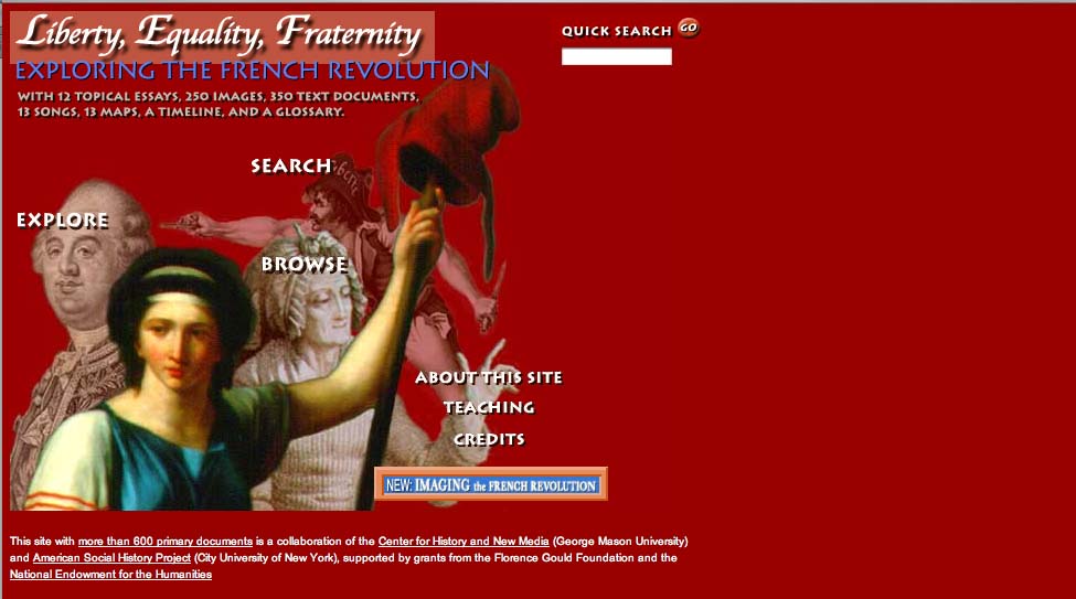
In any case, both versions of Liberty, Equality and Fraternity work well as texts for teaching the revolution; they pair substantial scholarly research with an extensive archive of maps, songs and images. Depending on their specific needs, users of the Liberty, Equality, Fraternity can choose from three main navigational paths -- explore, search, and browse. The "explore" section features twelve essays, written by historians Lynn Hunt of UCLA and Jack Censer of George Mason University, that can be accessed through a drop-down menu. Ten of these provide a succinct history of the Revolution, covering topics including the social causes of revolution, the fall of the monarchy, women and the revolution, the story of Napoleon, and the revolution's legacy in France and elsewhere. Two further essays provide analytic tools for scholars interested particularly in imagery or songs from the period.
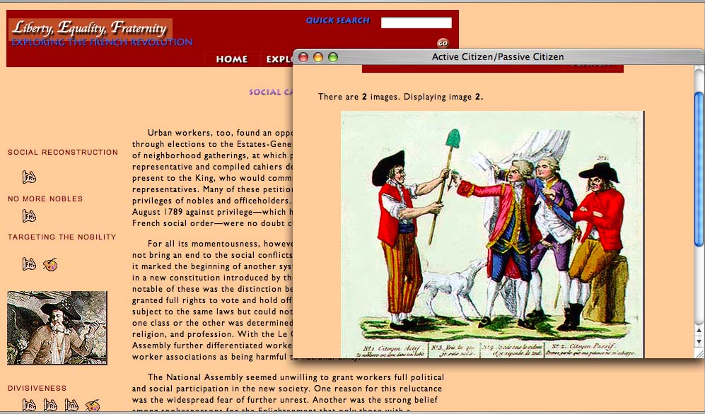
Once the user moves past the main menu window, the "look" of the site is, on the whole, somewhat spartan. In the case of the essays, the type is on the small side, though readable: a series of icons running down the left side of the page signal hyperlinks to primary source documents. In the image below, for example a political cartoon, "Active Citizen/Passive Citizen," is used to illustrate an essay on the social causes of the Revolution.
The images, songs and maps on the site -- along with a timeline and glossary -- can be accessed through the "Search" or "Browse" function, depending on whether the user knows in advance what they're looking for. There is wonderful material here: 245 images including political cartoons and pictures of decorated fans and porcelain from the period, 338 documents including personal memoirs, official reports, treatises and eyewitness accounts, 13 maps created especially for the project, and finally, 13 songs also produced uniquely for the project by musicians who worked from an 1899 songbook Playable in Quicktime, the songs are transcribed and translated in pop-up windows.
Interestingly, at the time the Center negotiated for permissions for their visual documents in Liberty, Equality, Fraternity, they paid much less than they would have had they wanted to include them in a print volume: recently, however rights holders have been asking for much higher royalty fees for the display of images and documents online.
Overall, Liberty, Equality, Fraternity is a site that works a bit better than it looks. Students and scholars can use the site both as a textual introduction to the French Revolution and as a valuable archive of visual and aural resources, but the project's visually bland and formally conservative interface is unlikely to encourage the uninitiated to explore the site. It's difficult to fault the site for this -- it relies on design tools and protocols that have shifted over time. As a digital classroom text, it certainly exceeds what a conventional paper text can do: it's just that the medium has evolved since the site was put online, both in terms of how archives are organized and in terms of the way in which the medium itself is often intertwined in the scholar's process of research and presentation.
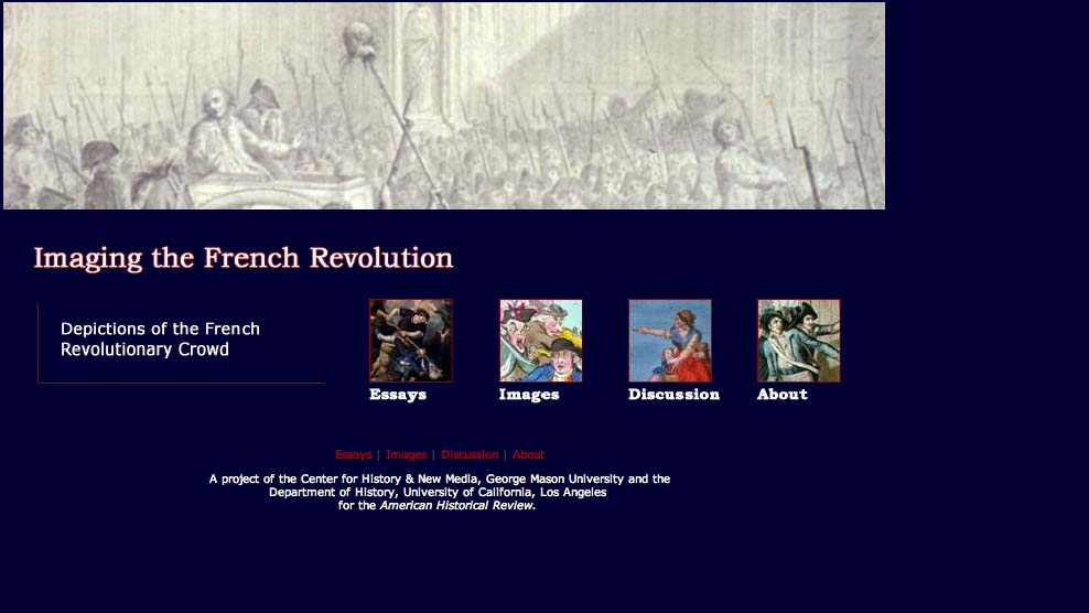
To get a sense of the evolution of the digital history text, click a button at the bottom right corner of the home page of Liberty, Equality, Fraternity and look at the site Imaging The French Revolution, a later work also authored by Censer and Hunt in collaboration with the CHMN. Imaging The French Revolution builds on and updates the original project by using recent developments in digital scholarship to take a closer look at some of the original primary source material. Described as "an experiment in digital scholarship," Imaging The French Revolution features seven essays from seven scholars asked to analyze forty-two images of crowds and crowd violence stored in a shared archive. These images, drawn from the original site, are made available in a fresh interface along with a flash-based "Image Tool" (created by a 12-year-old programming wiz) that allows them to magnify and layer images in order to draw their own conclusions.
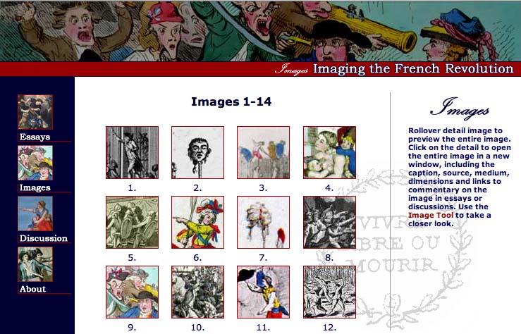
Part of the value of Imaging The French Revolution, then, stems from the way the user is positioned within the site -- not as a passive browser of archived information, but as an active observer who can use the image tool both to think through the images on their own and to interrogate the decisions made by the seven scholars who describe them. In the process of interrogating these decisions, the user can also access online discussions between these seven scholars that took place before they actually wrote their essays. All seven met during the summer of 2003 on an online forum to discuss issues of interpretation, methodology and the impact of digital media on scholarship: the discussion they had then filtered down into their final analytical work.
In other words, Imaging The French Revolution is innovative in two primary ways: it incorporates the user into the piece in a more interactive fashion, and it incorporates the digital medium into the process of knowledge-making -- a method of inquiry that has become increasingly common among saavy digital scholars. There's another way that Imaging The French Revolution reflects the current moment in online scholarship: as an "online-only" publication of American Historical Review, it is a sign of the changing attitudes towards digital scholarship. In 1998, the authors of Liberty, Equality, Fraternity felt the project needed an offline component to be both respectable and accessible; in 2005, the same authors were comfortable working on an online-only project for a journal whose readership had been primarly print-based until recently.
So what does this have to tell us about the future of the digital text? For one thing, it suggests that now that it has become more commonplace to find deep, rich online archives, we might come to expect more of the archive: rather than simply celebrating the fact that material is accessible, more attention will be paid to the conditions and interface of that accessibility. At the same time, it's also an indication that scholars are increasingly willing to eschew paper-based scholarship for serious scholarly analysis that embraces the methodological shifts implicit in the digital medium.
Posted by lisa lynch at 3:18 PM
December 8, 2005
Virtual Village Allows Virtual "Fieldwork"
At Wesleyan, faculty interested in creating multimedia learning environments turn to the Learning Objects Studio, a substantial multimedia development lab that has produced everything from flash animations of body wall formations in the chick embryo to the Ricardian Explorer, an "interactive computer game that simulates the functioning of the Ricardian model of international trade." Like Columbia, Weslyan restricts access of some of its "objects" (such as the Ricardian Explorer) to its student population, but there are a fair number of interesting projects available online.
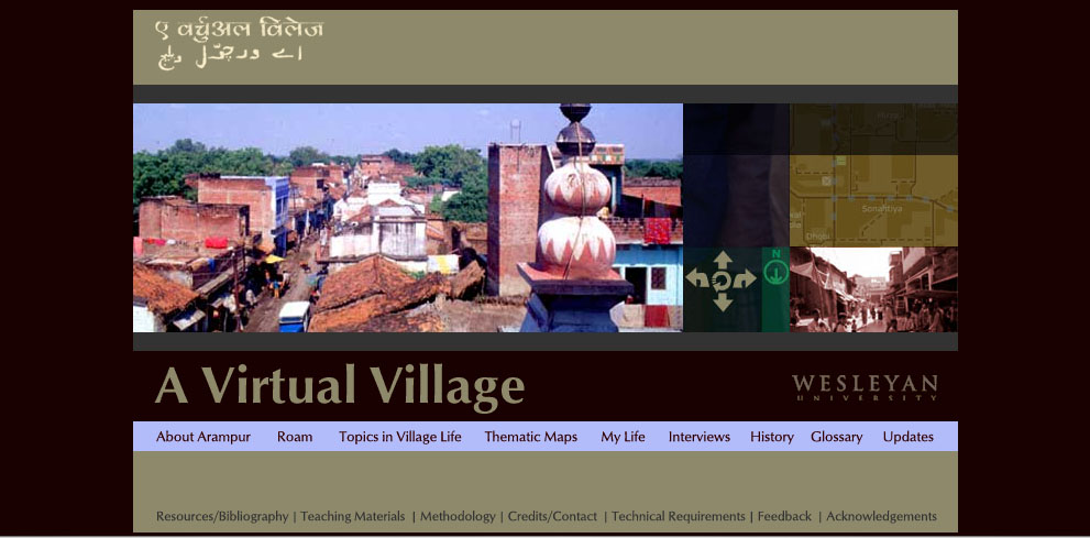
One of the most extensive is the four-year-old site "A Virtual Village," a project co-authored by Wesleyan religion professor Peter Gottschalk and Holy Cross religion professor Mathew Schmalz that maps and documents a small town in North India. Though Gottschalk decided to give it the pseudonym "Arampur," the village is "A Virtual Village" is a real place. Like many rural towns in the area, it has a population of about 5000 Indians with different caste, class and religious backgrounds; it also has geographical and cultural features such as a fifteenth-century mausoleum, numerous Sufi tombs, and temples devoted to a variety of gods and goddesses.
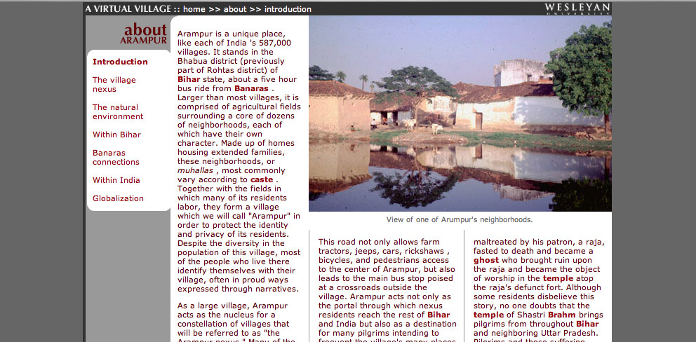
What's great about this web project is the balance it achieves between interactive mapping and scholarly text. The site is divided into eight primary sections, four of them textual and four of them visual. The first textual section, "About Arampur," is divided into pages that discuss topics such as the town's relationship to the city of Banaras, the state of Bihar, India as a nation, and the global economy. Like the later section "Topics In Village Life," these pages (example shown below) are hyperlinked to a glossary, but otherwise resemble the pages of a traditional college textbook:
These geographic essays provide the user with a strong framework for the actual geographic exploration that begins in the next two sections of the project, "Roam," and "Thematic Maps" "Roam" allows the user to explore a map of the village. Clicking on a spot indicated by a pale blue circle reveals a Quicktime VR panorama of the area: when the village map is reduced in size, the QTVR panorama displays additional features such as interviews with locals and "hotspots" that provide additional views of a given location (see red on photo below)
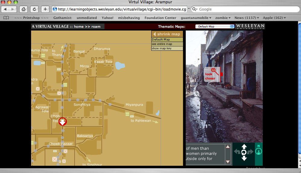
In the "Thematic Maps" section, this basic village maps is overlaid with a series of further map coordinates that reveal things such as local medical practicioners and foodways.
Another section that makes good use of visual material is "My Life," a series of photo essays of the village taken by actual village residents. According to the site developers, these photos - and the extensive series of interviews recorded and transcribed on the site - "allow students using the site work independently through virtual fieldwork and independent investigation." In other words, "A Virtual Village" does more than provide students with a rich scholarly introduction to the North Indian village it documents: it allows them to hone their own research methods, and draw their own conclusions about the "evidence" gathered by both scholars and native informants.
According to the Learning Objects website, the project designers are considering the creation of CD-rom based on the website: given that access to the internet is limited in rural India, this would certainly allow those who are documented in "A Virtual Village" greater access to the site. On the other hand, a great (though underdeveloped) aspect of the site is an "update" section, intended to track the changes in the village as it goes through various stages of development: a 2004 update, for example, describes the first cell phone tower in the village. Given the rapid nature of technological change in India, updates such as this would ensure that "A Virtual Village" truly remained a virtual document of the town.
Posted by lisa lynch at 2:02 PM
December 6, 2005
Supported Reading: Ambedkar Multimedia Study Environment

The Columbia Center for New Media Teaching & Learning (CCNMTL), one of the largest university centers devoted to creating new media education curricula, has been creating Multimedia Study Environments (MSE) for a number of years. During that time, they have taken a variety of written texts and transformed them into interactive digital texts. A few of them are open to the general public, including "The Annihilation of Caste."
This MSE explores the writings of Dr. B.R. Ambedkar, the first highly educated member of the Hindu "Untouchable" caste. Ambedkar's writings have extensive annotations in a variety of media, created by leading scholars from Columbia University. For example, early in the text, the word Hindu appears in the text. The term links its annotation, which includes: a definition relevant to Ambedkar's usage, a listing of every appearance for the word in the text, and video clips of leading scholars at Columbia giving further discussion on the term Hindu.
Links and multimedia are purposefully used to help clarify abstract terms for the novice reader and add details for the advanced reader. Further, the annotations themselves have hyperlinks to other parts of the site and to external resources. The annotations improve what glossaries and indexes have traditionally done. It makes much more intuitive sense to have annotations within a text, rather than at the bottom of a page or in the back of a book. This simple step of integrating the glossary and indexes into the text makes explicit the implicit idea that texts are part of a larger body of knowledge.
CCNMTL shows that basic web technology and interfaces can significantly increase the meaningfulness of a user's experience. This example shows that digital textbooks do not require the most sophisticated technology. Rather, strong visual and interaction design and well thought out content make this website a good model of how to support the exploration of new or familiar material.
Posted by ray cha at 2:35 PM
November 22, 2005
"Binding Memories" on Gutenberg-E
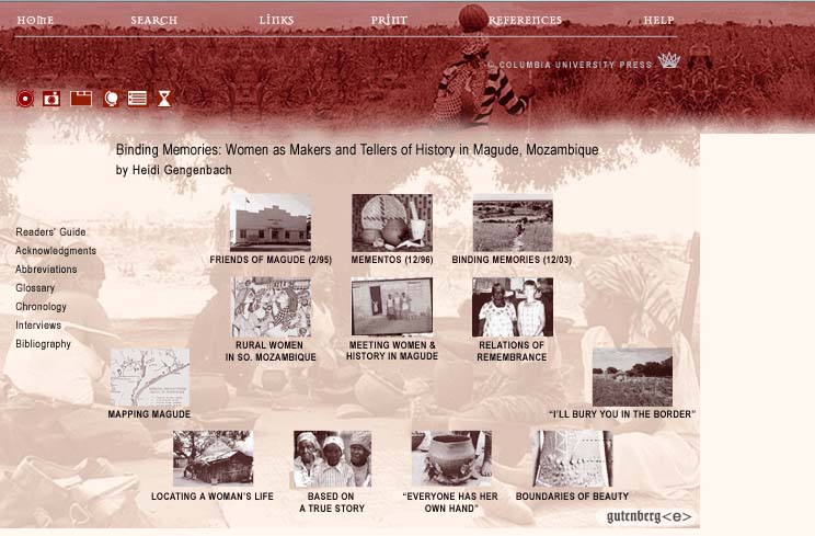
After receiving a Mellon grant in 1999, Columbia University Press began awarding $20,000 "Gutenberg-e" awards to scholars with outstanding history dissertations, in order to help these scholars revise their books into digital texts. So far, twelve of these digital books have been published on the Gutenberg-e site, and sixteen more are slated for publication: this makes Columbia University Press the most significantly player the e-publishing field to date. Currently, the texts can be read for free as part of a limited-time free trial offer; for $49.50, one can purchase unlimited online access to a single text and also download it as a PDF file.
Columbia and the Mellon Foundation must be commended for their efforts to move academic publishing into a perhaps more economically viable online environment: at the same time, the e-Gutenberg project still seems to express a fair amount of anxiety about the idea of digital textuality. Given the ambitious nature of the project, the site is suprisingly drab and monochrome - the only explanation I could think of for the lack of attention to design was that perhaps the guiding forces behind Gutenberg-e imagined that graphic interest would somehow detract from the serious nature of the scholarly work on the site.
A lack of concern for the medium extends to many of the texts as well, which for the most part limit their digital enhancements to hyperlinked explanations of concepts and the inclusion of still images and audio and video clips. Some of this material is wonderful: for example, Kenneth Este's A European Anabasis - Western European Volunteers in the German Army and SS, 1940-1945 features a compelling audio interview with the Belgian soldier Franz Vierendeels. But Estes, like most of the other authors, does not rework his text during the process of digital conversion: he merely illustrates it.
One notable exception to this rule is Heidi Gengenbach's Binding Memories: Women as Makers and Tellers of History in Magude, Mozambique. Gengenbach, who now teaches history at Harvard, actively embraces the digital medium and uses it to try to restructure her monograph. As she explains in the introduction to her book, moving from a print medium to a digital medium allowed her organize her monograph spatially, so that the reader was confronted with a title page in which "chapters" were placed in on the page in a way that encouraged exploration rather than front-to-back navigation through a text. Gengenbach writes:
Unlike some other recent electronic publications in history, this book was not "born digital." Its origins lie in a doctoral dissertation researched and written (on paper) several years before historians began crafting scholarship with cyberspace in mind... [Still], even back then, the arguments I wanted to make about women and history in Magude fit awkwardly with the conventions of academic history and the print monograph. There really was no singular beginning or end to my story, nor could the middle be narrated in a straight line. The study's subject, the relational practices whereby rural Mozambican women remember and communicate the past, was too varied, both in form and in angle of interpretation, to be subordinated neatly to any one rendering of their lives.
Gengenbach's title page thus does not simply illustrate the content of her various chapters: it also serves as a visual metaphor for her research methods, allowing the reader to see the way in which Gengenbach envisions the field of information engaged by her scholarship. According to Gengenbach, this view into her process gives the text a kind of "epistemological candor" that might be lacking in a text which relies on the classical structure of academic narrative to conceal the somewhat messier process of academic research. As Gengenbach writes:
Certainly, as others have noted, e-publication enables historians to share their sources with readers and thus opens scholarly analysis to wider, more participatory debate. But the truly radical potential of cyber-history rests in its power to expose the social basis - the ineluctably dynamic and located subjectivity - of historical analysis and in the power of historians to translate this self-exposure into creative new paradigms for constructing the past.
Another good use of the digital page to structure information is Gengenbach's audio histories section (below), which catalogs some of the interviews Gengenbach did for her fieldwork.
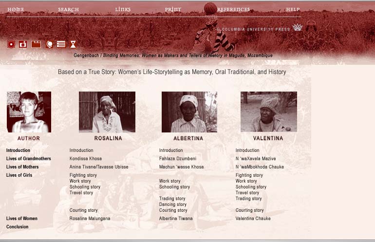
The page works well as a quick access database: clicking on the photographs of the interview subjects themselves brings up a biography and the audio interviews (which are in Portuguese and Shangaan ), while clicking on the links brings up English-language transcripts of the interviews. But more importantly, it provides another visual metaphor for Gegenbach's research process, allowing her to put her scholarly observations about storytelling on the same page as the stories themselves, thus foregrounding the story-telling qualities of scholarship itself.
Given Gengenbach's willingness to really think through the implications of making her work digital, I find myself wondering what she might have done if she had more sophisticated tools and a designer at her disposal. I'm hoping that Columbia Press allows the site to gradually evolve, and that future Gutenberg-e scholars might take inspiration from Gengenbach's example, allowing the medium to breathe new life into their scholarly efforts.
Posted by lisalynch at 2:50 PM
November 17, 2005
Biofutures: Owning Body Parts and Information
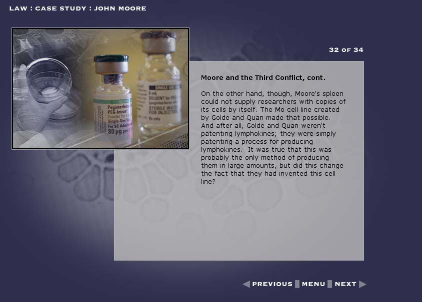
Biofutures, a DVD-ROM about biotechnology and culture currently under development, grew out of conversations between three humanities scholars who shared a common interest in emerging forms of biotechnology. Rob Mitchell, an English Professor at Duke University affiliated with the Duke Institute for Genome Science and Policy and Phillip Thurtle, a molecular biologist turned anthropologist who now teaches at the University of Washington, had both encountered - translation problems - when trying to teach humanities students about biotechnology.
The two professors realized that if they were going to clearly communicate the social, cultural and legal issues that lay behind the case studies they tried to present, they had to find a simple way to get the science across. Aware that a conventional textbook or course pack would only bury their students in a tangle of sometimes overwhelmingly technical information, they decided to create a digital text of their own that could both sift through out the different types of issues connected with biotech research while providing accessible - and lively - explanations of the science involved.
In order to come up with a design for their project, Mitchell and Thurtle teamed up with Helen Burgess, a new media scholar teaching at the Program in Digital Technology and Culture at Washington State. Burgess had recently worked on DVD project that had similar goals of setting up a dialogue between science and society: The Red Planet: Scientific and Cultural Encounters with Mars (University of Pennsylvania Press, 2001). The team chose to divide the text into three primary chapters: Biology, which focuses primarily on the physiological, chemical, and technological processes that make biocommerce possible; Law, which discusses continuities and changes in intellectual property law that have determined the shape of contemporary biocommerce; and Culture, which examines the ways in which biocommerce has been represented in film, novels, and recent art projects.
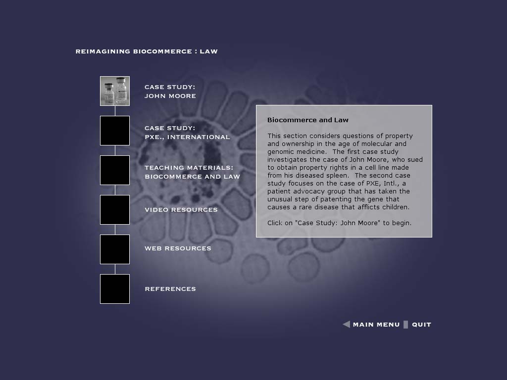
Each chapter in turn features two 'case studies,' which provide a strong underlying narrative. Moving from page to page in the case study narratives, the user encounters clickable items that provide different kinds (and levels) of explanatory item, including video interviews with experts from the fields of genetics, history, and law; video footage and computer animations of basic lab genetic procedures essential to biocommerce; and clips from popular films that have helped establish public perceptions of the possibilities and dangers of biocommerce. Beyond these "case studies," chapters also provides teaching resources and external links.
In developing these items, Burgess has managed to achieve a delicate balance between depth of contextual content and the forward motion of narrative. Since the clickable items are a reasonable length - and the case study are sufficiently compelling - the user never feels sidetracked or distracted by the information presented; the narrative spell is not broken.
One of the most appealing features of Biofutures is that the demonstrations and expert interviews provide a sense of getting first-hand information from many different disciplinary perspectives at once: while many attempts at the cultural studies of science are grounded in a specific discipline (anthropology, sociology, literary study), the truly interdisciplinary nature of this project makes it teachable in a wide variety of classrooms. According to Burgess and Mitchell, the scientists involved in the expert interviews have gotten more interested in the idea of teaching cultural and social perspectives through their participation in the project, and are looking forward to the release of the DVD.
A detailed description of the project is available here
Posted by lisa lynch at 11:32 AM
November 14, 2005
MIT Open Courseware: Introduction To Biology
Ever since the MIT Open CourseWare project launched eighteen months ago, the e-learning community has been debating about whether or not MIT's ambitious program is living up to its goal of providing 'free, searchable, access to MIT's course materials for educators, students, and self-learners around the world.' As Ben Vershbow noted in the if:book blog in August, many of the OpenCourseWare listings are essentially just syllabi with a few assignments, i.e., neither particularly radical nor particularly effective as online classes.
There are, however, several standouts on the site, and I'd like to discuss one of them: a Spring 2005 Section of Introduction to Biology. This is not the only MIT Open CourseWare selection to offer video lectures; currently, about 20 courses include video. Nor does it necessarily represent the future direction of the Open Courseware project - for reasons I'll detail below, MIT is ambivalent about relying heavily on video lectures. But it is a good example of a course that is close to fulfilling MIT's mandate of providing the MIT experience to anyone who logs on to the site.
One of the reasons why the Open Courseware biology offerings are particularly strong is that MIT has a special working group - an offshoot of the Howard Hughes Medical Institute - devoted especially to improving undergraduate biology education. This means that this class has been put together with a lot of thought about how best to teach biology to a students coming from a range of backgrounds and with a variety of different interest levels. It also means that a good deal of supplementary material is available on the course site, including the MIT Biology Hypertextbook, an introduction to the molecular biology that's included in the course in a hyperbook format. Thus, unlike many of the other courses on the MIT site, it is almost possible to use the Introductory Biology courseware as a complete digital text for beginning biology. The site does recommend that students purchase an introductory biology textbook (they recommend Scott Freeman's Biological Science), if only to serve as a 'detailed reference source' on the concepts that are highlighted in the lecture and section materials of the course.'
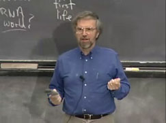
HHMI's emphasis on translating biology for undergrads is also evident in the video lectures. The course is co-taught by Professor Graham Walker, director of the HHMI Education group, and environmental sciences Professor Sallie W. Chisholm. Both professors are engaging, lucid and fun to watch. Walker in particular spends a lot of time explaining the practical implications of what he's talking about, drawing on media stories and medical accounts to pique student's interest.
So why am I making the argument that this site is a "digital textbook?" Because I found the lectures in themselves could be used as a biology text -- complete with illustrations and diagrams (here, sketched out on the board). Of course, they aren't optimally functional -- ideally, they could be embedded in a program such as TK3, with the class handouts and "hypertextbook" made available in a more active architecture that responded to the time-based nature of the lectures. Or the lectures themselves could be made searchable, so that a student could track all references to evolution, for example, over the course of the semester.
There's an interesting paradox here. These lectures work wonderfully as a text precisely because they are not in themselves interactive pedagogy. Walker and Chisolm monologue in front of a large (unseen) audience and don't entertain any questions: questions get asked during discussion sessions. They are also utterly conventional in terms of their own use of instructional technology: mainly, they rely on the blackboard, with occasional recourse to digital slides.
The digital slides are a problem for the MIT folks. Every time Walker projects something like a Newsweek photo or a cartoon from the New Yorker, the screen goes black except for the phrase 'removed due to copyright concerns.' This is more than a little frustrating. Since both professors use the board frequently, it is not possible to simply listen to the lectures; at the same time, staring at a black-out screen has the effect of making one's attention drift from what is being said.
It seems to me that this anxiety about copyright is a primary factor in preventing MIT from putting more video classes online. MIT explains things a bit differently: video lectures, they say, require too much bandwith to be universally accessible, and they require too much storage space on the MIT server. I'm a bit skeptical of these claims. One can make the video lectures available to those with faster connections without depriving the less-endowed access to syllabi and assignments, and I'm not buying the claim that MIT is running out of storage space (quick! hook up another firewire to the mainframe!). Instead, I see the Introduction To Biology class as a tantalizing hint of what might be possible if there were less anxiety about extending fair use in the classroom to the larger world of online learning.
Posted by lisa lynch at 12:23 PM
October 24, 2005
Leveling the Playing Field: SAT Math Pro
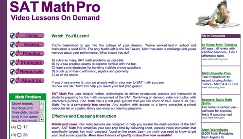
The SAT test was designed to level the playing field and provide talented students, who have not had the advantage of prep school training, entrée into elite colleges and universities. This crucial test has spawned an entire industry of preparation books, online practice tests, study centers, and private tutors. Access to these tools can help test-takers improve their scores dramatically. But, ironically, most of these products and services are priced out of reach for the very students the SAT is supposed to help.
Enter SAT MathPro, a free online resource that helps students prepare for the math module of the new SAT test. Launched in September 2005, the site grew out of Colleen King's experience as co-director of Math Advantage: a test prep and math tutoring center located in Wellesley, Massachusetts. Ms. King is also the creator two other award-winning math sites: MathPlayground.com for elementary age students and MathTV.org for middle schoolers. She uses a software tool called Camtasia Studio which allows her to record, edit and publish the interactive videos that bring her websites to life. She began these projects when a student, who had been coming to Math Advantage for years, was no longer able to attend classes and the math packets she was sending home to the student seemed inadequate.
"The static explanations could not capture the magic that had taken place in class," she said. "I searched the Web for answers and found Camtasia Studio.I set up my notebook computer, graphics tablet and microphone in the classroom. Each student had a chance to record his or her own unique way of solving the problems. After class, I would record an introduction for the student, and then use MenuMaker to organize the videos on a CD. The final product accomplished two important things: the student was able to learn the new math concepts we were studying and was included, to a large extent, in the classroom dynamic."
Digital tools allowed Ms. King to "create the illusion of an instructor solving a math problem in real time." She was also able to "record virtual manipulatives such as geoboards, number lines, graphs, protractors and rulers, which make the problem solving videos even more instructive." SAT MathPro incorporates techniques Ms. King learned while creating MathPlayground and MathTV. It uses multimedia video and audio to lead students through the test-taking process and to simulate the experience of a teacher "explaining" problem-solving methods and test-taking strategies. The site offers a three-step study process: assessment, practice and strategy.
Students begin by taking an assessment quiz to determine which topic areas require further study. A calculator, geometry reference sheet and timer are provided. Each of the three assessment quizzes consists of 12 questions "covering a broad range of math topics." When the student completes the quiz he/she receives a tally of correct and incorrect answers, an assessment of speed and accuracy, and a checklist of topics that need particular attention. 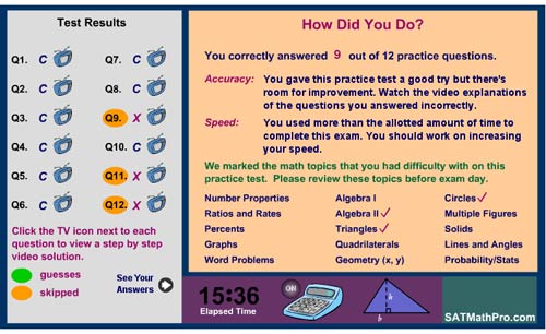 Clicking on the TV icon next to each question lets the student view a video explanation of the problem and the strategy for finding an answer. Students can control the pace of these mini-lectures, pausing and repeating the lessons as many times as needed. After watching the video tutorial, the student can click "zap it" to receive a follow-up question.
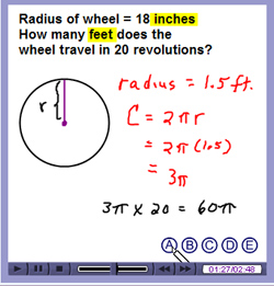 According to the assessment, I needed work on circles, so I proceeded to the "Practice" section and took the "Circles" lesson. The image on the left is a screen grab of the video lesson. A very charming animated chalk writes out the problem on a virtual chalkboard while Colleen King explains the problem-solving strategy.
After the "Practice" session, I studied the all-important "Strategies" section. This resource helps students develop skills to solve problems rapidly. The SAT is a timed test. According to the site, a test-taker has "approximately 75 seconds to read and understand the question, determine a problem solving strategy, work out the solution and mark your selection on the answer sheet." Under those circumstances, time-saving skills are crucial to success. Two of the strategies described on the site are "backsolving" and "picking numbers" both exploit the multiple choice aspect of the test. Readers can also download a useful strategy primer called SAT 2005 - Top Ten Traps and How to Ace Them! A guide to the trickiest problems the SAT has to offer.
This project is a good example of how digital media can be used to create and distribute resources that advance the cause of a free and fair educational system. This effort alone doesn't level the playing field, but it's a step in the right direction.
Posted by kim white at 11:39 AM
October 14, 2005
Analog to Digital: The Electronic Bedford Handbook
What happens when textbooks go digital? Diana Hacker's Electronic Bedford Handbook 6.0 offers a unique opportunity to explore that question. The digital version of her best-selling grammar handbook retains the content and design of the print edition, while introducing new ways of organizing, navigating, updating, presenting lessons, and customizing.
A Different Way of Organizing
Hacker's book makes an interesting case study of what happens when a textbook moves from analog to digital. The content is word-for-word the same as the print version, but digital architecture enables a new way of organizing the information. Examples appear as links, which activate pop-out pages (annotations). This allows the author to place the illustrations exactly where they are mentioned without interrupting the flow of the text. The printed page forces a kind of lateral organization, with illustrations expanding chapters like urban sprawl, disorienting the reader as the main text is continually interrupted. The digital version, with its pop-out annotation feature, creates a sense of deep space that allows the reader to think of an example as an idea stacked underneath the main idea.
A New Way of "Paging" Through the Book
The forward/backward arrow buttons at the bottom right corner mimic the page-turning action of a paper book, but that is where the similarities end. Navigation in the electronic version is practical, intuitive, and instantaneous. In addition to the requisite left-hand sidebar navigation, the Bedford Handbook provides hot links to all citations. These links take readers directly to the handbook page mentioned (getting back, however, is not as easy) or to the companion website. Section heads in the upper right corner, have a useful menu of links to all subsections and to chapter exercises.
Staying Up-to-Date
Direct connections to the more-frequently-updated companion website allows the electronic handbook to stay current longer than a stand-alone print version could. The companion site also includes relevant links to web-based reference information, which further expands the scope of the handbook.
Interactive Exercises
The electronic handbook reimagines the grammar lesson as an interactive experience. The tutorials provide clear and instantaneous feedback. Students find out why an answer is right or wrong. I tried a few of the exercises and, in addition to being more informative than their print predecessors, the tutorials had the feel of a game. I was actually having fun and I imagine students will also find these lessons more engaging than their print counterparts.
Preserving the Handbook "feel"
The electronic version is about the same size as the print book, which gives it a charming handbook feel. However, the book cannot be resized, and this raises legibility issues. Illustrations on page e-57, for example, show rough and final drafts of a student paper in five point type, barely readable on the screen.
Customization
This digital textbook allows students to do all the things they might normally do to a print textbook: dog-ear pages, highlight passages, attach post-it notes, annotate. Unlike the print version, however, these digital markings can be automatically compiled and searched. This lets students and teachers create customized versions of the textbook. Grammar reference books in particular seem to call for customizability. When you type "grammar module" into the Google search engine it returns over one and a half million instances. Every major publisher of textbooks has a grammar book and most colleges and universities publish their own web-accessible reference work on the subject. Innumerable self-published works by teachers and editors are also available.
I'd like to suggest that this profile represents a tip of the iceberg view of this particular subject area. I've selected the Bedford Handbook because it represents a standard of excellence and because its best-selling print ancestor allows us to compare/contrast print and digital versions. However, a cursory review of offerings available online (in many cases for free) indicates that there are other excellent examples and that the grammar unit is a good case-in-point for the diversity and customizability engendered by digital media.
I'm interested to hear from readers on this subject. Do you use customized digital assets to teach grammar? And if so, what have you found to be most useful? Are there resources you can point to that specifically address dyslexic students, ESL students, sight impaired students, or other special cases? Is a comprehensive resource like The Bedford Handbook more useful for you or do you assemble your own collection of reference material?
Posted by kim white at 8:53 PM
October 7, 2005
ix visual exercises: A Hands-on Approach to Understanding Visual Composition
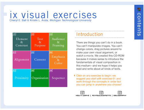
Dr. Cheryl E. Ball and Kristin L. Arola, have created a CD that answers the call for a brief but comprehensive hands-on introduction to the art of visual rhetoric. "We created this CD-Rom," the authors say, "because it makes sense to introduce fundamentals of visual composition in this medium. There are things you can't do in a book. You can't manipulate images. You can't change colors, drag pictures around to make your own visual argument, or watch a movie."
The brilliance of this digital tutorial is that it actively involves the student in the manipulation of images and uses the digital medium to show, rather than tell, how visual arguments are constructed. The mini-textbook takes a workbook approach to teach nine key concepts which include: Element & Contrast, Text & Purpose, Audience & Framing, Alignment, Context, Emphasis & Color, Proximity, Organization, Sequence. Each concept is approached in three steps. First, the student is given a definition along with an annotated visual example. Then the concept is taken through a concise analysis, which also includes annotated images. Finally, the student completes an assignment, which asks him/her to look at an image, manipulate an image, create an image, or construct a visual argument and then analyze the results. The written part of the assignment is completed in a pop-out window, which can be emailed to the instructor or printed out.
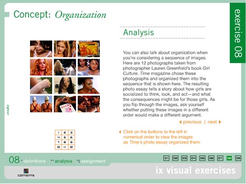
The concepts get progressively more complex as the reader proceeds through the exercises. My favorite, is exercise 8, which analyzes 12 photographs taken from Lauren Greenfield's book "Girl Culture." The photos were organized by Time Magazine in a particular sequence, "the resulting photo essay tells a story about how girls are socialized to think, look, and act - and what the consequences will be for those girls."

Each photograph is annotated with a statement summarizing the point it makes within the overall visual argument. For example, the photograph above left (#2 in the series, it follows a picture of Lily, a 5 year old, shopping at Rachel London's clothing store) has an annotation that reads:
The girls in this picture are eight years older than Lily - the way they've dressed and posed suggests that they are very self-aware. By continuing the sequence with another image of young girls, we are asked to start thinking about how and why these girls are presenting themselves. What are they emulating? Who are they performing for?
The picture above right (#11 in the series, the penultimate image in the essay) is a picture of "Fetus bingo" at La Vida, a high school for pregnant girls and teenage mothers. The annotation reads:
Given everything we've seen so far, this photo represents the consequences of growing up too soon. Young girls are told that to be noticed they need to dress and look like a woman - but that they shouldn't act like one. There are serious repercussions for those girls who actually do adult things, like having babies.
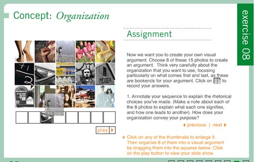
Following the "Girl Culture" example, students are asked to create their own visual argument in the assignment section. They choose eight photos from the fifteen photos provided. Then they drag and drop the thumbnails onto a storyboard, annotating each image with an explanation of "what each signifies and how one leads to another." They must also explain how the organization conveys the purpose of the argument. Clicking the "play" button, presents the series as a slide show.
Other interactive assignments include exercise 1, which allows the student to click on a button and see the image in question with a different colored background, foreground, or headline. Exercise 2 allows the student to isolate sections of the image for analysis. In exercise 6, the student analyzes the effect of warm and cool tones by manipulating a slide bar which alters the tone of the image. Exercise 7 asks the student to create a book jacket by dragging and dropping design elements onto a blank field.
This hands-on approach to parsing visual images is extremely effective and represents an important step forward in the development of teaching tools for this particular subject. Just as learning written composition requires reading and writing--understanding visual composition requires looking and composing. The composing part is the bit that generally gets left out of the visual literacy curriculum. This multimedia interactive textbook provides the appropriate tools to fill that gap.
Posted by kim white at 2:42 PM
September 30, 2005
The Textbook Behind the Textbook: Western Civilization Course Portfolio
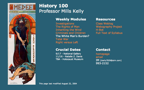
More than just a replacement for its print predecessor, the electronic textbook introduces new formats that help teachers improve course design and student learning. The public nature of online books can help transform the closed, teacher-centered, world of the lecture hall allowing students, teachers, and peer reviewers to examine and comment on all aspects of the course.
Dr. Mills Kelly's online textbook "Western Civilization" and the companion
Course Portfolio are an excellent case in point. The course portfolio is an open, running narrative of the course structure, goals, progress, conclusions, and, perhaps most importantly, the portfolio is "open to public scrutiny and is available to other members of the scholarly community for their use and elaboration." The course portfolio is the learning tool for teachers. It is a kind of textbook behind the textbook. Dr. Kelly used this twin-set (course portfolio and digital textbook) to answer the question, "how does the introduction of hypermedia into a history course influence student learning in that course?"

Dr. Kelly's creation of an online textbook and a course portfolio was part of an evolution in his thinking about the structure of the course itself. Over the years, he had become increasingly unhappy with the "coverage model introductory history survey course." Students, Dr. Kelly notes, have grown even more impatient with this format.
In survey after survey that I have conducted over the years, they tell me that the coverage model encourages the memorize-regurgitate-forget model of learning, but that a more focused approach helps them to think more carefully and to arrive at a deeper understanding of the material they are considering. In my surveys this year, fewer than 10% of the students said they preferred a coverage model course to one taught in a more focused manner.
To focus his teaching, Kelly decided to determine what the learning objectives for the course were and how he was going to assess whether or not the students had achieved the desired results. He followed Howard Gardner's advice, that a course should be designed with three concrete objectives in mind: "engage the central problem of the discipline, help students realize that source materials and subject matter do not exist in a pristine vacume, and give them opportunities to come at the same question or evidence from different perspectives."
Rather than approaching the curriculum as a chronology, (Plato to NATO in 14 weeks) Mills identified six essential concepts and broke the course into two-week blocks in which he addressed each of these main themes. Important events were discussed not in terms of what-happened-when, but in terms of how these happenings influenced larger concepts. The main objective was for students to gain skills and knowledge. Kelly's course design privileged understanding over information. He posted a detailed week-by-week chronicle of how the course unfolded.
Dr. Kelly's research led him to some interesting conclusions. He determined that students who access learning resources on the web display a higher level of recursive reading. According to Dr. Kelly, three-fourths of the students in the web sections went back to primary sources. Only one-fourth of students in the course section taught via print went back to materials assigned earlier in the semester. Their final essays bore out this finding, displaying a much lower use of sources assigned earlier in the semester.
Students I interviewed from the web sections said that because the documents they looked at from earlier in the semester were "just a click away," they were much more likely to use them. When I asked if they would have done the same thing with documents supplied in a course pack, all but one demurred, saying that, as one student put it, "having all that paper to sort through" would not be as immediate as a hyperlink. Or, as another student said in her interview, the web "is just easier to use than a book."
He found that the level of recursiveness was directly related to how well the web-based learning resources and assignments were designed.
He also concluded that the web does encourage independent investigation, but not as much as we would like, that the hypermedia revolution signals the doom of conventional history survey course, and historians must begin teaching web literacy. (He addresses this last conclusion in a more recent project, see below.)
Comments
The comment section addressed many interesting issues. I've decided to include excerpts from four authors on the two topics I felt were most important. First, there was a debate over Dr. Kelly's decision to focus on understanding rather than on facts.
Learning "facts" was not stated as a learning objective. One of the most widely touted examples of mediocrity in American public education is the dismal evidence that a significant proportion of people cannot correctly locate the Civil War within 50 years or so. Facts are important as a baseline for use of historical knowledge. -Samuel Thompson
This was refuted by Carolyn Schneider, who reminds us that reference books catalog the facts, but our job is to learn how the think and do.
ultimately, we don't want our students to KNOW as much as we want them to DO--which in our case would be THINKING, ANALYZING, EVALUATING--the "know" part they can always look up, and then that gets us to another "do"--which is research!
Another important point, had to do with the question of teaching vs. technology. Both commentors remind us that teaching is paramount, and solid course design always trumps technology.
I was struck by the extent to which student comments (Small Group Instructional Diagnosis) pertained not so much to web access as to the traditional classroom. Students remarked on the fact that you learned their names, that you delivered interesting lectures, that you encouraged discussions, that your grading focused too much on grammar, etc., etc. In other words, student consciousness of the web--whatever the reason--was certainly less over than my own. And perhaps that means--I should emphasize 'perhaps'--that the more conventional aspects of classroom teaching are still by far the most important thing in teaching, no matter whether the teacher hands them printed or web-accessible texts. -Dan Kaiser
This is especially noteworthy, to me, in your conclusions about technology and hypermedia--which do, as you say, have effects of various kinds but do not in themselves, alone, explain the most important things that do and do not happen in terms of student learning. What you show is that in a sense course design trumps technology. Or rather, technology needs to be seen as an aspect of course design rather than mostly as a different medium of delivery. This sounds obvious but I think it is not the dominant view. -Pat Hutchings

Dr. Kelly's Western Civilization Webography Project was a natural outgrowth of one of the conclusions he came to in his course portfolio research; historians must begin teaching web literacy.
Even the very best students simply do not think very much about whether or not a site is a good source of information. The only test most students impose on the sites they visit is a visual one--if the site appears to be very professional, then the information it contains must be valid.
The Webography project asks student to visit specific sites, rich with primary sources from European History. Students are given a rubric for analyzing the quality of the site. They review the site, assign it a numerical rating and write a brief review. These responses are posted to the database and made public. Dr. Kelly finds that this exercise significantly improves students' online research skills and, subsequently, the quality of their papers.
My on-going assessment of this project, dating back to the spring of 2003 is that very few of my students--meaning only one or two out of 50 in any given semester--turn in papers with poorly chosen websites once they have completed the webography project. In prior semesters as many as half of my students would receive reduced grades on writing assignments as a result of citing poor or misleading information from low quality sites.
In an email, Dr. Kelly told me of his latest efforts: "I have continued my research on the topics raised in my course portfolio, but have not put them into 'print.' Instead, I have funnelled my findings into various endeavors, such as World History Matters and the Western Civilization Webography Project. You'll see when you look at these, that I've veered from the more standard methods of representing my research into developing more practical applications of my findings for teachers and students."
Posted by kim white at 6:43 PM
September 21, 2005
Writing about Literature in the Media Age

Publishers are addressing the need for multiple media in the textbook marketplace by placing additional assets on CD-Rom and/or password-protected companion websites, and packaging them inside printed textbooks. This ubiquitous trio of resources reflects the inevitable (if glacial) move away from exclusive dependence on print media.
Daniel Anderson's "Writing about Literature in the Media Age," published by Pearson Longman, pushes the print/media genre forward a bit. Mr. Anderson's project weaves a network of connections that draw the separate elements together, and attempt to close the unavoidable gap between print and multimedia resources.
Most interesting of the media trio is the CD Rom, which provides students with extensive media assets for study and introduces strategies for close scrutiny of multimedia resources. The CD is divided into five sections: media, e-readings, video tutorials, extended inquiry, and resources.
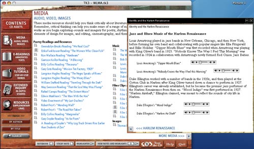
The media section includes audio, video and images that correspond with readings in the print textbook. Below is a screen-grab of a page that offers audio samples of Harlem Renaissance poets and musicians. Asking a student to consider poetry and music side by side creates a unique opportunity for understanding how artists communicate across disciplines. It also allows them to survey the aural landscape of a literary work, and to consider how sound and rhythm are employed by skillful writers.
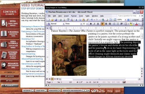
Most unique and useful are the video tutorials. Brief, but through mini-lessons on topics like: "Annotating a Text," "Giving Feedback Electronically," and "Using Images in Your Writing" (pictured below). The "Using Images" tutorial provides a clear example of how an image can enhance a written argument. It also gives the student instructions about how to place an image in a Word document, how to size the image and how to crop the image to focus the reader on a specific detail.
The "Extended Inquiry" section features five in-depth studies including, "The Political and the Personal In Hamlet." The print book has a corresponding section that includes the full text of Shakespeare's "Hamlet," along with a small sample of works created in response to the play. Among them, Margaret Atwood's short story, "Gertrude Talks Back"; Frederick Seidel's poem, "Hamlet"; and a black and white reproduction of John Everett Millais' "Ophelia." These responses to Hamlet introduce the lesson of artistic influence that the unit aims to teach. According to the book:
The works of Shakespeare have an incredible reach. Not only are quotations from his plays thrown around in our daily discourse, the larger messages of his works have become ingrained in the consciousness of contemporary society. Numerous artists have responded with paintings that represent scenes from Shakespeare's plays. Writers have composed adaptations and works that take up the key questions raised by the plays. Theatre companies have produced version of works like Hamlet continually for 400 years, and filmmakers regularly adapt Shakespeare's plays for the cinema.
The CD extends this argument with a color reproduction of John Everett Millais' "Ophelia," a reading of Hamlet's "to be or not to be" soliloquy, and video clips of scholars interpreting Hamlet. The Writing About Literature website extends the Hamlet inquiry even further with links to regularly updated online material.
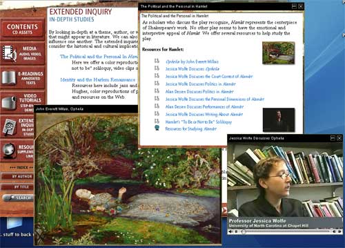
Including these media items gives a graphic representation of the "incredible reach" that the work has. It shows the diversity and complexity of artistic influence and it draws the student closer to an understanding of what literary scholars do as they attempt to consider the work from all relevant angles. Additionally, the concept of "extended inquiry" (central to all scholarly work) is illuminated by the interweaving of book, CD, and web resources.
Posted by kim white at 11:25 AM
August 31, 2005
Who Built America? The Expanded Textbook
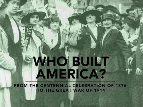
The early and mid-1990s saw a brief but brilliant flowering of CD-ROM publishing that, to some degree, has never been surpassed, even as the world wide web has evolved from a simple hypertext system into a vibrant, interactive medium. In spite of unprecedented accessibility to knowledge resources, and a sprawling social dimension, the web has so far produced very little in the way of educational resources that could legitimately be said to challenge the hegemony of the printed textbook.
For this reason, it is worth looking back at the CD-ROM heyday, when an exciting array of "expanded books" and other genre-busting, interactive works were produced that made prodigious use of multimedia and tested the possibilities of the personal computer as a reading and learning device. At that time, a number of quality educational titles emerged on CD-ROM that suggested a new direction for the textbook. Who Built America?, a publication of the American Social History Project at the City University of New York, is undoubtedly one of the finest.
Based on a comprehensive, two-volume print history, the Who Built America? (WBA) CD-ROMs constitute both a revision and an expansion of the original titles. The first disc covers a period beginning with Reconstruction and running up to the beginning of World War I, while the second picks up at the outbreak of the first great war and follows to the conclusion of the second. Disc 1 (view demo) was released in 1993 by the Voyager Company to great acclaim. But it was not until 2000 that the second disc was published, this time by Worth, in a slightly altered format. Most important, the second disc was built in TK3, a commercially available ebook authoring program developed by Night Kitchen, an outgrowth of the Voyager company, and progenitor of The Institute for the Future of the Book.
The choice of TK3 highlights another key challenge for redefining the textbook in the digital age: an electronic textbook cannot be read-only. It must allow the reader to personalize the text, making annotations, highlighting passages, inserting memory aids. TK3 enables this, preserving many of the most crucial affordances of print books with tools such as highlighting, sticky notes, notepads, and even a way to dog-ear pages.
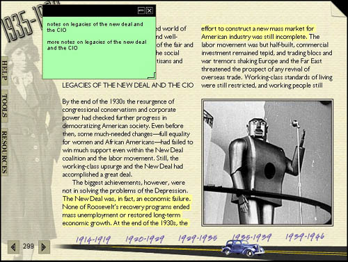
These familiar features are then augmented by the unique affordances of digital machines: rich multimedia, connectivity to the global network, and powerful search capability. This is the textbook enhanced. (more about TK3)
Retaining the basic printed textbook format, each WBA disc contains approximately 3,000 source documents - text, audio, film and links to the world wide web. In effect, the textbook expands into a nearly bottomless resource, while preserving the rigor of a bounded print text.
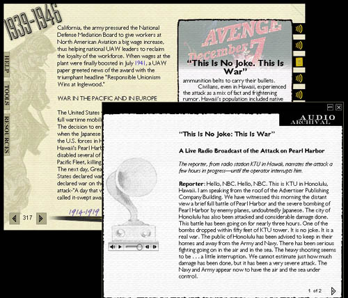
Even more significant, by placing source materials alongside the authors' exposition, a student is better able to make sense of the book as a work of scholarship, and even to challenge the authors' assumptions by drawing their own conclusions based on unvarnished, documentary evidence. The implications of this are profound, since the textbook has long been a top-down instrument of unquestionable authority.
Posted by ben vershbow at 12:17 PM
August 29, 2005
ICONS: Simulating the Game of Global Politics Online
![]()
ICONS is a program developed by the University of Maryland that weds the study of global politics - for high school, university, and professional-level students - with live, simulated negotiation. Anyone who did Model U.N. in high school will find this familiar. Only with ICONS, the simulation space is online and conferences take place across the network.
Each academic year ICONS organizes distributed and single-classroom simulations for paying participants. Scenarios are timely and relevant to real-world political developments, ranging from international health crises, to environmental or financial treaties, to security and anti-terrorism issues. The idea is for an ICONS simulation to be inserted into a lesson plan or curriculum as a purpose-driven, high stakes component. A simulation is a tool that applies and activates the usual course of study by placing students into a live, contentious situation where they must solve a real-world problem and juggle a host of competing interests.
![]()
Proposal: Peace Plan for Algeria
Simulations actually take place on the ICONSnet - a secure online playspace providing communications infrastructure and workspace for conference participants. ICONSnet is entirely web-based, requiring no client software on individual students' machines. When logged on, students can send messages to fellow team members or to other teams. They can draft and vote on proposals, amend existing ones, and engage in real-time conferences with other groups. All the while, instructors can evaluate students through private progress reports from the teams and by monitoring message and conference logs.
![]()
Proposal List
A typical simulation involves 15-20 teams, each representing a different country. The process can be broken up into three main stages (taken from the ICONS site):
Pre-simulation Preparation (4-6 weeks):Students work as a team to research positions using the ICONS research library and other online resources to determine a negotiating strategy for their role in the simulation.
Simulation Participation - Negotiation & Decision-Making (4-5 weeks):Students pursue their specific goals through interactions with other teams using the ICONSnet online communication system. This may include messaging, conferences and consideration of proposals.
Post-Simulation Debriefing (~2 weeks):Teachers lead students through written and verbal reviews of the exercise to reinforce learning objectives.
Teachers and developers can also design their own simulation using the Simulation Builder, but they still must pay for access to the ICONSnet. The site also features a Research Library stocked with useful resources that students can use to prepare for ICONS simulations: country and regional profiles; links to government sites, charters and treaties; link bibliographies for various issue areas; and a rich aggregation of news sources.
Strong as it is, however, the library would benefit from a thorough revision, and should probably be more customizable by users. For example, most of the news sources appear to have been last updated in 2003, but by now, most of them probably have RSS feeds. The page could easily be restructured to incorporate a feed reader that would allow individual students to organize syndicated content by region, issue area and other criteria.
Posted by ben vershbow at 9:43 PM
August 1, 2005
Ivanhoe: An Online Playspace For Collaborative Interpretation
Back in 2000, University of Virginia English professors Jerome McGann and Johanna Drucker exchanged a series of emails in which they attempted to re-write the conclusion of Sir Walter Scott's epic romance, Ivanhoe. They did this to answer a question:
"How might the rewriting of a literary text provide self-conscious insight into the literary work and into the processes of interpretation constituted by any and every act of reading?"
The question stemmed from a larger preoccupation that they shared, namely that digital machines and the web are changing the way we read and process texts. The game of re-writing seemed somehow to fit with this. They wondered how this playful, interpretative experiment might be expanded and systematized for an online space - one that would allow multiple readers to interpret a text collaboratively, even competitively? Theories developed, diagrams were sketched, and before long, the foundations were laid for an exciting new approach to textual studies.
The Ivanhoe exercise led to a series of classroom experiments - interpretive games played around a variety of literary texts from Wuthering Heights to A Wrinkle In Time. The games were essentially collaborative research projects, and made use of the limited tools on hand, chiefly blogs. But the theoretical discussions that coincided were all focused on building some kind of specialized tool, a virtual game board. This was taken up by UVA's Applied Research in Patacriticism initiative in collaboration with the Speculative Computing Lab (SpecLab), bringing together textual studies, visual theory and serious programming power.
In its present form, Ivanhoe is an online playspace for multi-player collaboritive interpretation. Each player chooses a role, which is at the very least a kind of moniker, and at most an entirely new persona through which they will engage the text and other participants. A game is made up of "moves." A move might be a gloss, a comment, a re-write of a text, the presentation of a new document, an entry in a journal etc. Each player must provide justification before "publishing" a move, and once the move is published it is permanently logged in the game.
Like any great classroom discussion, a game can veer into tangential territory, new evidence can come to light, and playful inventions can arise. In the playspace, each of these developments, large and small, assumes a visual presence on the subjective landscape. It is a landscape that is constantly shifting, in part because it depicts a living process, but also because the point of view is always moving from player to player. This, too, is depicted visually. When one point of view is selected, its relationship to other players and to various moves and documents is highlighted.
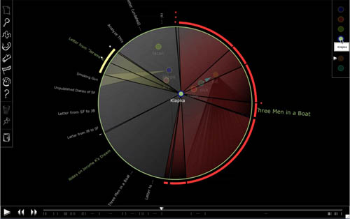
As stated in the online demo: a "role's position in the discourse field is the product of their relation to other players and actions taken." When games become sufficiently complex, with multiple players entwined in multiple subjective trajectories, they begin to resemble Suprematist paintings, with circles, triangles and vectors cutting across the central sphere.
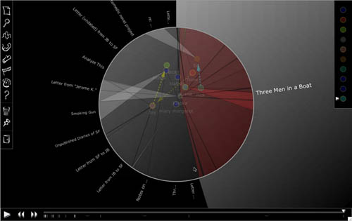
Ivanhoe is intended to investigate how human interaction with machines might illuminate and call attention to the interpretative processes of the individual reader. By situating these processes in a game space governed by certain rules and procedures, awareness is cultivated in the players of individual interpretive acts and of their place in a progression, or digression. It also asks how digital instruments and social software might facilitate collaboration - or even a more productive kind of competition - in the humanities. To quote from "Reflections on the Ivanhoe Game" in TEXT Technology (Drucker and Rockwell 1983) (download pdf), an article chronicling the project's history:
"Collaborative work is still novel in the Humanities, but will increase. Shared resources aggregated from geographically distributed collections create altered conditions for editing and study. Our aim is to concentrate the development of these features in a concerted effort towards increasing awareness of interpretation as a process. One might argue, in fact, that interpretation in its subjective and historical dimensions is the core activity of humanities."
Posted by ben vershbow at 10:51 PM
July 6, 2005
Penn State's Wiki-Based Pilot Program

For most freshman college students, the first-year composition course is an important introduction to the rigors of college-level writing and thinking. As digital media begins to take a more central role in scholarly discourse, many colleges and universities are redesigning this gateway course to incorporate modes of thinking, writing, and interdisciplinary learning specific to the networked medium.
Penn State's wiki farm pilot program is one example. It allows teachers of freshman composition to propose and teach interdisciplinary wiki-based courses. Instructors Richard Doyle, Jeff Pruchnic, and Trey Conner argue that students in the pilot program produce better work than students enrolled in traditional versions of the course. The peer-reviewed wiki environment contextualizes grammar and mechanics, and motivates students to proof their work carefully in order to impress their audience. Critical thinking skills are also honed, as students compete to post the best, most original argument.
The self-governing ecology of the networked wiki format also creates a fruitful environment for discussion and debate. The wiki places control over the direction and duration of the discussion into students' hands. This allows them to become skillful at negotiating the, sometimes volatile, terrain of public debate. Richard Doyle notes the success of these public forums. He says that in the years he has been teaching the course there has not been a single "flame war" (a term referring to the online exchange of inflammatory remarks). Doyle also points out that in wiki-based courses, "students are learning how to interact responsibly in an information-dense environment." He says, "Students are being trained to deal with the fluid environments they are going to find themselves in."
In a typical wiki pilot course, each student produces about 100 pages of material and must read, comment on, and grade their fellow students' work. Doyle's course "Rhetorical Ecologies" is a great example of the advantages inherent in digital learning environments. The requisite "textbook" is done away with and replaced by open source materials that are available online.

Jeff Pruchnic's course, Coding for Corporate Survival, uses the wiki format to support collaborative projects. For example, class problem #1 asks students to create a preliminary report for the fictional consulting firm of NeuVex, hired by Penn State University to design, construct, and integrate an automated, online room-reservation system. The students work in teams and submit their reports as editable online wiki documents.
Students in Pruchnic's class are given the tools they need to define the problems and search independently for solutions. The instructor helps out by posting relevant business news on the "Announcements/Hot Linx" section of the home page and assigning online readings, but, in general, students are expected to make these investigations on their own, using the teacher as a mentor and guide. This stands in stark contrast to the prefabricated problems and solutions put forth by traditional textbooks. As Richard Doyle puts it, "this is a learner-centered environment, the teacher is there to act as coach or zen master, making periodic interventions."
Posted by kim white at 9:43 AM
June 27, 2005
How Stuff Is Made: Using Wikis to Structure New Paradigms for Participation
How Stuff is Made (HSIM) is a student-authored visual encyclopedia documenting the manufacturing processes, labor conditions and environmental accounts of contemporary products. It is a collaboratively produced, independent, academic, wiki-based publication. Encyclopedia entries are summative photo essays created by engineering, design and art students guided by faculty who ensure high standards of evidence. (website FAQ page)
The project was initiated by Natalie Jeremijenko, of the University of San Diego. Inspired by the popular "How Stuff Works" website, Jeremijenko created an alternative format that would require her students to look more deeply, and more critically, at the objects they crave. Each semester, students must research a product, complete a photo essay that describes how it is manufactured, and publish the results on the HSIM wiki.
To complete their essays, students must gain access to the manufacturing process. This requirement lessens plagiarism, encourages higher standards of evidence, and helps student gain valuable insight into the human and environmental cost of consumerism. Additionally, as Jeremijenko notes, "it is not a bad idea if students of business, engineering and design are required to visit a manufacturing facility at least once in their college career." When the finished essays are published to the wiki, students must send notification to the product manufacturer with instructions regarding where to find the essay and how to edit its contents.
This project represents an interesting alternative to textbooks. Rather than passively receiving information, students are required to participate in the creation of open source knowledge. This helps them understand the process of knowledge creation and sharpens their critical faculties. Additionally, publishing an essay to a public site, heightens accountability. Students have been known to continue editing their wiki articles long after class is over.
In her abstract for the Share, Share Widely conference, Dr. Jeremijenko claims that the HSIM project provides "...evidence that the way we structure participation changes what information is produced, who produces it, and how it circulates." Additionally, the work "provides material to question what these changes may mean for learning."
Posted by kim white at 10:11 AM
June 14, 2005
Decameron Web: A Growing Hypermedia Archive of Materials Dedicated to Boccaccio's Masterpiece
A true encyclopedia of early modern life and a summa of late medieval culture, the Decameron is also a universal repertory of perennially human situations and dilemmas: it is the perfect subject for an experiment in a new form of scholarly and pedagogical communication aimed at renewing a living dialogue between a distant past and our present.
Started by graduate and undergraduate students in 1994 at Brown University's Italian Studies program, under the direction of Prof. Massimo Riva, Decameron Web has grown steadily up to the present day, providing a broad range of resources for scholars, students and general readers. Decameron Web suggests what might come to replace the conventional print textbook in the humanities: a dynamic learning environment through which investigators (at varying levels of experience) can trace trajectories.
The site can serve as a primer for newcomers to the Decameron, with useful sections on Boccaccio's period and literary influences, and profiles of major characters and themes. A more advanced scholar can take advantage of complete, searchable texts in Italian and English, period music recordings, an extensive critical bibliography, and analytical tools such as a motif index and a concordance. The "pedagogy" section provides resources that teachers and students can use in their courses - reading guides, sample papers, course modules, and a variety of articles on the meaningful use of technology in the classroom.

Decameron Web is not a static space:
...this collection of materials will continue to grow in years to come, as students and scholars at Brown University and other institutions contribute syllabi, successful teaching strategies, new essays, interpretations, images, and so forth.
It is, however, more closed than open. Authority is maintained by strict editorial oversight, and new modules, syllabi and resources are added through these filters. As it stands now, Decameron Web is an outstanding reference work with an array of useful tools. The site changes slowly over time, but does not at present provide forums for the community to engage with itself. The network of scholars and students that has arisen around Decameron Web would be well served by a more dynamic social software platform, one that could be built into the existing architecture. This could consist of a simple discussion board, or a community weblog for news and developments. It could also include more sophisticated tools like multi-player analytical games, or spaces for collaborative projects. We believe this should be the next stage of Decameron Web's evolution - to truly explore a "new form of scholarly and pedagogical communication."

(page on Pasolini's film of The Decameron)
Posted by ben vershbow at 11:29 AM

