January 6, 2006
Narrative Structure and Medium: "The Red Planet" and the Future of the Educational DVD-ROM
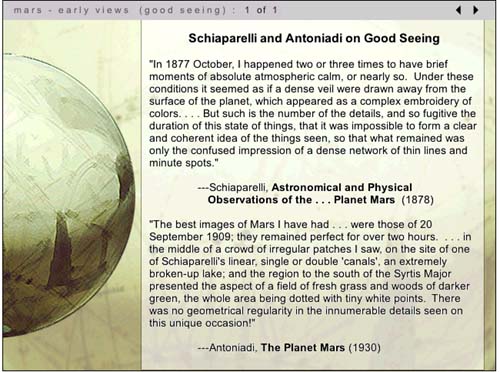
As we've noted before in Next/Text, a key question in considering the future of the digital textbook is whether the text should be delivered to the user via the web or on a disc. In the 1990s -- when Voyage pioneered the development of the educational CD-ROM -- the choice was clear: accessing video and audio was far too difficult to make developing web content worthwhile.
Since the demise of Voyager, however, the production of disc-based educational material has gradually decreased, and it has become less clear that ROM discs are the medium of choice for delivering "thick" multimedia content. As some of the examples we've written about (especially the WebCT film course and the MIT Biology class) demonstrate, streaming video can be easily integrated into online instructional material: there's still much room for improvement, but it's clear that online video and audio delivery will only improve over time.
So what is the future of the disc-based educational text? The question seems especially relevant now that the recent industry debate over the formats of next-generation DVDs has provoked more than a few technology analysts to wonder aloud whether discs themselves are a doomed delivery medium. I'm not completely convinced by these arguments, as I feel that, as far as educational media are concerned, there may still be good reasons to put things on disc. In what follows, I'll be weighing the pros and cons of scholarly work on DVD-ROM through a discussion of The Red Planet, a DVD-ROM project published in 2001 by the University of Pennsylvania Press.
The Red Planet is the first publication in Penn's Mariner 10 Series, a publishing venture that represents the first attempt by a university press to publish scholarly work on DVD-ROM. The titles chosen for this Penn series are interdisciplinary studies that blend what C.P. Snow might call the "two cultures" of science and the humanities; each also includes a wide range of textual, visual and audio resources. Thus far, in addition to The Red Planet, Penn has published a volume on humanistic approaches to medicine; a physics text, "The Gravity Project," is forthcoming.
Interestingly, The Red Planet has its roots in an unsuccesful venture in online education: project co-author Robert Markely was first approached to do a series of video interviews to be embedded in a web course about science fiction. When that project fell through in 1997, Markley realized that such interviews would be an ideal first step towards creating a digital scholarly text that explored the roles Mars has played in 19th and 20th century astronomy, literature and speculative thought. Teaming up with multimedia designer/theorists Helen Burgess (also a co-author for Biofutures, a DVD-ROM-in-progress that I've previously discussed) Harrison Higgs and Michele Kendrick, Markley approached Penn with his idea for the project.
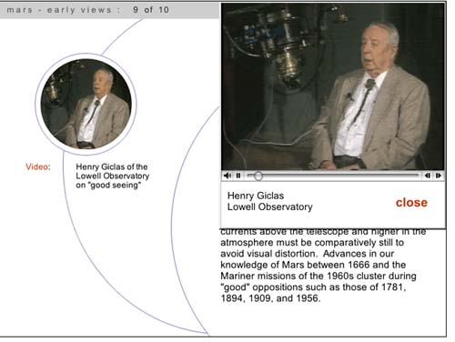
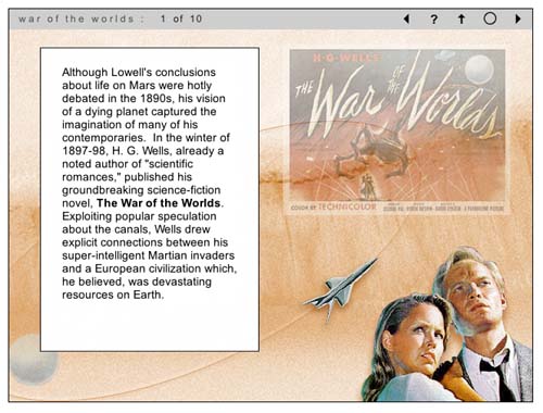
After getting the go-ahead from Penn -- and substantial funding from West Virgina University and Washington State University -- the group spent more than four years completing the project. Markley wrote a 200-page monograph on cultural and scientific approaches to Mars divided into nine chapters -- Early Views; The Canals of Mars; The War of the Worlds; Dying Planet; Red and Dead; Missions to Mars; Ancient Floods; Dreams of Terraforming, and Life On Mars. He and others in the group in the group then interviewed science fiction writers including Kim Stanley Robinson, cultural critics such as N. Katherine Hayles and a diverse group of major scientific figures including Richard Zare, Carol Stoker, Christopher McKay and Henry Giclas (the Giclas interview is pictured below). They also assembled hundreds of current and archival photos, quotations from scientific and literary texts, dozens of clips from science fiction films, and an impressive array of diagrams explaining key concepts in astronomy. And to complement the DVD-ROM project, they authored a website with educational resources, a timeline, and updatable discussions of debates about Mars exploration.
The success of The Red Planet stems from the fact that all of this multimedia does not serve simply to gloss on Markley's monograph: it changes Markley's own authoring process as well. As Markely points out in a chapter he wrote on the project for a book titled Eloquent Images, his main challenge was to create a work that was scholarly enough to be considered worthy by tenure committees, a requirement that has been a serious hurdle to the willingness of academics to invest time and effort in the creation of digital scholarly work. "The majority of commercial educational software treats content as a given," Markley wrote, "reified as information that has to be encoded within a programming language and designed in such a way as to enhance its usuability." To Markley, moving beyond this "usable information" paradigm, involved more than just foregrounding the text: it meant that the designers should make a significant contribution to the intellectual shape of the project that extended beyond usability issues and promoted them to the status of co-authors.
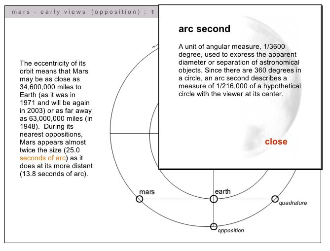
With this in mind, Markley and his co-authors worked collaboratively to develop a navigation structure for the project that reflected both scholarly and pedagogical concerns. The resulting interface eschews the hypertext structures of many web-based projects and relies instead on a chronological narrative structure that the authors felt best maintained the integrity of the scholarly text. In other words, hyperlinks don't move the user around inside the central text, but rather lead to film clips or selections of explanatory material (such as the diagram illustrating the term 'arc second,' pictured below).
The structure of The Red Planet thus resembles, in some ways, the structure of Columbia University's Gutenberg-e publications: if the reader chooses, they can read straight through the text and ignore the linked explanations and supporting material. For the most part, video interviews open on seperate pages and launch automatically (the screenshot above actually shows an exception to this), but the reader can always use the forward navigation key to advance the narrative.
The Red Planet demonstrates that this text-centric approach to digital scholarly work need not come at the expense of the quality of multimedia integrated into the project. From the beginning, Markley and his collaborators wanted The Red Planet to be a standout in terms of both the amount and the quality of supporting media. This, in turn, determined their choice of medium: in writing grant proposals to fund the development of the project, Markley stressed the importance of using DVD-ROM instead of CD-ROM to construct the volume. At the time The Red Planet was produced, the disc was able to hold about six times more data than a traditional CD-ROM; it was also able to read this data about seven times faster, meaning that the video segments played much more smoothly and were of far higher quality. As Markely wrote in his chapter for Eloquent Images, "video on CD-ROM is a pixilated, impressionistic oddity: on DVD-ROM, video begins to achieve something of the semiotic verisimilitude we associate with film."
The DVD-ROM format also allows The Red Planet'sdesigners to incorporate much longer video clips into their project: interviews are up to five minutes in length, and video clips are the maximum length allowable under fair use. In the case of the interviews, the longer interviews allow for detailed explorations of the question at hand: in the case of the film clips, the expansiveness of the selections gives the viewer a sense that they are experiencing a portion of the actual film rather than a snapshot.
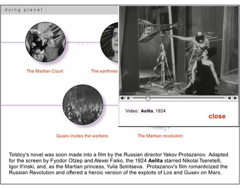
Still, though the videos are high quality, they are not full screen (as shown by the screenshot above, which shows a page that features a series of clips from the 1924 Russian film Aelita). The limited size of the clips is one of a series of tradeoffs Markley and his team found they had to make when confronted with their own limited budgets and realistic pricing expectations for their DVD-ROM. In his chapter for Eloquent Images, Markley writes:
In authoring The Red Planet, we were caught in an ongoing process of having to decide what we could afford in time, money and labor to live up to our grant application claims that DVD ROM could do what neither CD Rom nor the web could manage: integrate hours of high-quality video into a scholarly multimedia project. At the same time, we had to engineer downward the minimum requirements of RAM, operating systems, monitor resolutions, etc to avoid pricing our project out of the mainstream educational market.
Markley's point is an important one: DVD-ROMs have the potential to deliver amazing multimedia content, but that is simply the capacity of the medium. A successful DVD-ROM author not only has to find the time, money, and skill to produce the project; they also have to operate within the constraints of a market which is increasingly accustomed to getting educational content online for free. In the end, The Red Planet was probably more successful at the former than the latter: as a example of the genre, it is exceptional both in content and design, yet the disc has yet to find the wide audience of both scholars and Mars enthusiasts that its authors had hoped it would find.
Looking at The Red Planet and reading Markley's theorization of the work done by his team, I'm impressed by their very self-reflective effort to author a major project over several years in the midst of a rapidly shifting new media landscape. I'm convinced by Markley's argument claims in Eloquent Images that the DVD-ROM format allows multimedia authors to create projects that are more narrative-centered, and thus also, perhaps, more scholarly and more acceptable to the legitimating bodies of academia. At the same time, I'm unsure what will happen to the market for such work: either we will see a critical mass of DVD-ROMS emerge that will create a critical mass of reader/users, or the format will atrophy as the web becomes more and more the preferred method of distribution. Markley himself is aware of the uncertain future of projects such as his own: while making the case for The Red Planet as the best fit between form, content and medium, he also notes that the project is less "a model to be emulated" as much as it is "a historical document, a means to think through the scholarly and professional legitimation of video and visual information."
So should scholars persist in authoring in the medium? I think so, as long as they take a clear-eyed view of its advantages and pitfalls, and as long as they realize -- as Markley and his team did all along -- that while the time and effort spent on a DVD-ROM project is greater than the time spent on a traditional academic monograph, the audience might ultimately be more limited. Not always: a project such as the Biofutures DVD (discussed in an earlier post), which has been developed with a very specific pedagogical aim, might find a more extensive academic audience even if it doesn't find a non-academic one. The same might be said for Medicine and Humanistic Understanding, the newest title in the Mariner 10 series. The key is finding a way to create a new media object that is stable enough to allow users to take advantages of its merits both now and in the foreseeable future.
Posted by lisa lynch at 2:37 PM
December 29, 2005
"The American Film" -- Using WebCT To Author Digital Texts
Over the past few years, more and more professors have begun using course management software such as WebCT or Blackboard (and, increasingly, the non-commercial and open-source Sakai) to organize their syllabi, place assignments online, and create online forums for class discussion. In some cases, WebCT courses are designed so comprehensively that they come to resemble digital course texts, including a substantial amount of original pedagogical material. One example of this is The American Film, a course taught by Thomas Valasek at Raritan Valley Community College that has been recognized this year as an Exemplary Course by in an annual WebCT competition (a description of the class and guest access are available here through the WebCT site).
Valasek, who uses WebCT as a distance-learning platform, has incorporated his own lectures and film analyses into the site, and included relevant film clips which are annotated by his own voiceover narration. This means that students are able to access unique content through the site, instead of using WebCT merely as a portal to download information authored elsewhere. It also means that Valasek has managed to create an online-only film course that give students the feeling of being present when the professor is walking them through scenes of a film -- perhaps the most important part of a lecture-based film class.
The American Film introduces students to American cinema through a discussion of the narrative and visual style of Hollywood movies. After a section on the culture of Hollywood (centered around the film The Player), and on narrative and visual style in film (centered respectively on American Beauty and On The Waterfront), Valasek focuses on four popular film genres: romantic comedy, the western, science fiction, and film noir. Students are expected to watch a series of films on their own and to use the lectures and discussions on the course site as a launching point for their own research projects. In each case, Valasek pairs a classic example of the genre with a contemporary adaptation, with the expectation that students might be able to draw on their familiarity with the more recent film to help with their interpretations of the older work.
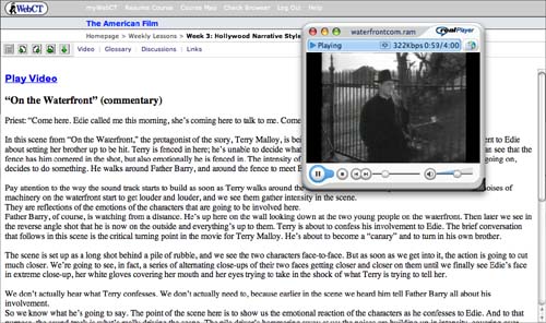
An example of Valasek's voiceover work can be found in his discussion of the crucial scene from On The Waterfront when the priest Father Barry tries to convince Terry Malloy, the films protagonist, to confess to his fiancee that he had helped organize a mob hit on his own brother. As the clip plays, Valasek's narration asks us to pay attention the metaphorical use of a high metal fence in the background: "Terry is fenced in here; he's unable to decide what he wants to do and what the right thing to do is. We can see that the fence has him cornered in the shot, but also emotionally he is fenced in."
As the scene shifts, Valasek continues to describe in detail both the visual and aural techniques used by Kazan to convey emotional intensity, making sure that his voiceover keeps pace with the film itself:
The scene is set up as a long shot behind a pile of rubble, and we see the two characters face-to-face. But as soon as we get into it, the action is going to cut much closer. We're going to see, in fact, a series of alternating close-ups of their two faces getting closer and closer on them until we finally see Edie's face in extreme close-up, her white gloves covering her mouth and her eyes trying to take in the shock of what Terry is trying to tell her...The point of the scene here is to show us the emotional reaction of the characters as he confesses to Edie. And to that purpose, the sound track is what's really driving the scene. The pile driver's hammering away at us; the noises are building up in intensity, covering over their words, drowning out everything that they say, but adding this powerful emotional overlay to the scene.
Valasek's clips are about three minutes long -- ample, but still within the boudaries of fair use -- and students can choose to watch them with or without Valesek's voiceovers. They can also read the transcripts of Valasek's comments seperately from watching the clip.
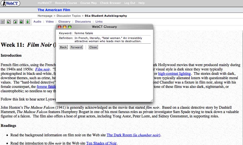
Additional features of the site include a hyperlinked glossary of film terms (pictured above), linked assignments, and an online forum in which students analyze the films they watch -- a necessary addition, since class discussion takes place entirely online.
At present, the primary limitations of The American Film seem to be those of WebCT itself. As a piece of software, WebCT is designed more for efficacy than elegance, and the clunky interface can be headache-producing: it's also the case that students who have all of their classes on the platform sometimes experience "WebCT blur," the feeling that all of their courses are seeping together. Of course, Valasek could move past these limitations by developing the multimedia content on this site even further; instead of embedding it in a WebCT platform, he could potentially create a DVD with his film analyses and discussion for broader use as an introductory film text. I'm curious as to whether anyone working in WebCT has considered the fact that they, like Valasek, are already well on the way to producing a digital textbook. Now that such labor-intensive multimedia learning objects are being created with increasingly frequency for course-specific situations, there needs to be more conversation about how to "free" such scholarly effort for broader academic use.
Posted by lisa lynch at 1:24 PM
Learning from the Simulated Fruit Fly
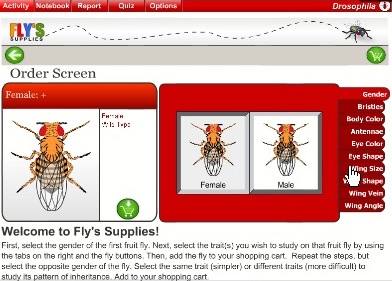
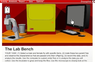
The Virtual Courseware Project creates interactive, online simulations for the life and earth sciences on their sciencecourseware.org site, including Drosophila. Taking its name from the fruit fly used in genetics research, Drosophila uses the classic fruit fly example to teach basic genetic concepts. Using an inquiry-based approach, students begin by ordering flies with certain attributes, such as gender, eye color and wing angle. Then, in the "lab bench" screen below, students mate male and female flies with certain attributes and observe which characteristics get passed along to their offspring. Then, they report their findings. These steps are designed to also teach the scientific method, which include making observations, formulating hypothesis, creating experiments, analyzing results, and writing up findings. Finally, students also get assessed on their learning.
A comment submitted by a teacher using Drospohila explained how this module was helpful in conjunction with experiments using real fruit flies. Working with both the real and the virtual may be the ideal. On one hand, the minor inconsistencies that result from real-life experiments can be an important part of the learning process, and virtual experiments don't allow for such inconsistencies. On the other hand, simulations offer the ability to repeat experiments many times to ensure understanding for class discussions or exams. In the real world, repeating experiments is often time or cost prohibitive.

I appreciate the structured learning aspects of these lessons, especially the assessment feature. Too often, learning modules leave out the any assessment. Even ungraded assessment allows students to an opportunity to make sure they understand concepts or prepare questions for class. The site also includes how their materials meet the standard requirements for each state in the US. The creators of Drosophila have taken steps to create a deep learning experience which re-enforce scientific methods using digital technology that paper-based science textbooks cannot replicate.
Posted by ray cha at 1:20 PM
December 8, 2005
Virtual Village Allows Virtual "Fieldwork"
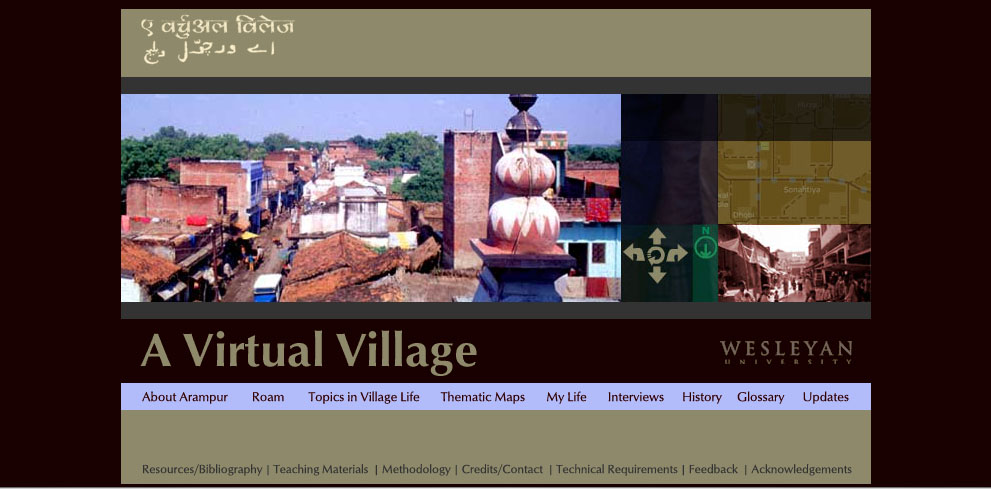
At Wesleyan, faculty interested in creating multimedia learning environments turn to the Learning Objects Studio, a substantial multimedia development lab that has produced everything from flash animations of body wall formations in the chick embryo to the Ricardian Explorer, an "interactive computer game that simulates the functioning of the Ricardian model of international trade." Like Columbia, Weslyan restricts access of some of its "objects" (such as the Ricardian Explorer) to its student population, but there are a fair number of interesting projects available online.
One of the most extensive is the four-year-old site "A Virtual Village," a project co-authored by Wesleyan religion professor Peter Gottschalk and Holy Cross religion professor Mathew Schmalz that maps and documents a small town in North India. Though Gottschalk decided to give it the pseudonym "Arampur," the village is "A Virtual Village" is a real place. Like many rural towns in the area, it has a population of about 5000 Indians with different caste, class and religious backgrounds; it also has geographical and cultural features such as a fifteenth-century mausoleum, numerous Sufi tombs, and temples devoted to a variety of gods and goddesses.
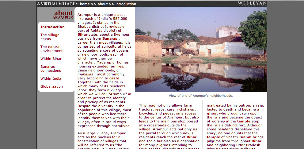
What's great about this web project is the balance it achieves between interactive mapping and scholarly text. The site is divided into eight primary sections, four of them textual and four of them visual. The first textual section, "About Arampur," is divided into pages that discuss topics such as the town's relationship to the city of Banaras, the state of Bihar, India as a nation, and the global economy. Like the later section "Topics In Village Life," these pages (example shown below) are hyperlinked to a glossary, but otherwise resemble the pages of a traditional college textbook:
These geographic essays provide the user with a strong framework for the actual geographic exploration that begins in the next two sections of the project, "Roam," and "Thematic Maps" "Roam" allows the user to explore a map of the village. Clicking on a spot indicated by a pale blue circle reveals a Quicktime VR panorama of the area: when the village map is reduced in size, the QTVR panorama displays additional features such as interviews with locals and "hotspots" that provide additional views of a given location (see red on photo below)
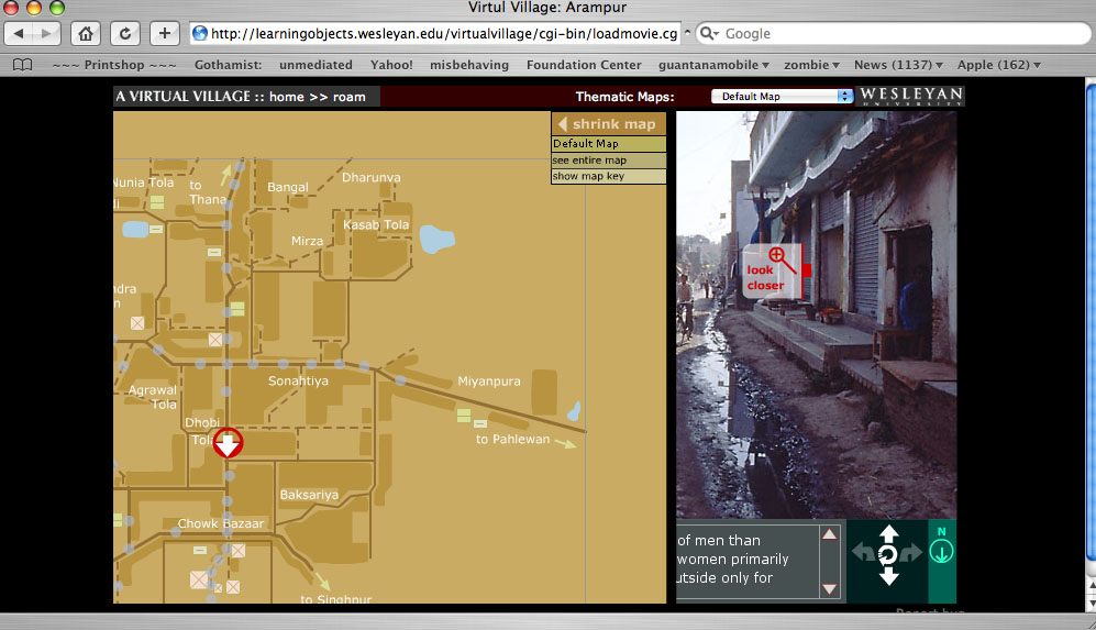
In the "Thematic Maps" section, this basic village maps is overlaid with a series of further map coordinates that reveal things such as local medical practicioners and foodways.
Another section that makes good use of visual material is "My Life," a series of photo essays of the village taken by actual village residents. According to the site developers, these photos - and the extensive series of interviews recorded and transcribed on the site - "allow students using the site work independently through virtual fieldwork and independent investigation." In other words, "A Virtual Village" does more than provide students with a rich scholarly introduction to the North Indian village it documents: it allows them to hone their own research methods, and draw their own conclusions about the "evidence" gathered by both scholars and native informants.
According to the Learning Objects website, the project designers are considering the creation of CD-rom based on the website: given that access to the internet is limited in rural India, this would certainly allow those who are documented in "A Virtual Village" greater access to the site. On the other hand, a great (though underdeveloped) aspect of the site is an "update" section, intended to track the changes in the village as it goes through various stages of development: a 2004 update, for example, describes the first cell phone tower in the village. Given the rapid nature of technological change in India, updates such as this would ensure that "A Virtual Village" truly remained a virtual document of the town.
Posted by lisa lynch at 2:02 PM
December 7, 2005
Team Up With Timo: Vocabulary Builder With Speech Synthesis
Children with speech difficulties - whether stemming from hearing impairment, autism, or language impediment - often benefit from drills in which they practice mimicking the facial muscle, jaw and tongue movements of instructors. However, as anyone who has taught or taken speech classes is well aware, such exercises are often fraught: children can become frustrated or embarassed by the face-to-face encounter such drills require.
Team Up With Timo, a collaboration between psychology professor Dom Massaro and software developer Dan Feshbach, is an interactive tutorial that allows K-4 students to closely study the mouth movements of an animated 3-D vocal coach and practice both pronounciation and reading comprehension. Timo, the software-driven language tutor, is a commercial spinoff of Baldi, a similar language tutor created more than 15 years ago in Dr. Dominic Massaro's Perceptual Science Lab at the University of California at Santa Cruz.
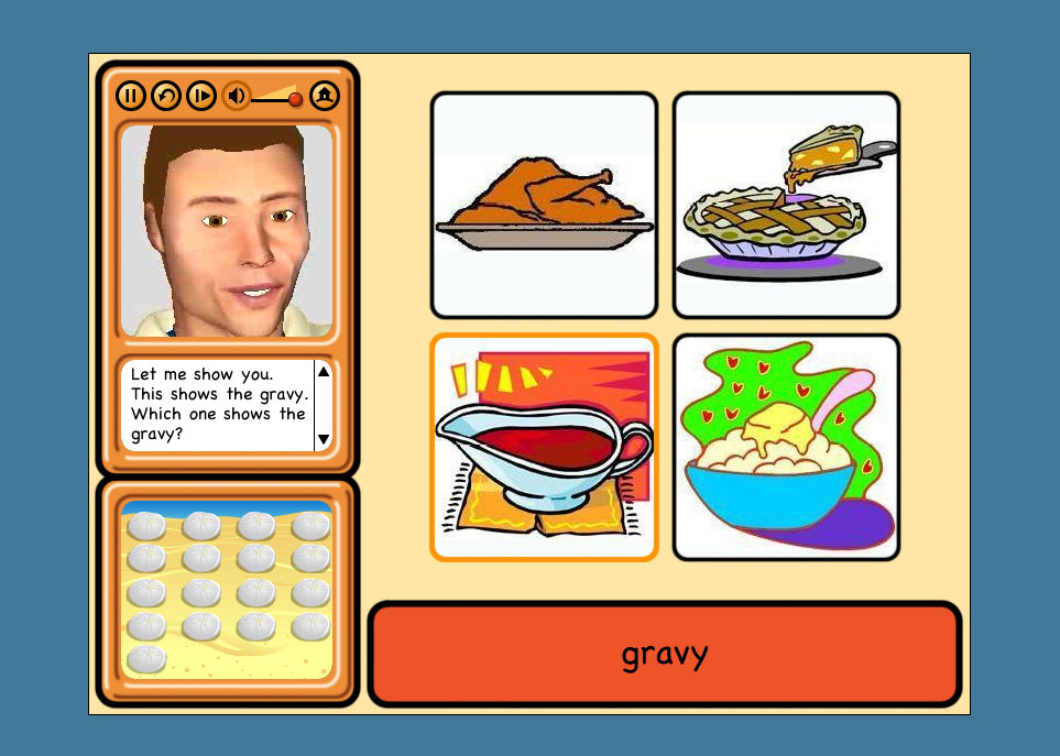
The software interface is very straightforward: after choosing from one of 127 vocabulary lessons, students are directed to a screen with three central elements: a central window in which the lesson takes place and two side windows containing Timo's talking head and a scoreboard. The lesson begins with Timo pronouncing the name of an object pictured in the lesson screen - in the screenshot above, a pot of gravy from a Thanksgiving meal - while the word itself appears below the set of images. The student is asked first to select the image based on a visual cue; the image they must select is highlighted). Then, they are asked to select the image according to a verbal cue from Timo; if they are hearing impaired, they will need to lip-read in order to understand what to select. After this, they must select the vocabulary word for each image based on the same verbal cue; finally, they must pronounce the word themselves following both verbal and visual cues (in the screenshot below, Timo is asking students to say the words planets, sun and moon: because this is a trial version of the program, the microphone function is turned off).

I originally assumed that Timo would contain a speech recognition program that would be able to evaluate students' pronounciations, but there isn't - which makes sense, because, to my knowledge, speech recognition software isn't sophisticated yet enough to recognize or evaluate speech impairments. Instead, Timo has a recording function, so that teachers and therapists can evaluate student's speech on their own.
The lack of internal speech evaluation is thus understandable, but it does lead to one peculiarity in the program: while students only get 'points' for correct answers in the first three stages of the tutorial, (these points indicated in the scoring window, somewhat mysteriously, by the accumulation of sand dollars on the beach) they get points every time the microphone records them trying to pronounce a word, no matter how it is pronounced. This design quirk, in turn, might lead the student to decide that their pronounciation of a word is ultimately emphasized less than their recognition of it, but several academic studies using Timo have shown that it's effective at teaching pronounciation.
Personally, I wanted Timo to show a little more soul: his facial expressions are doubtless constrained by the software's focus on modeling speech, but it seemed like it would be possible for him to be a bit happier-looking when students get the answers right -- sand dollars are well and good, but what about a smile? According to the product website, Baldi (the original version of Timo) has been used to teach austitic children the meaning of facial expressions, so it seems like more expressiveness is certainly possible.
Massaro and Feschbach are now developing a Timo authoring program, which is currently looking for beta testers: it's designed to let speech therapists and parents create their own lessons with Timo. If you're interested, contact them at pilot@animatedspeech.com.
Posted by lisa lynch at 2:49 PM
November 17, 2005
Biofutures: Owning Body Parts and Information
Biofutures, a DVD-ROM about biotechnology and culture currently under development, grew out of conversations between three humanities scholars who shared a common interest in emerging forms of biotechnology. Rob Mitchell, an English Professor at Duke University affiliated with the Duke Institute for Genome Science and Policy and Phillip Thurtle, a molecular biologist turned anthropologist who now teaches at the University of Washington, had both encountered - translation problems - when trying to teach humanities students about biotechnology.
The two professors realized that if they were going to clearly communicate the social, cultural and legal issues that lay behind the case studies they tried to present, they had to find a simple way to get the science across. Aware that a conventional textbook or course pack would only bury their students in a tangle of sometimes overwhelmingly technical information, they decided to create a digital text of their own that could both sift through out the different types of issues connected with biotech research while providing accessible - and lively - explanations of the science involved.
In order to come up with a design for their project, Mitchell and Thurtle teamed up with Helen Burgess, a new media scholar teaching at the Program in Digital Technology and Culture at Washington State. Burgess had recently worked on DVD project that had similar goals of setting up a dialogue between science and society: The Red Planet: Scientific and Cultural Encounters with Mars (University of Pennsylvania Press, 2001). The team chose to divide the text into three primary chapters: Biology, which focuses primarily on the physiological, chemical, and technological processes that make biocommerce possible; Law, which discusses continuities and changes in intellectual property law that have determined the shape of contemporary biocommerce; and Culture, which examines the ways in which biocommerce has been represented in film, novels, and recent art projects.
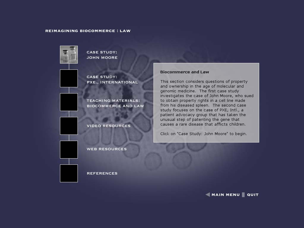
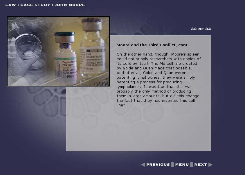
Each chapter in turn features two 'case studies,' which provide a strong underlying narrative. Moving from page to page in the case study narratives, the user encounters clickable items that provide different kinds (and levels) of explanatory item, including video interviews with experts from the fields of genetics, history, and law; video footage and computer animations of basic lab genetic procedures essential to biocommerce; and clips from popular films that have helped establish public perceptions of the possibilities and dangers of biocommerce. Beyond these "case studies," chapters also provides teaching resources and external links.
In developing these items, Burgess has managed to achieve a delicate balance between depth of contextual content and the forward motion of narrative. Since the clickable items are a reasonable length - and the case study are sufficiently compelling - the user never feels sidetracked or distracted by the information presented; the narrative spell is not broken.
One of the most appealing features of Biofutures is that the demonstrations and expert interviews provide a sense of getting first-hand information from many different disciplinary perspectives at once: while many attempts at the cultural studies of science are grounded in a specific discipline (anthropology, sociology, literary study), the truly interdisciplinary nature of this project makes it teachable in a wide variety of classrooms. According to Burgess and Mitchell, the scientists involved in the expert interviews have gotten more interested in the idea of teaching cultural and social perspectives through their participation in the project, and are looking forward to the release of the DVD.
A detailed description of the project is available here
Posted by lisa lynch at 11:32 AM
November 4, 2005
Soliloquy Reading Assistant: Turning the Computer into A Personalized Tutor
Most of the projects on nexttext highlight ways in which electronic media is changing the format of the textbook--extending and enhancing content. But digital technology also presents an opportunity to change the format of the learning experience, extending and enhancing the teacher. Our most recent profile, SAT Math Pro, used animation and audio software to capture and present a real teacher explaining a math problem. Soliloquy Reading Assistant takes it a step further, using voice recognition software which "listens" as a student reads out loud, and responds with audio-visual commentary tailored to the individual needs of that reader.
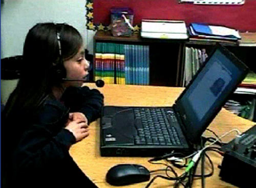
This simulated tutor extends the reach of the teacher, providing the kind of individual attention that is (according the website) scientifically proven to improve fluency. To use Soliloquy Reading Assistant, the student puts on a headset (see above), logs in and selects a book from the "library." Content is provided by leading educational publishers including: Caras, Pearson, Scott Foresman, and Charlesbridge Publishing. Once a book is selected, the student can choose to hear it read via the "Read to me" feature or she/he can simply begin reading into the microphone. Voice recognition and analysis software "listens" and when the student mispronounces a word it responds by reading the word correctly. If the student hesitates over a word, but does not mispronounce it, the word is added to the "review" list. Upon completion of the story, students can play back their voice recording and hear how they did. The "Review" feature identifies words the student has mastered as well as words that need practice. To help build vocabulary, students can take advantage of a context sensitive glossary. Students are further engaged by a system of "Power Points" awarded each time a story is completed. The more students read, the more Power Points they will rack up. A "Progress Screen" shows the results of their current reading and a log of their past readings.
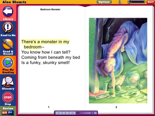
As you can see in the screen grab above, the electronic version looks very much like the print book, fully illustrated with large, easy-to-read type. Soliloquy also has additional accessibility settings to help users with low vision or motor skills.
Teachers using Soliloquy also have an array of tools at their disposal. They can quickly check on the progress of each student from their own computer, listen to the students' audio recordings and make automatic assignments.
Through two basic types of reports, they can see how much students read and at how many words per minute.
The Reading Assistant Manager's 'Usage Report' provides the following information for each student: reading time, listening time, quiz time, total usage, number of completed titles, last session date and total number of sessions - Reports and data can be exported to be included in grant proposals, larger reports, and student information systems.
The 'Fluency Report' provides teachers with: date of last session, number of completed titles, average text level, total number of readings, Words-Correct-Per-Minute for the first and last readings, as well as average Words-Correct-Per-Minute. Teachers can also create custom reports, choosing from a list of topics. Administrators only may also create reports based on student criteria such as ESL, free lunch, ethnicity, etc.
Breakthrough products like Soliloquy Reading Assistant are exciting because they allow us to start thinking about a future where simulated teachers are built into all electronic textbooks. The question to ponder is: what will the emergence of the robotic teacher mean for the future of education itself? There are some clear advantages. This technology greatly improves learning for students enrolled in large classes where they get little individual attention. I'm concerned, however, that as these technologies develop, they might be seen as acceptable replacements for real teachers.
Another drawback: a robotic tutor can't provide uniquely human forms of encouragement that are conveyed via gesture, expression and a whole array of non-verbal communications which give students positive messages about their abilities and their potential. On the flipside: a robotic tutor can't provide uniquely human forms of discouragement that are conveyed (intentionally or unintentionally) via gesture, expression and a whole array of non-verbal communications which give students negative messages about their abilities and their potential.
I'll just add one more subjective response I had to the Soliloquy demo. To make the point clear, I'll contrast it with the response I had to SAT Math Pro. Since I knew the "virtual teacher" was Colleen King, a real person and a teacher, I felt the voice was somehow embodied and the message was trustworthy. The Soliloquy tutor, by contrast, was an unknown entity, who sounded more like a voice actor than real teacher. It's a subtle thing and I don't know if it will register with kids, but the slickness of the vocal performance made it more difficult for me to engage.
But all criticism (and future speculation) aside. Soliloquy Reading Assistant is a superb example of "what happens when textbooks go digital."
Posted by kim white at 7:41 AM
October 20, 2005
The Beethoven's Ninth Symphony CD Companion
"Music appreciation" is a much-maligned scholarly subset -- a throwaway course at university for saps and jocks, "clapping for credit" to the hackneyed strains of Vivaldi's Four Seasons or The Brandenburg Concerti. But anyone who has taken one of these courses with a talented teacher knows that the results can be life-changing. Like great popular science writers Stephen Jay Gould or Richard Feynman, who unlocked the secrets of nature and mathematics for a general audience, a great introductory music course can teach the art of listening to people bound for various non-musical futures. Wherever they end up, their ear is forever wiser.
A great teacher provides context, weaves a narrative, and helps you get inside the mechanics and mathematics of the music. It's a process of deconstructing the complex organism that is the orchestra -- picking it apart, leading you through its components, and training your ear to put it back together again. The best music history lectures I attended in college involved the professor running back and forth between the stereo system, the podium and the blackboard. Occasionally he'd dash over to piano and hammer out a few bars. Sometimes, if we were examining a chamber work, he'd invite a trio or quartet from the neighboring conservatory, stopping them and starting them like a DJ, going over certain passages intensively. I would sit back and listen, sometimes taking notes, as new pieces of the puzzle were introduced. Later, I would immerse myself in the recordings and connect the dots from what I'd learned.
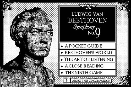
In 1989, the Voyager Company produced what is generally considered to be the first interactive electronic publication: The Beethoven's Ninth Symphony CD Companion. Developed in Apple's HyperCard, it was the first CD-ROM publication to wed a computer program to an audio disk. Most important, it was the combination in one work of recording, text, and inspired instruction -- all the tools needed to unlock the secrets of the music.
If the CD-ROM was a bottle, than the genie -- the inspired instructor, the individual creative voice that ties it all together -- was Robert Winter, a pioneering music scholar, pianist and author at UCLA who went on to develop two more titles with Voyager in this series, including Stravinsky's Rite of Spring (view demo) and Dvorak's Symphony No. 9 "From the New World". The Beethoven stack is built around an excellent recording of the Ninth Symphony by the Vienna Philharmonic. A single-page overview provides a menu of the symphony, allowing the reader to jump to any section instantaneously.
In other sections, Winter ties in basic theory, counting out sections of the music, explaining shifts in rhythm (especially helpful with Stravinsky). He also provides ample textual materials going in depth on various musical conventions and concepts, and providing a rich sense of Beethoven's world and the cultural cosmos in which he worked. There is even a quiz section to help give you a sense of how your listening has improved.
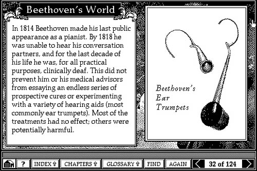
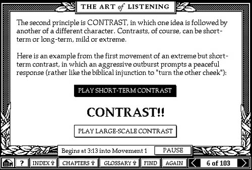
But the central element of the CD-ROM is close reading. As you listen, a cursor takes you through the score measure by measure with a running a commentary from Winter -- identifying themes, elucidating passages, and drawing attention to the effects of particular instruments.
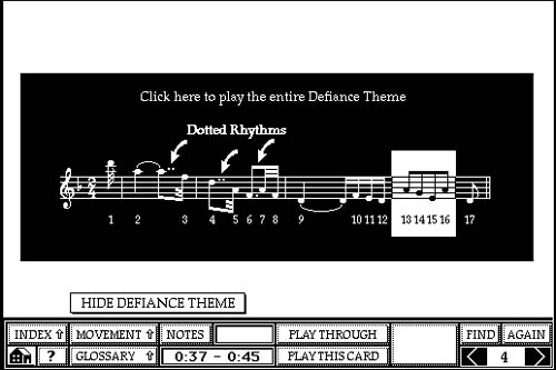
From a design standpoint, this is the major breakthrough of Beethoven's Ninth: the tying of text to specific sections of music in "time-based events."

Putting the teacher inside the book infuses it with the dynamism and precision of a live lecture. It also expands our conception of what it means to illustrate a page. We know how to handle still images or diagrams -- these are relatively easy to arrange in relation to the main flow of the argument. But for time-based media such as music and film -- or in works for which music or film provides the "spine" of the book -- the rhetorical devices must be updated. It's no problem in a live lecture. The professor can simply talk over the symphony or film -- pausing, replaying, emphasizing certain sections. But how do you get this inside the book? How do you write a critical work on time-based media that is not alienated from its subject? Beethoven's Ninth was the program that first suggested a solution.
Posted by ben vershbow at 6:50 PM
October 7, 2005
ix visual exercises: A Hands-on Approach to Understanding Visual Composition
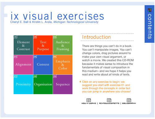
Dr. Cheryl E. Ball and Kristin L. Arola, have created a CD that answers the call for a brief but comprehensive hands-on introduction to the art of visual rhetoric. "We created this CD-Rom," the authors say, "because it makes sense to introduce fundamentals of visual composition in this medium. There are things you can't do in a book. You can't manipulate images. You can't change colors, drag pictures around to make your own visual argument, or watch a movie."
The brilliance of this digital tutorial is that it actively involves the student in the manipulation of images and uses the digital medium to show, rather than tell, how visual arguments are constructed. The mini-textbook takes a workbook approach to teach nine key concepts which include: Element & Contrast, Text & Purpose, Audience & Framing, Alignment, Context, Emphasis & Color, Proximity, Organization, Sequence. Each concept is approached in three steps. First, the student is given a definition along with an annotated visual example. Then the concept is taken through a concise analysis, which also includes annotated images. Finally, the student completes an assignment, which asks him/her to look at an image, manipulate an image, create an image, or construct a visual argument and then analyze the results. The written part of the assignment is completed in a pop-out window, which can be emailed to the instructor or printed out.
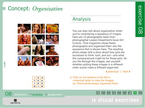
The concepts get progressively more complex as the reader proceeds through the exercises. My favorite, is exercise 8, which analyzes 12 photographs taken from Lauren Greenfield's book "Girl Culture." The photos were organized by Time Magazine in a particular sequence, "the resulting photo essay tells a story about how girls are socialized to think, look, and act - and what the consequences will be for those girls."

Each photograph is annotated with a statement summarizing the point it makes within the overall visual argument. For example, the photograph above left (#2 in the series, it follows a picture of Lily, a 5 year old, shopping at Rachel London's clothing store) has an annotation that reads:
The girls in this picture are eight years older than Lily - the way they've dressed and posed suggests that they are very self-aware. By continuing the sequence with another image of young girls, we are asked to start thinking about how and why these girls are presenting themselves. What are they emulating? Who are they performing for?
The picture above right (#11 in the series, the penultimate image in the essay) is a picture of "Fetus bingo" at La Vida, a high school for pregnant girls and teenage mothers. The annotation reads:
Given everything we've seen so far, this photo represents the consequences of growing up too soon. Young girls are told that to be noticed they need to dress and look like a woman - but that they shouldn't act like one. There are serious repercussions for those girls who actually do adult things, like having babies.
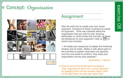
Following the "Girl Culture" example, students are asked to create their own visual argument in the assignment section. They choose eight photos from the fifteen photos provided. Then they drag and drop the thumbnails onto a storyboard, annotating each image with an explanation of "what each signifies and how one leads to another." They must also explain how the organization conveys the purpose of the argument. Clicking the "play" button, presents the series as a slide show.
Other interactive assignments include exercise 1, which allows the student to click on a button and see the image in question with a different colored background, foreground, or headline. Exercise 2 allows the student to isolate sections of the image for analysis. In exercise 6, the student analyzes the effect of warm and cool tones by manipulating a slide bar which alters the tone of the image. Exercise 7 asks the student to create a book jacket by dragging and dropping design elements onto a blank field.
This hands-on approach to parsing visual images is extremely effective and represents an important step forward in the development of teaching tools for this particular subject. Just as learning written composition requires reading and writing--understanding visual composition requires looking and composing. The composing part is the bit that generally gets left out of the visual literacy curriculum. This multimedia interactive textbook provides the appropriate tools to fill that gap.
Posted by kim white at 2:42 PM
September 21, 2005
The Voyager Macbeth: An Expanded Critical Edition
Remember HyperCard? Apple's original, card-based graphical application made it possible to craft book-like works out of a database structure, allowing for multiple trajectories through the text and the intermingling of graphics and motion media. (Smackerel.net provides a nice refresher on "When Multimedia Was Black & White") Many of the works built in HyperCard have taken on the status of relics, but the best of them never fail to impress, reminding us that some of the biggest conceptual leaps in digital media were made over ten years ago, and in many ways remain unsurpassed.
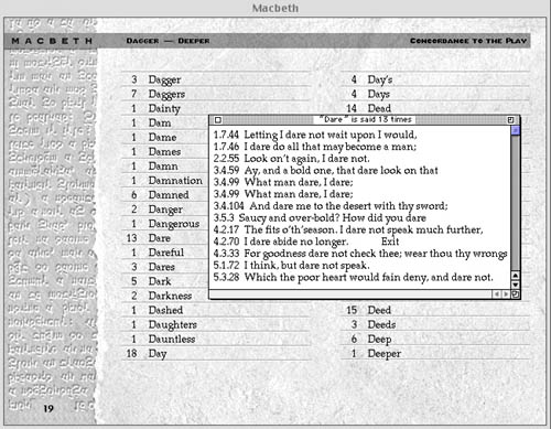
The Voyager Macbeth is a HyperCard-based CD-ROM that blew the lid off what seemed possible in a critical edition of a literary text (view demo). The disc is structured around the 1993 New Cambridge edition of the play, introduced by David Rodes, and thoroughly annotated by A.C. Braunmuller - both leading Shakespeare scholars and professors at UCLA. Producer and chief programmer Michael Cohen describes it as "a rich, immersive, book-like experience" - "a layered format." The text can be read, searched, listened to, watched, and even recited out loud with a pre-recorded actor reading opposite (a feature called "Macbeth Karaoke"). Trevor Nunn's seminal 1976 Royal Shakespeare Company production with Ian McKellan and Judy Dench supplies a complete audio track that can be brought into action instantly with a mouse click, beginning on any desired line. One can read the entire text this way, the pages turning automatically, with the impeccable cast of the RSC bringing it to life like a radio play.
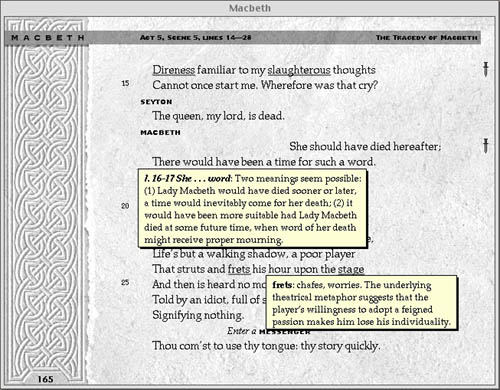
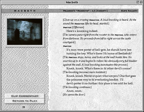
Each page is rich with annotations, which can be summoned as pop-up windows by clicking on underlined words or passages. You can also click on little dagger icons in the margins that provide further context or tie a speech to other moments and motifs in the play, or little film strip icons that indicate video clips are available. Here opens another region of this vast edition. The editors have provided lengthy clips, with commentary, from three of the greatest screen adaptations of Shakespeare's tragedy - Orson Welles' Macbeth (1948), Akira Kurosawa's Throne of Blood (1957), and Roman Polanski's The Tragedy of Macbeth (1971) - all of which can be viewed (albeit on a small screen - this would be different now) within the book.
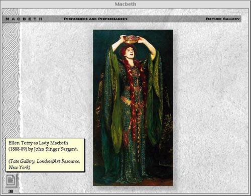
Other assets that expand the universe of the play and deepen the reader's investigation include a lengthy introduction by Professor Rodes, a library of critical essays, detailed background on Shakespeare's life and Elizabethan context, excerpts from the Holinshed Chronicles from which the play is drawn, a large archive of images documenting Macbeth's influence on western culture and various stage productions through the centuries, and important analytical tools such as character profiles, scene summaries and analysis, a full text concordance, and collation with other versions of the play (indispensable in Shakespeare scholarship). The only thing lacking, which could no doubt be solved if The Voyager Macbeth were being remade today, is the ability to write one's own notes in the text and to mark specific sections.
Chatting with Michael Cohen, I asked why so few electronic works of this caliber have been produced since the mid 90s. He pointed to the world wide web, which came into public use just as CD-ROMs were hitting their stride, and had the unfortunate effect of all but halting this period of development. "The web enables the making of small things." To some extent these things can be woven together, but the web is fundamentally not good at providing a center, which is essential for serious scholarship and textual analysis. "There is a place," he continued, "for well-considered, architected book-like materials." These materials should be able to weave together rich media and text in a way that paper cannot, yet still retain the focus and coherence of bounded print materials.
"But," I asked, "isn't the network something that should be used productively in these 'book-like' objects? There are resources on the web that can be of use, not to mention opportunities to communicate and work collaboratively with other students through the book. 'Macbeth Karaoke,' for instance, could incorporate a live chat tool that would make it possible to read with scene partners over the web." Or, students could interpret the text collaboratively with the Ivanhoe game (also profiled on nexttext). He agreed that the network should be fully employed, and that hopefully, tools would be developed that enabled the relatively easy production of bounded, media-rich works that can piggy-back on the web and draw on all the affordances of networked space. This suggests a vision of the future textbook that exists comfortably in the context of the web, and yet is not entirely of the web. Like a boat in the stream, it retains all the rigors and cohesion of the material world.
Cohen sees great potential in the recent increase in high school and university programs that provide laptops to every student. They'll need to load something on to that equipment, something more disciplined than a web browser. When you have unbroken access to your own machine, you can dive deeper - perhaps there is the potential for rich, immersive educational materials to make an entrance in programs like these.
Posted by ben vershbow at 8:17 AM
August 31, 2005
Who Built America? The Expanded Textbook

The early and mid-1990s saw a brief but brilliant flowering of CD-ROM publishing that, to some degree, has never been surpassed, even as the world wide web has evolved from a simple hypertext system into a vibrant, interactive medium. In spite of unprecedented accessibility to knowledge resources, and a sprawling social dimension, the web has so far produced very little in the way of educational resources that could legitimately be said to challenge the hegemony of the printed textbook.
For this reason, it is worth looking back at the CD-ROM heyday, when an exciting array of "expanded books" and other genre-busting, interactive works were produced that made prodigious use of multimedia and tested the possibilities of the personal computer as a reading and learning device. At that time, a number of quality educational titles emerged on CD-ROM that suggested a new direction for the textbook. Who Built America?, a publication of the American Social History Project at the City University of New York, is undoubtedly one of the finest.
Based on a comprehensive, two-volume print history, the Who Built America? (WBA) CD-ROMs constitute both a revision and an expansion of the original titles. The first disc covers a period beginning with Reconstruction and running up to the beginning of World War I, while the second picks up at the outbreak of the first great war and follows to the conclusion of the second. Disc 1 (view demo) was released in 1993 by the Voyager Company to great acclaim. But it was not until 2000 that the second disc was published, this time by Worth, in a slightly altered format. Most important, the second disc was built in TK3, a commercially available ebook authoring program developed by Night Kitchen, an outgrowth of the Voyager company, and progenitor of The Institute for the Future of the Book.
The choice of TK3 highlights another key challenge for redefining the textbook in the digital age: an electronic textbook cannot be read-only. It must allow the reader to personalize the text, making annotations, highlighting passages, inserting memory aids. TK3 enables this, preserving many of the most crucial affordances of print books with tools such as highlighting, sticky notes, notepads, and even a way to dog-ear pages.
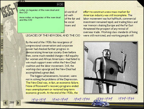
These familiar features are then augmented by the unique affordances of digital machines: rich multimedia, connectivity to the global network, and powerful search capability. This is the textbook enhanced. (more about TK3)
Retaining the basic printed textbook format, each WBA disc contains approximately 3,000 source documents - text, audio, film and links to the world wide web. In effect, the textbook expands into a nearly bottomless resource, while preserving the rigor of a bounded print text.
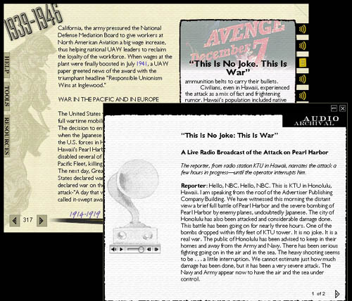
Even more significant, by placing source materials alongside the authors' exposition, a student is better able to make sense of the book as a work of scholarship, and even to challenge the authors' assumptions by drawing their own conclusions based on unvarnished, documentary evidence. The implications of this are profound, since the textbook has long been a top-down instrument of unquestionable authority.
Posted by ben vershbow at 12:17 PM
