« November 2005 | Main | January 2006 »
December 29, 2005
"The American Film" -- Using WebCT To Author Digital Texts
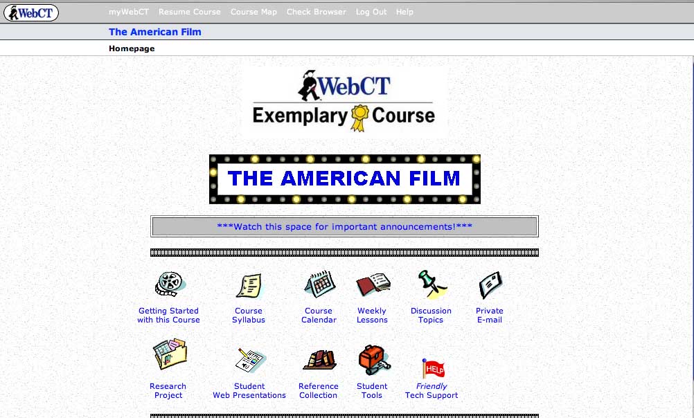
Over the past few years, more and more professors have begun using course management software such as WebCT or Blackboard (and, increasingly, the non-commercial and open-source Sakai) to organize their syllabi, place assignments online, and create online forums for class discussion. In some cases, WebCT courses are designed so comprehensively that they come to resemble digital course texts, including a substantial amount of original pedagogical material. One example of this is The American Film, a course taught by Thomas Valasek at Raritan Valley Community College that has been recognized this year as an Exemplary Course by in an annual WebCT competition (a description of the class and guest access are available here through the WebCT site).
Valasek, who uses WebCT as a distance-learning platform, has incorporated his own lectures and film analyses into the site, and included relevant film clips which are annotated by his own voiceover narration. This means that students are able to access unique content through the site, instead of using WebCT merely as a portal to download information authored elsewhere. It also means that Valasek has managed to create an online-only film course that give students the feeling of being present when the professor is walking them through scenes of a film -- perhaps the most important part of a lecture-based film class.
The American Film introduces students to American cinema through a discussion of the narrative and visual style of Hollywood movies. After a section on the culture of Hollywood (centered around the film The Player), and on narrative and visual style in film (centered respectively on American Beauty and On The Waterfront), Valasek focuses on four popular film genres: romantic comedy, the western, science fiction, and film noir. Students are expected to watch a series of films on their own and to use the lectures and discussions on the course site as a launching point for their own research projects. In each case, Valasek pairs a classic example of the genre with a contemporary adaptation, with the expectation that students might be able to draw on their familiarity with the more recent film to help with their interpretations of the older work.
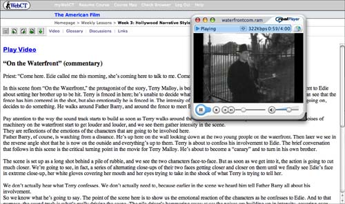
An example of Valasek's voiceover work can be found in his discussion of the crucial scene from On The Waterfront when the priest Father Barry tries to convince Terry Malloy, the films protagonist, to confess to his fiancee that he had helped organize a mob hit on his own brother. As the clip plays, Valasek's narration asks us to pay attention the metaphorical use of a high metal fence in the background: "Terry is fenced in here; he's unable to decide what he wants to do and what the right thing to do is. We can see that the fence has him cornered in the shot, but also emotionally he is fenced in."
As the scene shifts, Valasek continues to describe in detail both the visual and aural techniques used by Kazan to convey emotional intensity, making sure that his voiceover keeps pace with the film itself:
The scene is set up as a long shot behind a pile of rubble, and we see the two characters face-to-face. But as soon as we get into it, the action is going to cut much closer. We're going to see, in fact, a series of alternating close-ups of their two faces getting closer and closer on them until we finally see Edie's face in extreme close-up, her white gloves covering her mouth and her eyes trying to take in the shock of what Terry is trying to tell her...The point of the scene here is to show us the emotional reaction of the characters as he confesses to Edie. And to that purpose, the sound track is what's really driving the scene. The pile driver's hammering away at us; the noises are building up in intensity, covering over their words, drowning out everything that they say, but adding this powerful emotional overlay to the scene.
Valasek's clips are about three minutes long -- ample, but still within the boudaries of fair use -- and students can choose to watch them with or without Valesek's voiceovers. They can also read the transcripts of Valasek's comments seperately from watching the clip.
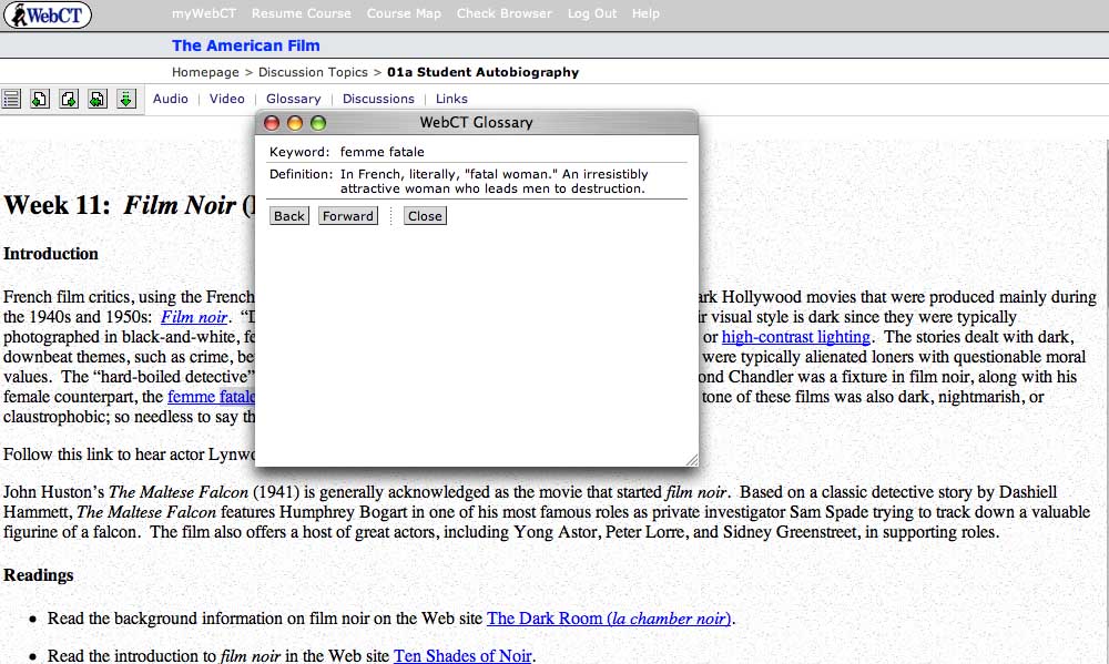
Additional features of the site include a hyperlinked glossary of film terms (pictured above), linked assignments, and an online forum in which students analyze the films they watch -- a necessary addition, since class discussion takes place entirely online.
At present, the primary limitations of The American Film seem to be those of WebCT itself. As a piece of software, WebCT is designed more for efficacy than elegance, and the clunky interface can be headache-producing: it's also the case that students who have all of their classes on the platform sometimes experience "WebCT blur," the feeling that all of their courses are seeping together. Of course, Valasek could move past these limitations by developing the multimedia content on this site even further; instead of embedding it in a WebCT platform, he could potentially create a DVD with his film analyses and discussion for broader use as an introductory film text. I'm curious as to whether anyone working in WebCT has considered the fact that they, like Valasek, are already well on the way to producing a digital textbook. Now that such labor-intensive multimedia learning objects are being created with increasingly frequency for course-specific situations, there needs to be more conversation about how to "free" such scholarly effort for broader academic use.
Posted by lisa lynch at 1:24 PM
Learning from the Simulated Fruit Fly
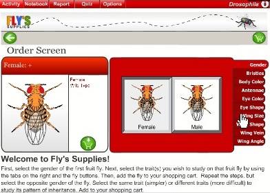
The Virtual Courseware Project creates interactive, online simulations for the life and earth sciences on their sciencecourseware.org site, including Drosophila. Taking its name from the fruit fly used in genetics research, Drosophila uses the classic fruit fly example to teach basic genetic concepts. Using an inquiry-based approach, students begin by ordering flies with certain attributes, such as gender, eye color and wing angle. Then, in the "lab bench" screen below, students mate male and female flies with certain attributes and observe which characteristics get passed along to their offspring. Then, they report their findings. These steps are designed to also teach the scientific method, which include making observations, formulating hypothesis, creating experiments, analyzing results, and writing up findings. Finally, students also get assessed on their learning.
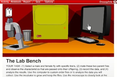
A comment submitted by a teacher using Drospohila explained how this module was helpful in conjunction with experiments using real fruit flies. Working with both the real and the virtual may be the ideal. On one hand, the minor inconsistencies that result from real-life experiments can be an important part of the learning process, and virtual experiments don't allow for such inconsistencies. On the other hand, simulations offer the ability to repeat experiments many times to ensure understanding for class discussions or exams. In the real world, repeating experiments is often time or cost prohibitive.

I appreciate the structured learning aspects of these lessons, especially the assessment feature. Too often, learning modules leave out the any assessment. Even ungraded assessment allows students to an opportunity to make sure they understand concepts or prepare questions for class. The site also includes how their materials meet the standard requirements for each state in the US. The creators of Drosophila have taken steps to create a deep learning experience which re-enforce scientific methods using digital technology that paper-based science textbooks cannot replicate.
Posted by ray cha at 1:20 PM
December 13, 2005
"Liberty, Equality, Fraternity" and "Imaging The French Revolution:" Two Generations of Digital Texts
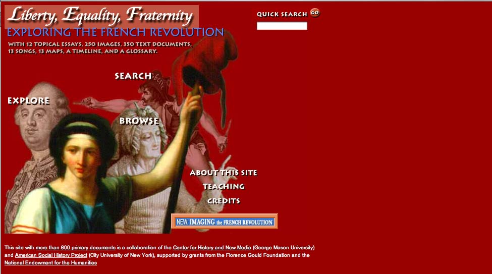
Since 1994, Roy Rozensweig's Center For History And New Media at George Mason University has pioneered the use of digital media to document and analyze historical events. Their particular focus is to transform history from an elite activity practiced mainly in the academy to a more democratic form of inquiry that both draws on and appeals to new audiences. Thus far, they have sponsored over a dozen ambitious digital history projects, ranging from the widely heralded September 11 Digital Archive to a digital recreation of P.T. Barnum's 19th century New York City museum of oddities.
In this review, I'll be looking at two CHNM-sponsored efforts -- Liberty, Equality, Fraternity and Imaging the French Revolution -- that explore the cultural history of eighteenth century France through both scholarly analysis and an extensive archive of cultural artifacts. Seven years divide the production of the two sites: Liberty, Equality, Fraternity was published by the Center in 1998, while Imaging The French Revolution was published in early 2005 as part of a joint effort with American Historical Review,. While both sites are engaging and useful, both also reflect the moment of their production: they thus can tell us something about the history of digital publishing even as they provide a deeper understanding of the history of the French Revolution.
Liberty, Equality, Fraternity is a collaboration between the CHNM and the American Social History Project, a center at the City University of New York which shares CHNM's goal of revitalizing the study and teaching of history through the use of digital tools. Prior to working on Liberty, Equality, Fraternity, the Social History Project partnered with Voyager to produce a digital edition of their award-winning textbook Who Built America, which is still available as two seperate CD-ROMs (the second CD-ROM was produced in the post-Voyager era by Worth Publishers).
Like Who Built America, Liberty, Equality, Fraternity has a CD-ROM component: those interested in the project can either rely exclusively on the website or purchase an accompanying text and CD-ROM from Penn State University Press. The decision to produce a CD-ROM stems partly from the fact that when the site was first published in 1998, this form of extensive online scholarship was still in its pre-adolescence. In 2005, it's far more likely to find a project such as this one authored entirely on the web (or published as a textbook with a password-protected website), but back then the availability of broadband was not something to be taken for granted. The CD-ROM also contains video interviews that aren't available online at all for much the same reasons. It's also possible that the authors found it hard to conceive of a project as ambitious as this without thinking of it in the context of a published volume.
In any case, both versions of Liberty, Equality and Fraternity work well as texts for teaching the revolution; they pair substantial scholarly research with an extensive archive of maps, songs and images. Depending on their specific needs, users of the Liberty, Equality, Fraternity can choose from three main navigational paths -- explore, search, and browse. The "explore" section features twelve essays, written by historians Lynn Hunt of UCLA and Jack Censer of George Mason University, that can be accessed through a drop-down menu. Ten of these provide a succinct history of the Revolution, covering topics including the social causes of revolution, the fall of the monarchy, women and the revolution, the story of Napoleon, and the revolution's legacy in France and elsewhere. Two further essays provide analytic tools for scholars interested particularly in imagery or songs from the period.
Once the user moves past the main menu window, the "look" of the site is, on the whole, somewhat spartan. In the case of the essays, the type is on the small side, though readable: a series of icons running down the left side of the page signal hyperlinks to primary source documents. In the image below, for example a political cartoon, "Active Citizen/Passive Citizen," is used to illustrate an essay on the social causes of the Revolution.
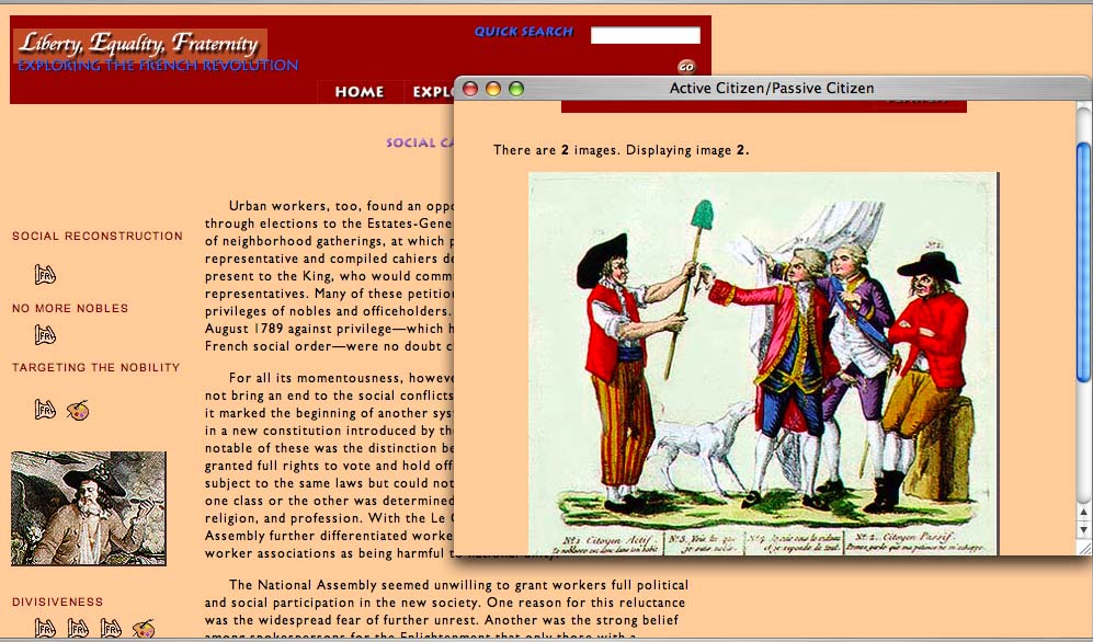
The images, songs and maps on the site -- along with a timeline and glossary -- can be accessed through the "Search" or "Browse" function, depending on whether the user knows in advance what they're looking for. There is wonderful material here: 245 images including political cartoons and pictures of decorated fans and porcelain from the period, 338 documents including personal memoirs, official reports, treatises and eyewitness accounts, 13 maps created especially for the project, and finally, 13 songs also produced uniquely for the project by musicians who worked from an 1899 songbook Playable in Quicktime, the songs are transcribed and translated in pop-up windows.
Interestingly, at the time the Center negotiated for permissions for their visual documents in Liberty, Equality, Fraternity, they paid much less than they would have had they wanted to include them in a print volume: recently, however rights holders have been asking for much higher royalty fees for the display of images and documents online.
Overall, Liberty, Equality, Fraternity is a site that works a bit better than it looks. Students and scholars can use the site both as a textual introduction to the French Revolution and as a valuable archive of visual and aural resources, but the project's visually bland and formally conservative interface is unlikely to encourage the uninitiated to explore the site. It's difficult to fault the site for this -- it relies on design tools and protocols that have shifted over time. As a digital classroom text, it certainly exceeds what a conventional paper text can do: it's just that the medium has evolved since the site was put online, both in terms of how archives are organized and in terms of the way in which the medium itself is often intertwined in the scholar's process of research and presentation.
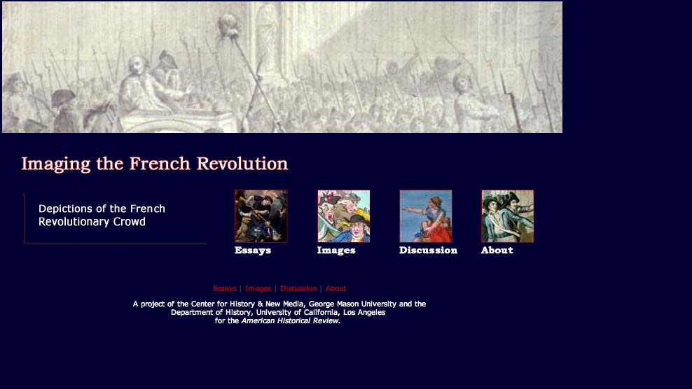
To get a sense of the evolution of the digital history text, click a button at the bottom right corner of the home page of Liberty, Equality, Fraternity and look at the site Imaging The French Revolution, a later work also authored by Censer and Hunt in collaboration with the CHMN. Imaging The French Revolution builds on and updates the original project by using recent developments in digital scholarship to take a closer look at some of the original primary source material. Described as "an experiment in digital scholarship," Imaging The French Revolution features seven essays from seven scholars asked to analyze forty-two images of crowds and crowd violence stored in a shared archive. These images, drawn from the original site, are made available in a fresh interface along with a flash-based "Image Tool" (created by a 12-year-old programming wiz) that allows them to magnify and layer images in order to draw their own conclusions.
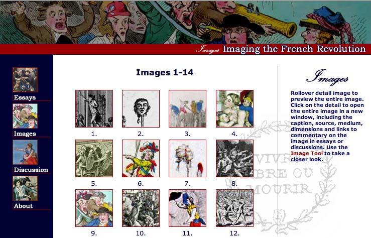
Part of the value of Imaging The French Revolution, then, stems from the way the user is positioned within the site -- not as a passive browser of archived information, but as an active observer who can use the image tool both to think through the images on their own and to interrogate the decisions made by the seven scholars who describe them. In the process of interrogating these decisions, the user can also access online discussions between these seven scholars that took place before they actually wrote their essays. All seven met during the summer of 2003 on an online forum to discuss issues of interpretation, methodology and the impact of digital media on scholarship: the discussion they had then filtered down into their final analytical work.
In other words, Imaging The French Revolution is innovative in two primary ways: it incorporates the user into the piece in a more interactive fashion, and it incorporates the digital medium into the process of knowledge-making -- a method of inquiry that has become increasingly common among saavy digital scholars. There's another way that Imaging The French Revolution reflects the current moment in online scholarship: as an "online-only" publication of American Historical Review, it is a sign of the changing attitudes towards digital scholarship. In 1998, the authors of Liberty, Equality, Fraternity felt the project needed an offline component to be both respectable and accessible; in 2005, the same authors were comfortable working on an online-only project for a journal whose readership had been primarly print-based until recently.
So what does this have to tell us about the future of the digital text? For one thing, it suggests that now that it has become more commonplace to find deep, rich online archives, we might come to expect more of the archive: rather than simply celebrating the fact that material is accessible, more attention will be paid to the conditions and interface of that accessibility. At the same time, it's also an indication that scholars are increasingly willing to eschew paper-based scholarship for serious scholarly analysis that embraces the methodological shifts implicit in the digital medium.
Posted by lisa lynch at 3:18 PM
December 9, 2005
Online Science For The Wired Classroom: The "Disease Spread" Gizmo from Explore Learning
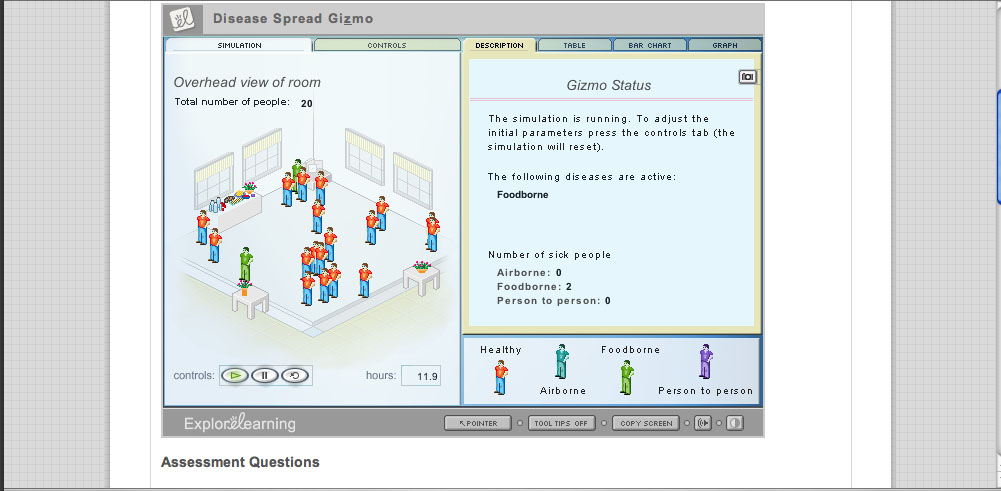
When considering the ways in which born-digital learning materials might replace conventional textbooks, it's important to think about how digital material might change the notion of what a textbook can be - for example, replacing the idea of a "one size fits all" standard classroom text with a number of smaller, atomized learning modules. The six-year-old company Explore Learning has produced over 400 such interactive modules, which they call "gizmos," for use in math and science classrooms. Each gizmo is a brief, animated Shockwave presentation, accompanied by a control panel, a series of assessment questions, and an "exploration guide" that suggests a series of experiments for students. Available through subscription, Explore Learning gizmos have won e-learning awards and recognition from the National Science Foundation, and are widely used in schools around the country.
Browsing through the gizmos (the company allows the user a 30-day free trial before asking them to purchase a subscription), I found them fairly sophisticated both in conceptualization and design. Explore Learning has managed to avoid the hypercolorful "edutainment software" approach of some K-12 digital instructional material, but they've also made their experiments visually interesting enough to capture the often variable attention of high school science students. The selection encompasses most math and science requirements for grades 6 through 12 (and early collecge): algebra, geometry, physics, data analysis, biology, chemistry, and earth and space science. There are gizmos which reveal the structure of snowflakes, teach about RNA and protein synthesis, and explore the interior surface of the Earth.
What makes gizmos pedagogically valuable is that they are not simply demonstrations of scientific principles, but experiments in which students are asked to collect data and report results. One such experiment is the "Disease Spread" gizmo, a relatively straightforward module intended for life sciences classrooms in grades 6 thought 8. "Disease Spread" teaches about airborne, food-born, and person-to-person transmission of disease. The gizmo is centered around a "simulation room" containing an adjustable number of persons and a buffet table filled with food. A s shown in the image above, red figures are healthy, while blue figures are infected with airborne disease, green with foodborne diseases, and purple with diseases obtained through person-to-person contact. Using the control panel, students select how many people are in the room, and study the patterns of disease tranmission by consulting tables and by looking at the figures in the room to see if they have changed color. The image below shows the effects of foodborne disease transmission over a brief interval of time:
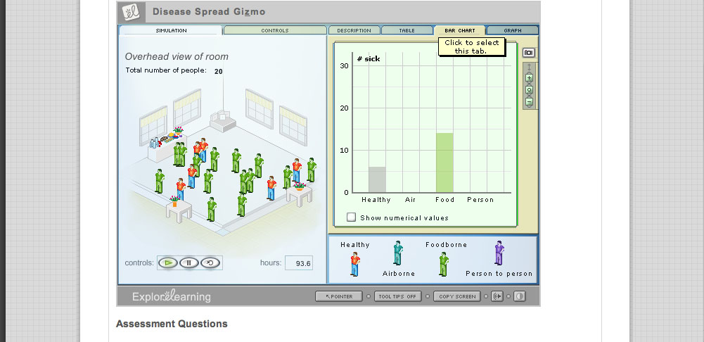
After the simulation has run through on its own, the instruction sheet linked to the gizmo asks the student to manipulate the controls on the simulation in order to answer research questions. One question focuses on whether multiple methods of contagion allow a disease to spread more quickly:
If the same disease could spread through both airborne and foodborne transmission, would it spread more quickly or more slowly than if it could only spread by one of these means? Think about your answer, and then check it by running another trial of the simulation with both Airborne and Foodborne turned on under Allowed diseases on the Controls tab. Explain how the simulation's results support your answer.
I found the "disease transmission" gizmo to be a simple and effective teaching tool; I could easily see it work in a middle school biology or health classrom. I did wonder, however, whether the gizmo, oversimplified the idea of "person to person" disease contact. The explanatory text claims that "some diseases can spread through physical contact between healthy and infected people. For example, a person infected with one of these diseases might accidentally pass on his or her pathogens to healthy people by shaking their hands or patting them on the back."
In the absence of a other information - and given the proliferation of misinformation about disease - I'm concerned that such a simplified approach might lead middle school students to believe that diseases such as HIV/AIDS could be spread through handshakes or pats on the back. This suggests, in turn, the need for teachers to insert gizmos inside a balanced curriculum that goes beyond the included exploration guides to anticipate and compensate for what the gizmos can't do. An overreliance on atomized tools like gizmos may make for a lively classroom, but it could also potentially underemphasize the "connecting the dots" or thinking deeply about an issue. Learning aids have been around for decades, but the success of Explore Learning and Brainpop suggests that teachers are increasingly relying on online aids both in and out of the classroom. It's important to consider whether this has produced a structural change in math and science pedagogy that needs to be assessed beyond thinking through whether these online modules teach the lessons they promise to teach.
Finally, it's interesting to note that over the past year, explore learning was acquired by Proquest, a leading provider of online information resources that hasn't until recently made inroads into the world of K-12. The fact that Proquest -- instead of a K-12 publishing house -- is now in charge of determining the direction of explore learning suggests that the company will continue as an archive of indexed and searchable learning materials, rather than exploring how various groups of gizmos might be woven into a multimedia math or science text.
Posted by lisa lynch at 3:53 PM
December 8, 2005
Virtual Village Allows Virtual "Fieldwork"
At Wesleyan, faculty interested in creating multimedia learning environments turn to the Learning Objects Studio, a substantial multimedia development lab that has produced everything from flash animations of body wall formations in the chick embryo to the Ricardian Explorer, an "interactive computer game that simulates the functioning of the Ricardian model of international trade." Like Columbia, Weslyan restricts access of some of its "objects" (such as the Ricardian Explorer) to its student population, but there are a fair number of interesting projects available online.
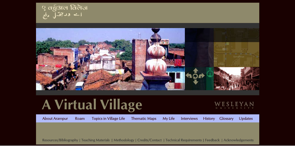
One of the most extensive is the four-year-old site "A Virtual Village," a project co-authored by Wesleyan religion professor Peter Gottschalk and Holy Cross religion professor Mathew Schmalz that maps and documents a small town in North India. Though Gottschalk decided to give it the pseudonym "Arampur," the village is "A Virtual Village" is a real place. Like many rural towns in the area, it has a population of about 5000 Indians with different caste, class and religious backgrounds; it also has geographical and cultural features such as a fifteenth-century mausoleum, numerous Sufi tombs, and temples devoted to a variety of gods and goddesses.
What's great about this web project is the balance it achieves between interactive mapping and scholarly text. The site is divided into eight primary sections, four of them textual and four of them visual. The first textual section, "About Arampur," is divided into pages that discuss topics such as the town's relationship to the city of Banaras, the state of Bihar, India as a nation, and the global economy. Like the later section "Topics In Village Life," these pages (example shown below) are hyperlinked to a glossary, but otherwise resemble the pages of a traditional college textbook:
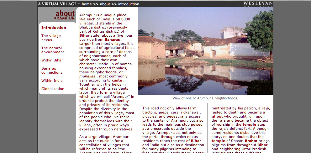
These geographic essays provide the user with a strong framework for the actual geographic exploration that begins in the next two sections of the project, "Roam," and "Thematic Maps" "Roam" allows the user to explore a map of the village. Clicking on a spot indicated by a pale blue circle reveals a Quicktime VR panorama of the area: when the village map is reduced in size, the QTVR panorama displays additional features such as interviews with locals and "hotspots" that provide additional views of a given location (see red on photo below)
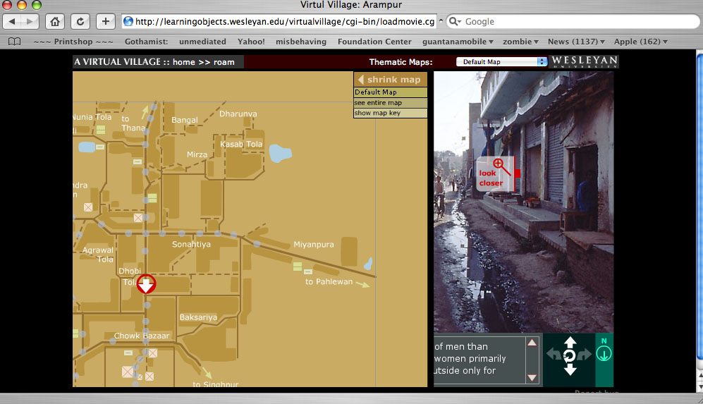
In the "Thematic Maps" section, this basic village maps is overlaid with a series of further map coordinates that reveal things such as local medical practicioners and foodways.
Another section that makes good use of visual material is "My Life," a series of photo essays of the village taken by actual village residents. According to the site developers, these photos - and the extensive series of interviews recorded and transcribed on the site - "allow students using the site work independently through virtual fieldwork and independent investigation." In other words, "A Virtual Village" does more than provide students with a rich scholarly introduction to the North Indian village it documents: it allows them to hone their own research methods, and draw their own conclusions about the "evidence" gathered by both scholars and native informants.
According to the Learning Objects website, the project designers are considering the creation of CD-rom based on the website: given that access to the internet is limited in rural India, this would certainly allow those who are documented in "A Virtual Village" greater access to the site. On the other hand, a great (though underdeveloped) aspect of the site is an "update" section, intended to track the changes in the village as it goes through various stages of development: a 2004 update, for example, describes the first cell phone tower in the village. Given the rapid nature of technological change in India, updates such as this would ensure that "A Virtual Village" truly remained a virtual document of the town.
Posted by lisa lynch at 2:02 PM
December 7, 2005
Team Up With Timo: Vocabulary Builder With Speech Synthesis
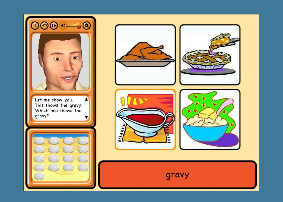
Children with speech difficulties - whether stemming from hearing impairment, autism, or language impediment - often benefit from drills in which they practice mimicking the facial muscle, jaw and tongue movements of instructors. However, as anyone who has taught or taken speech classes is well aware, such exercises are often fraught: children can become frustrated or embarassed by the face-to-face encounter such drills require.
Team Up With Timo, a collaboration between psychology professor Dom Massaro and software developer Dan Feshbach, is an interactive tutorial that allows K-4 students to closely study the mouth movements of an animated 3-D vocal coach and practice both pronounciation and reading comprehension. Timo, the software-driven language tutor, is a commercial spinoff of Baldi, a similar language tutor created more than 15 years ago in Dr. Dominic Massaro's Perceptual Science Lab at the University of California at Santa Cruz.
The software interface is very straightforward: after choosing from one of 127 vocabulary lessons, students are directed to a screen with three central elements: a central window in which the lesson takes place and two side windows containing Timo's talking head and a scoreboard. The lesson begins with Timo pronouncing the name of an object pictured in the lesson screen - in the screenshot above, a pot of gravy from a Thanksgiving meal - while the word itself appears below the set of images. The student is asked first to select the image based on a visual cue; the image they must select is highlighted). Then, they are asked to select the image according to a verbal cue from Timo; if they are hearing impaired, they will need to lip-read in order to understand what to select. After this, they must select the vocabulary word for each image based on the same verbal cue; finally, they must pronounce the word themselves following both verbal and visual cues (in the screenshot below, Timo is asking students to say the words planets, sun and moon: because this is a trial version of the program, the microphone function is turned off).

I originally assumed that Timo would contain a speech recognition program that would be able to evaluate students' pronounciations, but there isn't - which makes sense, because, to my knowledge, speech recognition software isn't sophisticated yet enough to recognize or evaluate speech impairments. Instead, Timo has a recording function, so that teachers and therapists can evaluate student's speech on their own.
The lack of internal speech evaluation is thus understandable, but it does lead to one peculiarity in the program: while students only get 'points' for correct answers in the first three stages of the tutorial, (these points indicated in the scoring window, somewhat mysteriously, by the accumulation of sand dollars on the beach) they get points every time the microphone records them trying to pronounce a word, no matter how it is pronounced. This design quirk, in turn, might lead the student to decide that their pronounciation of a word is ultimately emphasized less than their recognition of it, but several academic studies using Timo have shown that it's effective at teaching pronounciation.
Personally, I wanted Timo to show a little more soul: his facial expressions are doubtless constrained by the software's focus on modeling speech, but it seemed like it would be possible for him to be a bit happier-looking when students get the answers right -- sand dollars are well and good, but what about a smile? According to the product website, Baldi (the original version of Timo) has been used to teach austitic children the meaning of facial expressions, so it seems like more expressiveness is certainly possible.
Massaro and Feschbach are now developing a Timo authoring program, which is currently looking for beta testers: it's designed to let speech therapists and parents create their own lessons with Timo. If you're interested, contact them at pilot@animatedspeech.com.
Posted by lisa lynch at 2:49 PM
December 6, 2005
Supported Reading: Ambedkar Multimedia Study Environment

The Columbia Center for New Media Teaching & Learning (CCNMTL), one of the largest university centers devoted to creating new media education curricula, has been creating Multimedia Study Environments (MSE) for a number of years. During that time, they have taken a variety of written texts and transformed them into interactive digital texts. A few of them are open to the general public, including "The Annihilation of Caste."
This MSE explores the writings of Dr. B.R. Ambedkar, the first highly educated member of the Hindu "Untouchable" caste. Ambedkar's writings have extensive annotations in a variety of media, created by leading scholars from Columbia University. For example, early in the text, the word Hindu appears in the text. The term links its annotation, which includes: a definition relevant to Ambedkar's usage, a listing of every appearance for the word in the text, and video clips of leading scholars at Columbia giving further discussion on the term Hindu.
Links and multimedia are purposefully used to help clarify abstract terms for the novice reader and add details for the advanced reader. Further, the annotations themselves have hyperlinks to other parts of the site and to external resources. The annotations improve what glossaries and indexes have traditionally done. It makes much more intuitive sense to have annotations within a text, rather than at the bottom of a page or in the back of a book. This simple step of integrating the glossary and indexes into the text makes explicit the implicit idea that texts are part of a larger body of knowledge.
CCNMTL shows that basic web technology and interfaces can significantly increase the meaningfulness of a user's experience. This example shows that digital textbooks do not require the most sophisticated technology. Rather, strong visual and interaction design and well thought out content make this website a good model of how to support the exploration of new or familiar material.
Posted by ray cha at 2:35 PM
