« The Textbook Behind the Textbook: Western Civilization Course Portfolio | Main | Analog to Digital: The Electronic Bedford Handbook »
October 7, 2005
ix visual exercises: A Hands-on Approach to Understanding Visual Composition

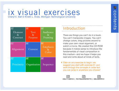
Dr. Cheryl E. Ball and Kristin L. Arola, have created a CD that answers the call for a brief but comprehensive hands-on introduction to the art of visual rhetoric. "We created this CD-Rom," the authors say, "because it makes sense to introduce fundamentals of visual composition in this medium. There are things you can't do in a book. You can't manipulate images. You can't change colors, drag pictures around to make your own visual argument, or watch a movie."
The brilliance of this digital tutorial is that it actively involves the student in the manipulation of images and uses the digital medium to show, rather than tell, how visual arguments are constructed. The mini-textbook takes a workbook approach to teach nine key concepts which include: Element & Contrast, Text & Purpose, Audience & Framing, Alignment, Context, Emphasis & Color, Proximity, Organization, Sequence. Each concept is approached in three steps. First, the student is given a definition along with an annotated visual example. Then the concept is taken through a concise analysis, which also includes annotated images. Finally, the student completes an assignment, which asks him/her to look at an image, manipulate an image, create an image, or construct a visual argument and then analyze the results. The written part of the assignment is completed in a pop-out window, which can be emailed to the instructor or printed out.

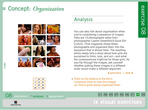
The concepts get progressively more complex as the reader proceeds through the exercises. My favorite, is exercise 8, which analyzes 12 photographs taken from Lauren Greenfield's book "Girl Culture." The photos were organized by Time Magazine in a particular sequence, "the resulting photo essay tells a story about how girls are socialized to think, look, and act - and what the consequences will be for those girls."

Each photograph is annotated with a statement summarizing the point it makes within the overall visual argument. For example, the photograph above left (#2 in the series, it follows a picture of Lily, a 5 year old, shopping at Rachel London's clothing store) has an annotation that reads:
The girls in this picture are eight years older than Lily - the way they've dressed and posed suggests that they are very self-aware. By continuing the sequence with another image of young girls, we are asked to start thinking about how and why these girls are presenting themselves. What are they emulating? Who are they performing for?
The picture above right (#11 in the series, the penultimate image in the essay) is a picture of "Fetus bingo" at La Vida, a high school for pregnant girls and teenage mothers. The annotation reads:
Given everything we've seen so far, this photo represents the consequences of growing up too soon. Young girls are told that to be noticed they need to dress and look like a woman - but that they shouldn't act like one. There are serious repercussions for those girls who actually do adult things, like having babies.

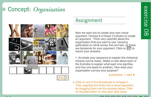
Following the "Girl Culture" example, students are asked to create their own visual argument in the assignment section. They choose eight photos from the fifteen photos provided. Then they drag and drop the thumbnails onto a storyboard, annotating each image with an explanation of "what each signifies and how one leads to another." They must also explain how the organization conveys the purpose of the argument. Clicking the "play" button, presents the series as a slide show.
Other interactive assignments include exercise 1, which allows the student to click on a button and see the image in question with a different colored background, foreground, or headline. Exercise 2 allows the student to isolate sections of the image for analysis. In exercise 6, the student analyzes the effect of warm and cool tones by manipulating a slide bar which alters the tone of the image. Exercise 7 asks the student to create a book jacket by dragging and dropping design elements onto a blank field.
This hands-on approach to parsing visual images is extremely effective and represents an important step forward in the development of teaching tools for this particular subject. Just as learning written composition requires reading and writing--understanding visual composition requires looking and composing. The composing part is the bit that generally gets left out of the visual literacy curriculum. This multimedia interactive textbook provides the appropriate tools to fill that gap.
Posted by kim white at October 7, 2005 2:42 PM
