
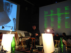
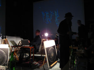
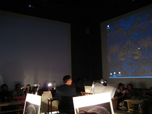
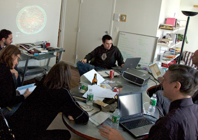
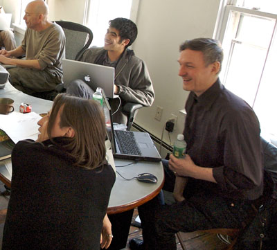
The field of information visualization is cluttered with works that claim to illuminate but in fact obscure. These are what Brad Paley calls “write-only” visualizations. If you put information in but don’t get any out, says Paley, the visualization has failed, no matter how much it dazzles. Brad discusses these matters with the zeal of a spiritual seeker. Just this Monday, he gave a master class in visualization on two laptops, four easels, and four wall screens at the Institute’s second “Monkeybook” evening at our favorite video venue in Brooklyn, Monkeytown. It was a scintillating performance that left the audience in a collective state of synaptic arrest.
Jesse took some photos:
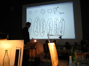
We stand at a crucial juncture, Brad says, where we must marshal knowledge from the relevant disciplines — design, the arts, cognitive science, engineering — in order to build tools and interfaces that will help us make sense of the huge masses of information that have been dumped upon us with the advent of computer networks. All the shallow efforts passing as meaning, each pretty piece of infoporn that obfuscates as it titillates, is a drag on this purpose, and a muddying of the principles of “cognitive engineering” that must be honed and mastered if we are to keep a grip on the world.
With this eloquent gospel still echoing in my brain, I turned my gaze the next day to a new project out of IBM’s Visual Communication Lab that analyzes individuals’ editing histories in Wikipedia. This was produced by the same team of researchers (including the brilliant Fernanda Viegas) that built the well known History Flow, an elegant technique for visualizing the revision histories of Wikipedia articles — a program which, I think it’s fair to say, would rate favorably on the Paley scale of readability and illumination. Their latest effort, called “Chromograms,” hones in the activities of individual Wikipedia editors.
The IBM team is interested generally in understanding the dynamics of peer to peer labor on the internet. They’ve focused on Wikipedia in particular because it provides such rich and transparent records of its production — each individual edit logged, many of them discussed and contextualized through contributors’ commentary. This is a juicy heap of data that, if placed under the right set of lenses, might help make sense of the massively peer-produced palimpsest that is the world’s largest encyclopedia, and, in turn, reveal something about other related endeavors.
Their question was simple: how do the most dedicated Wikipedia contributors divvy up their labor? In other words, when someone says, “I edit Wikipedia,” what precisely do they mean? Are they writing actual copy? Fact checking? Fixing typos and syntactical errors? Categorizing? Adding images? Adding internal links? External ones? Bringing pages into line with Wikipedia style and citation standards? Reverting vandalism?
All of the above, of course. But how it breaks down across contributors, and how those contributors organize and pace their work, is still largely a mystery. Chromograms shed a bit of light.
For their study, the IBM team took the edit histories of Wikipedia administrators: users to whom the community has granted access to the technical backend and who have special privileges to protect and delete pages, and to block unruly users. Admins are among the most active contributors to Wikipedia, some averaging as many as 100 edits per day, and are responsible more than any other single group for the site’s day-to-day maintenance and governance.
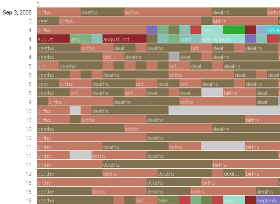
What the researches essentially did was run through the edit histories with a fine-toothed, color-coded comb. A chromogram consists of multiple rows of colored tiles, each tile representing a single edit. The color of the tile corresponds with the first letter of the text in the edit, or in the case of “comment chromograms,” the first letter of the user’s description of their edit. Colors run through the alphabet, starting with numbers 1-10 in hues of gray and then running through the ROYGBIV spectrum, A (red) to violet (Z).

It’s a simple system, and one that seems arbitrary at first, but it accomplishes the important task of visually separating editorial actions, and making evident certain patterns in editors’ workflow.
Much was gleaned about the way admins divide their time. Acvitity often occurs in bursts, they found, either in response to specific events such as vandalism, or in steady, methodical tackling of nitpicky, often repetitive, tasks — catching typos, fixing wiki syntax, labeling images etc. Here’s a detail of a chromogram depicting an administrator’s repeated entry of birth and death information on a year page:
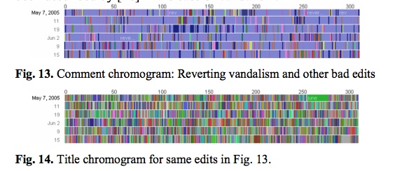
The team found that this sort of systematic labor was often guided by lists, either to-do lists in Wikiprojects, or lists of information in articles (a list of naval ships, say). Other times, an editing spree simply works progressively through the alphabet. The way to tell? Look for rainbows. Since the color spectrum runs A to Z, rainbow patterned chromograms depict these sorts of alphabetically ordered tasks. As in here:

This next pair of images is almost moving. The top one shows one administrator’s crusade against a bout of vandalism. Appropriately, he’s got the blues, blue corresponding with “r” for “revert.” The bottom image shows the same edit history but by article title. The result? A rainbow. Vandalism from A to Z.
Chromograms is just one tool that sheds light on a particular sort of editing activity in Wikipedia — the fussy, tedious labors of love that keep the vast engine running smoothly. Visualizing these histories goes some distance toward explaining how the distributed method of Wikipedia editing turns out to be so efficient (for a far more detailed account of what the IBM team learned, it’s worth reading this pdf). The chromogram technique is probably too crude to reveal much about the sorts of editing that more directly impact the substance of Wikipedia articles, but it might be a good stepping stone.
Learning how to read all the layers of Wikipedia is necessarily a mammoth undertaking that will require many tools, visualizations being just one of them. High-quality, detailed ethnographies are another thing that could greatly increase our understanding. Does anyone know of anything good in this area?
Category Archives: visualization
monkeybook 2: an evening with brad paley
 Monkeybook is an occasional series of new media evenings hosted by the Institute for the Future of the Book at Monkeytown, Brooklyn’s premier video art venue. For our second event, we are thrilled to present brilliant interaction designer, friend and collaborator W. Bradford Paley, who will be giving a live tour of his work on four screens. Next Monday, May 7. New Yorkers, save the date!
Brad is one of those rare individuals: an artist who is also a world-class programmer. His work focuses on making elegant, intuitive visualizations of complex data, in projects ranging from TextArc, a dazzling visual concordance of a text (a version of which was presented with the new Gamer Theory edition), to a wireless handheld device used by traders at the New York Stock Exchange to keep up with the blitz of transactions. It’s a crucial area of experimentation that addresses one of the fundamental problems of our time: how to make sense of too much information. And in a field frequently characterized by empty visual titillation, Brad’s designs evince a rare lucidity and usefulness. They convey meaning beautifully – and beauty meaningfully.
Brad is always inspiring when talking about his stuff, which is going to look absolutely stunning in the Monkeytown space. If you’re in the area, be sure not to miss this. For those of you who don’t know it, Monkeytown is unique among film venues in New York — an intimate room with a gigantic screen on each of its four walls, low comfy sofas and fantastic food. A strange and special place. If you think you can come, be sure to make a reservation ASAP as seating will be tight.
More info here.
(Monkeybook 1)
gamer theory 2.0
…is officially live! Check it out. Spread the word.
I want to draw special attention to the Gamer Theory TextArc in the visualization gallery – a graphical rendering of the book that reveals (quite beautifully) some of the text’s underlying structures.
Gamer Arc detail
TextArc was created by Brad Paley, a brilliant interaction designer based in New York. A few weeks ago, he and Ken Wark came over to the Institute to play around with the Gamer Theory in TextArc on a wall display:
Ken jotted down some of his thoughts on the experience: “Brad put it up on the screen and it was like seeing a diagram of my own writing brain…” Read more here (then scroll down partway).
starting bottom-left, counter-clockwise: Ken, Brad, Eddie, Bob
More thoughts about all of this to come. I’ve spent the past two days running around like a madman at the Digital Library Federation Spring Forum in Pasadena, presenting our work (MediaCommons in particular), ducking in and out of sessions, chatting with interesting folks, and pounding away at the Gamer site — inserting footnote links, writing copy, generally polishing. I’m looking forward to regrouping in New York and processing all of this.
Thanks, Florian Brody for the photos.
Oh, and here is the “official” press/blogosphere release. Circulate freely:
The Institute for the Future of the Book is pleased to announce a new edition of the “networked book” Gamer Theory by McKenzie Wark. Last year, the Institute published a draft of Wark’s path-breaking critical study of video games in an experimental web format designed to bring readers into conversation around a work in progress. In the months that followed, hundreds of comments poured in from gamers, students, scholars, artists and the generally curious, at times turning into a full-blown conversation in the manuscript’s margins. Based on the many thoughtful contributions he received, Wark revised the book and has now published a print edition through Harvard University Press, which contains an edited selection of comments from the original website. In conjunction with the Harvard release, the Institute for the Future of the Book has launched a new Creative Commons-licensed, social web edition of Gamer Theory, along with a gallery of data visualizations of the text submitted by leading interaction designers, artists and hackers. This constellation of formats — read, read/write, visualize — offers the reader multiple ways of discovering and building upon Gamer Theory. A multi-mediated approach to the book in the digital age.
http://web.futureofthebook.org/mckenziewark/
More about the book:
Ever get the feeling that life’s a game with changing rules and no clear sides, one you are compelled to play yet cannot win? Welcome to gamespace. Gamespace is where and how we live today. It is everywhere and nowhere: the main chance, the best shot, the big leagues, the only game in town. In a world thus configured, McKenzie Wark contends, digital computer games are the emergent cultural form of the times. Where others argue obsessively over violence in games, Wark approaches them as a utopian version of the world in which we actually live. Playing against the machine on a game console, we enjoy the only truly level playing field–where we get ahead on our strengths or not at all.
Gamer Theory uncovers the significance of games in the gap between the near-perfection of actual games and the highly imperfect gamespace of everyday life in the rat race of free-market society. The book depicts a world becoming an inescapable series of less and less perfect games. This world gives rise to a new persona. In place of the subject or citizen stands the gamer. As all previous such personae had their breviaries and manuals, Gamer Theory seeks to offer guidance for thinking within this new character. Neither a strategy guide nor a cheat sheet for improving one’s score or skills, the book is instead a primer in thinking about a world made over as a gamespace, recast as an imperfect copy of the game.
——————-
The Institute for the Future of the Book is a small New York-based think tank dedicated to inventing new forms of discourse for the network age. Other recent publishing experiments include an annotated online edition of the Iraq Study Group Report (with Lapham’s Quarterly), Without Gods: Toward a History of Disbelief (with Mitchell Stephens, NYU), and MediaCommons, a digital scholarly network in media studies. Read the Institute’s blog, if:book. Inquiries: curator [at] futureofthebook [dot] org
McKenzie Wark teaches media and cultural studies at the New School for Social Research and Eugene Lang College in New York City. He is the author of several books, most recently A Hacker Manifesto (Harvard University Press) and Dispositions (Salt Publishing).
gamer theory 2.0 – visualize this!
Call for participation: Visualize This!
 How can we ‘see’ a written text? Do you have a new way of visualizing writing on the screen? If so, then McKenzie Wark and the Institute for the Future of the Book have a challenge for you. We want you to visualize McKenzie’s new book, Gamer Theory.
Version 1 of Gamer Theory was presented by the Institute for the Future of the Book as a ‘networked book’, open to comments from readers. McKenzie used these comments to write version 2, which will be published in April by Harvard University Press. With the new version we want to extend this exploration of the book in the digital age, and we want you to be part of it.
All you have to do is register, download the v2 text, make a visualization of it (preferably of the whole text though you can also focus on a single part), and upload it to our server with a short explanation of how you did it.
All visualizations will be presented in a gallery on the new Gamer Theory site. Some contributions may be specially featured. All entries will receive a free copy of the printed book (until we run out).
By “visualization” we mean some graphical representation of the text that uses computation to discover new meanings and patterns and enables forms of reading that print can’t support. Some examples that have inspired us:
- Brad Paley’s Text Arc
- Marcos Weskamp’s Newsmap
- Fernanda Viegas’ Wikipedia “History Flow”
- Chirag Mehta’s US Presidential Speeches Tag Cloud
- Kushal Dave’s Exegesis
- Magnus Rembold and Jurgen Spath’s comparative essay visualizations in Total Interaction
- Philip DeCamp, Amber Frid-Jimenez, Jethran Guiness, Deb Roy: “Gist Icons” (pdf)
- CNET News.com’s The Big Picture
- Visuwords online graphical dictionary
- Christopher Collins’ DocuBurst
- Stamen Design’s rendering of Kate Hayles’ Narrating Bits in USC’s Vectors
- Brian Kim Stefans’ The Dreamlife of Letters
- Young-Hae Chang Heavy Industries
Understand that this is just a loose guideline. Feel encouraged to break the rules, hack the definition, show us something we hadn’t yet imagined.
All visualizations, like the web version of the text, will be Creative Commons licensed (Attribution-NonCommercial). You have the option of making your code available under this license as well or keeping it to yourself. We encourage you to share the source code of your visualization so that others can learn from your work and build on it. In this spirt, we’ve asked experienced hackers to provide code samples and resources to get you started (these will be made available on the upload page).
Gamer 2.0 will launch around April 18th in synch with the Harvard edition. Deadline for entries is Wednesday, April 11th.
Read GAM3R 7H30RY 1.1.
Download/upload page (registration required):
http://web.futureofthebook.org/gamertheory2.0/viz/
ITIN place | 2007 redux: design journal, parts 1 & 2
ITIN place — May 2006 archives (left two columns with live links):
[1] SUMMER 2006
At the beginning of the summer, Ben Vershbow, Alex Itin, and I began to discuss a redesign of IT IN place‘s archives. Itin blogs prolifically, his posts rich with media: scans of paintings, animated .gifs, Vimeo linked video collages. As a result, at present, his blog archive is enormous, slow loading, and unweildy. The archive requires better display and search capabilities—a map— to foreground the sheer volume of Itin’s work, rather than bury it. Below is a series of exchanges, both visual and conversational, following the redesign of IT IN place‘s archives…
some thoughts on mapping
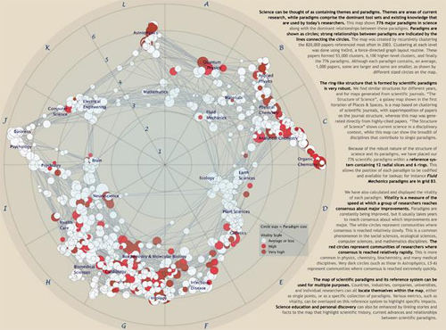
Map of scientific paradigms. by Kevin Boyack and Richard Klavans
Mapping is a useful abstraction for exploring ideas, and not just for navigation through the physical world. A recent exhibit, Places & Spaces: Mapping Science, (at the New York Public Library of Science, Industry, and Business), presented maps that render the invisible path of scientific progress using metaphors of cartography. The maps ranged in innovation: there were several that imitated traditional geographical and topographical maps, while others created maps based on nodal presenation—tree maps and hyperbolic radial maps. Nearly all relied on citation analysis for the data points. Two interesting projects: Brad Paley’s TextArc Visualization of “The History of Science”, which maps scientific progress as described in the book “The History of Science”; and Ingo Gunther’s Worldprocessor Globes, which are perfectly idiosyncratic in their focus.
But, to me, the exhibit highlighted a fundamental drawback of maps. Every map is an incomplete view of an place or a space. The cartographer makes choices about what information to include, but more significantly, what information to leave out. Each map is a reflection of the cartographer’s point of view on the world in question.
Maps serve to guide—whether from home to a vacation house in the next state, or from the origin of genetic manipulation through to the current replication practices stem-cell research. In physical space, physical objects circumscribe your movement through that space. In mental space, those constraints are missing. How much more important is it, then, to trust your guide, and understand the motivations behind your map? I found myself thinking that mapping as a discipline has the same lack of transparency as traditional publishing.
How do we, in the spirit of exploration, maintain the useful art of mapping, yet expand and extend mapping for the networked age? The network is good at bringing information to people, and collecting feedback. A networked map would have elements of both information sharing, and information collection, in a live, updateable interface. Jeff Jarvis has discussed this idea already in his post on networked mapping. Jarvis proposes mashing up Google maps (or open street map) with other software to create local maps, by and for the community.
This is an excellent start (and I hope we’ll see integration of mapping tools in the near future), but does this address the limitations of cartographic editing? What I’m thinking about is something less like a Google map, and more like an emergent terrain assembled from ground-level and satellite photos, walks, contributed histories, and personal memories. Like the Gates Memory Project we did last year, this space would be derived from the aggregate, built entirely without the structural impositions of a predetermined map. It would have a Borgesian flavor; this derived place does not have to be entirely based on reality. It could include fantasies or false memories of a place, descriptions that only exists in dreams. True, creating a single view of such a map would come up against the same problems as other cartographic projects. But a digital map has the ability to reveal itself in layers (like old acetate overlays did for elevation, roads, and buildings). Wouldn’t it be interesting to see what a collective dreamscape of New York looked like? And then to peel back the layers down to the individual contributions? Instead of finding meaning through abstraction, we find meaningful patterns by sifting through the pile of activity.
We may never be able to collect maps of this scale and depth, but we will be able to see what a weekend of collective psychogeography can produce at the Conflux Festival, which opened yesterday in locations around NYC. The Conflux Festival (formerly the Psychogeography Festival) is “the annual New York festival for contemporary psychogeography, the investigation of everyday urban life through emerging artistic, technological and social practice.” It challenges notions of public and private space, and seeks out areas of exploration within and at the edges of our built environment. It also challenges us, as citizens, to be creative and engaged with the space we inhabit. With events going on in the city simultaneously at various locations, and a team of students from Carleton college recording them, I hope we’ll end up with a map composed of narrative as much as place. Presented as audio- and video-rich interactions within specific contexts and locations in the city, I think it will give us another way to think about mapping.
clifford lynch takes on computation and open access
Academic Commons mentions that Clifford Lynch has written a chapter, entitled, “Open Computation: Beyond Human-Reader-Centric Views of Scholarly Literatures” in an upcoming book on open access edited by Neil Jacobs of the Joint Information Committee. His chapter, which is available online, looks at the potential computational analyses that could be formed by collecting scholarly literature into a digital repository. These “large scholarly literature corpora” would be openly accessible and used for new branches of research currently not possible.
He takes cues from the current work in text mining and large scale collections of scholarly documents, such as the Persus Digital Library hosted by Tufts Unviersity. Lynch also acknowledges the skepticism that many scholars hold to the value of text mining analysis in the humanities. Further, he discusses the limitations that current intellectual property regimes place on the creation of a large, accessible scholarly corpora. Although many legal and technical obstacles exist, his proposal does seem more feasible than something like Ted Nelson’s Project Xanadu because the corpora he describes have boundaries, as well as supporters who believe that these bodies of literature should be accessible.
Small scale examples show the challenges Lynch’s proposal faces. I am reminded of the development of meta-analysis in the field of statistics. Although the term meta-analysis is much older, the contemporary usage refers to statistical techniques developed in the 1970s to aggregate results from a group of studies. These techniques are particularly popular in the medical research and the public health sciences (often because their data sets are small.) Thirty years on, these methods are frequently used and their resulted published. However, the methods are still questioned in certain circles.
Gene Glass gives a good overview of meta-analysis, concluding with a reflection on how the criticisms of its use reveal insights on fundamental problems with research in his field of education research. He notes the difference in the “fundamental unit” of his research, which is a study, versus physics, which is lower level, accessible and generalizable. Here, even taking a small step back reveals new insights on the fundamentals of his scholarship.
Lynch speculates on how the creation of corpora might play out, but he doesn’t dwell on the macro questions that we might investigate. Perhaps it is premature to think about these ideas, but the possible directions of inquiry are what lingered in my mind after reading Lynch’s chapter.
I am struck by the challenge of graphically representing the analysis of these corpora. Like the visualizations of the blogosphere, these technologies could not only analyze the network of citations, but also word choice and textual correlations. Moreover, how does the body of literature change over time and space, as ideas and thoughts emerge or fall out of favor. In the humanities, can we graphically represent theoretical shifts from structuralist to post-structuralist thought, or the evolution from pre-feminist to feminist to post-feminist thought? What effect did each of these movements have on each other over time?
The opportunity also exists of exploring the possible ways of navigating corpora of this size. Using the metaphor of Google Earth, where one can zoom in from the entire Earth down to a single home, what can we gain from being able to view the sphere of scholarly literature in such a way? Glass took one step back to analyze groups of studies, and found insight on the nature of education research. What are the potential insights can we learn from viewing the entire corpus of scholarly knowledge from above?
Lynch describes expanding our analysis beyond the human scale. Even if his proposal never reaches fruition, his thought experiments revealed (at least to me) how knowledge acquisition occurs over a multidimensional spectrum. You can have a close reading of a text or merely skim the first sentence of each paragraph. Likewise, you can read an encyclopedia entry on a field of study or spend a year reading 200 books to prepare for a doctoral qualifying exam. However, as people, we have limits to the amount of information we can comprehend and analyze.
Purists will undoubtedly frown upon the use of computation that cannot be replicated by humans in scholarly research. Another example is the use of computational for solving proofs in mathematics, which is still controversial. The humanities will be no different, if not more so. A close reading of certain texts will always be important, however the future that Lynch offers just may give that close reading an entirely new context and understanding. One of the great things about inquiry is that sometimes you do not know where you will end up until you get there.
shirky (and others) respond to lanier’s “digital maoism”
Clay Shirky has written an excellent rebuttal of Jaron Lanier’s wrong-headed critique of collaborative peer production on the Internet: “Digital Maoism: The Hazards of the New Online Collectivism.” Shirky’s response is one of about a dozen just posted on Edge.org, which also published Lanier’s essay.
Shirky begins by taking down Lanier’s straw man, the cliché of the “hive mind,” or mob, that propels collective enterprises like Wikipedia: “…the target of the piece, the hive mind, is just a catchphrase, used by people who don’t understand how things like Wikipedia really work.”
He then explains how they work:
Wikipedia is best viewed as an engaged community that uses a large and growing number of regulatory mechanisms to manage a huge set of proposed edits. “Digital Maoism” specifically rejects that point of view, setting up a false contrast with open source projects like Linux, when in fact the motivations of contributors are much the same. With both systems, there are a huge number of casual contributors and a small number of dedicated maintainers, and in both systems part of the motivation comes from appreciation of knowledgeable peers rather than the general public. Contra Lanier, individual motivations in Wikipedia are not only alive and well, it would collapse without them.
(Worth reading in connection this is Shirky’s well-considered defense of Wkipedia’s new “semi-protection” measures, which some have decried as the death of the Wikipedia dream.)
I haven’t finished reading through all the Edge responses, but was particularly delighted by this one from Fernanda Viegas and Martin Wattenberg, creators of History Flow, a tool that visualizes the revision histories of Wikipedia articles. Building History Flow taught them how to read Wikipedia in a more sophisticated way, making sense of its various “arenas of context” — the “talk” pages and massive edit trails underlying every article. In their Edge note, Viegas and Wattenberg show off their superior reading skills by deconstructing the facile opening of Lanier’s essay, the story of his repeated, and ultimately futile, attempts to fix an innacuracy in his Wikipediated biography.
Here’s a magic trick for you: Go to a long or controversial Wikipedia page (say, “Jaron Lanier”). Click on the tab marked “discussion” at the top. Abracadabra: context!
These efforts can also be seen through another arena of context: Wikipedia’s visible, trackable edit history. The reverts that erased Lanier’s own edits show this process in action. Clicking on the “history” tab of the article shows that a reader — identified only by an anonymous IP address — inserted a series of increasingly frustrated complaints into the body of the article. Although the remarks did include statements like “This is Jaron — really,” another reader evidently decided the anonymous editor was more likely to be a vandal than the real Jaron. While Wikipedia failed this Jaron Lanier Turing test, it was seemingly set up for failure: would he expect the editors of Britannica to take corrections from a random hotmail.com email address? What he didn’t provide, ironically, was the context and identity that Wikipedia thrives on. A meaningful user name, or simply comments on the talk page, might have saved his edits from the axe.
Another respondent, Dan Gillmor, makes a nice meta-comment on the discussion:
The collected thoughts from people responding to Jaron Lanier’s essay are not a hive mind, but they’ve done a better job of dissecting his provocative essay than any one of us could have done. Which is precisely the point.
premature burial, or, the electronic word in time and space
We were talking yesterday (and Bob earlier) about how to better organize content on if:book – how to highlight active discussion threads, or draw attention to our various categories. Something more dynamic than a list of links on the sidebar, or a bunch of hot threads advertised at the top. A significant problem with blogs is the tyranny of the vertical column, where new entries call out for attention on a stack of rapidly forgotten material, much of which might still be worth reading even though it was posted back in the dark ages (i.e. three days ago). Some of the posts that get buried still have active discussions stemming from them. Just today, “ways of seeing, ways of writing” – posted nearly two weeks ago – received another comment. The conversation is still going. (See also Dan’s “blog reading: what’s left behind”.)
This points to another thorny problem, still unsolved nearly 15 years into the world wide web, and several years into the blogging craze: how to visualize asynchronous conversations – that is, conversations in which time lapses between remarks. If the conversation is between only two people, a simple chronological column works fine – it’s a basic back-and-forth. But consider the place where some of the most dynamic multi-person asynchronous conversations are going on: in the comment streams of blog entries. Here you have multiple forking paths, hopping back and forth between earlier and later remarks, people sticking close to the thread, people dropping in and out. But again, you have the tyranny of the vertical column.
We’re using an open source platform called Drupal for our NextText project, which has a blog as its central element but can be expanded with modular units to do much more than we’re able to do here. The way Drupal handles comments is nice. You have the usual column arranged chronologically, with comments streaming downward, but readers have the option of replying to specific comments, not just to the parent post. Replies to specific comments are indented slightly, creating a sort of sub-stream, and the the fork can keep on going indefinitely, indenting rightward.
This handles forks and leaps fairly well, but offers at best only a partial solution. We’re still working with a print paradigm: the outline. Headers, sub-headers, bullet points. These distinguish areas in a linear stream, but they don’t handle the non-linear character of complex conversations. There is always the linear element of time, but this is extremely limiting as an organizing principle. Interesting conversations make loops. They tangle. They soar. They sag. They connect to other conversations.
But the web has so far been dominated by time as an organizing principle, new at the top and old at the bottom (or vice versa), and this is one the most-repeated complaints people have about it. The web favors the new, the hot, the immediate. But we’re dealing with a medium than can also handle space, or at least the perception of space. We need not be bound to lists and outlines, we need not plod along in chronological order. We could be looking at conversations as terrains, as topographies.
The electronic word finds itself in an increasingly social context. We need to design a better way to capture this – something that gives the sense of the whole (the big picture), but allows one to dive directly into the details. This would be a great challenge to drop into a design class. Warren Sack developed a “conversation map” for news groups in the late 90s. From what I can tell, it’s a little overwhelming. I’m talking about something that draws people right in and gets them talking. Let’s look around.
the big picture
Though a substantial portion of our reading now takes place online, we still chafe against the electronic page, in part because today’s screens are hostile to the eye, but also, I think, because we are waiting for something new – something beyond a shallow mimicry of print. Occasionally, however, you come across something that suggests a new possibility for what a page, or series of pages, can be when words move to the screen.
I came across such a thing today on CNET’s new site, which has a feature called “The Big Picture,” a dynamic graphical display that places articles at the center of a constellation, drawing connections to related pieces, themes, and company profiles.

Click on another document in the cluster and the items re-arrange around a new center, and so on – ontologies are traced. But CNET’s feature does not go terribly far in illuminating the connections, or rather the different kinds of connections, between articles and ideas. They should consider degrees of relevance, proximity in time, or overlaps in classification. Combined with a tagging system, this could get interesting. As it stands, it doesn’t do much that a simple bullet list of related articles can’t already do admirably, albeit with fewer bells and whistles.
But this is pushing in an interesting direction, testing ways in which a web publication can organize and weave together content, shedding certain holdovers from print that are no longer useful in digital space. CNET should keep playing with this idea of an article ontology viewer – it could be refined into a legitimately useful tool.