 I went to Boston over the weekend and grabbed a book at random from my bookshelf for reading on the trip – an English translation of Gabriele D’Annunzio’s Il Piacere. D’Annunzio is probably best known to English-speaking audiences as being the novelist in residence for the Fascists – which he was – though he’s also the closest thing the Italians have to Proust. I’ve meant to read D’Annunzio for a while out of a vague sense of duty; however, you don’t often see him in English translations, and when I saw this copy for sale in a used book store a few months ago, I picked it up. Little did I suspect that it would provide fodder for rumination about the present and future of the book and publishing.
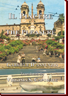
From the start, there seemed to be something a little bit off with this book. The punctuation of the title seems to be in a state of flux: “Il Piacere The Pleasure” says the front cover, “Il Piacere – The Pleasure” says the spine, and “Il Piacere (The Pleasure)” says the title page. The author’s name is spelled “D’annunzio” on the cover, “d’Annunzio” on the title page, and “D’Annunzio” on an about-the-author page after the title page. The back cover doesn’t say mention the title or the author, because it’s devoted to advertising for the publisher, 1stBooksLibrary.com. A visit to the company’s website made things much more clear: 1stBooksLibrary.com, now AuthorHouse.com, is essentially an online vanity press. For about $700 (as far as I can tell), they’ll publish your book for you – in paperback and even in ebook form if you’re willing to pay extra. Sadly, one can’t get “Il Piacere The Pleasure” as an ebook. What seems to have happened here is that the translator, who I won’t name, paid to have her translation of Il Piacere published. But more on the publisher later.
This book was clearly a labor of love. I won’t comment about the quality of the translation, save to say that D’Annunzio’s language is frilly in Italian, but reaches new levels of rococo here. I’m more interested in the book as an artifact. And an interesting artifact it is. The confusion of its cover (the background image which seems to be a family snapshot of the Spanish Steps from the 1950s) continues inside. The spelling isn’t perfect in English: I suspect the trouble of dealing with all the Italian words (large patches are left untranslated, one presumes for color) and proper names made it annoying to run a spellcheck on it. It’s even worse in Italian: on the first page, we find the church at the top of the Spanish Steps (Trinità dei Monti) referred to as both “Trinita de’ Monti” and “Trinita dei Monti”. And even a bilingual spell-checker wouldn’t prevent malapropisms like the one on p. 29, where we learn that a character is subject “to unseen tenderness, to quick melancholy, to raped anger” – which makes your eyes widen until you realize that word should be “rapid”.
Just as troublesome is the punctuation. Italian, like French, uses a long dash before direct discourse, called a lineetta. Although Joyce did his best tried to convert us to the French method, most English novels still use quotation marks. Here, both are used, kind of: there’s a hyphen and a space before every quotations, like this:
– “Come, come!”, Andrea said to Elena, taking her arm, after having left some money on the table.
Repeated over 281 pages, this soon ceases to be cute and becomes wearing. Dashes between phrases also become hyphens. There are two spaces after every period, a rule of thumb which should have disappeared with the typewriter. There’s no hyphenation at the end of lines, which leads to large gaps between words. And the superstructure of the book is a mess. The four sections of the book are headed “Book I”, “LIBRO SECONDO – SECOND BOOK”, “LIBRO TERZO – THIRD BOOK”, and finally, a terse “LIBRO”. I could go on.
It’s a laudable aim – I think it’s great that anyone can translate D’Annunzio on their own, and it’s fantastic to live in an age when anyone can publish such a thing, and I think the translator should be congratulated on her achievement. What this might point to, however, is a downside of a future without publishers. Nobody needs an editor to be published any more, or a book designer, or even a proofreader, which is a radical change in how books can be produced. But just because you can do it yourself doesn’t necessarily obviate the need for them. This book needed a copy editor badly. A designer and a regular editor to make helpful advice wouldn’t have hurt anything. Had I not taken such glee in marking up the textual infelicities, I almost certainly would not have persevered through the book.
Visiting AuthorHouse.com, I’m not sure what to think. (There, for what it’s worth, the title of the book I have is Il Piacere, The Pleasure.) They’ve published some reasonably reputable things – a book by Senator Dick Lugar, for example, is currently being promoted on the front page. Searching for them as a publishing house on Amazon.com reveals that people are reviewing, and presumably buying, some of their books. Although Authorhouse publishes a huge number of books (they claim two million books, and over twenty thousand authors as of 2004), one can’t help wondering if it’s a scam. Kooks of all varieties seem to be well represented: one can buy a copy of The Shakespeare Code, The Book of Theories: Evolution, Metaphysics and Politics, or What Really Happens at the Rapture:: Rapture or Rupture- Your Choice, as well as such works of fiction as Nolocaust. Some of the people publishing there defy description: try reading a synopsis of any of the 31 (!) novels that the prodigious Robert James Warner has published through them, with such titles as Willy the Wonder Fish, That God Damned Hill!, and Robodick. It’s pretty clear that it’s a new variation on the old vanity press.
A less than scrupulous boss once told me that any kid out of junior high could do what I was doing as a book designer. That’s partly true. This copy of D’Annunzio was almost certainly written in MS Word, dumped into a 5” by 8” template and printed to a PDF, which was sent to the printers. A junior high kid could, with a bootleg copy of Adobe Acrobat and fifteen minutes of training, put out a book that looks much like these print-on-demand titles. A little more work and you’ve got your very own ebook. But it takes more than software, and I think that in our rush for new technology, that’s sometime forgotten. It’s great to do away with the infrastructure of publishing: it’s rotten and should have been done away with a long time ago. But the infrastructure of publishing – editors, proofreaders, designers – did ensure that books were readable. It’s hard for readers to take your book seriously if it looks like an amateur job. If you’re going to make your own books, you should make them well. There’s human work to be done for print on demand before we can take it seriously as one of the futures of publishing.


