
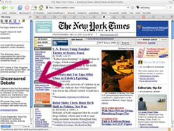
 About a week ago, I attended a fascinating workshop at USC on Social Software in the Academy – a gathering of some of the most interesting thinkers, teachers and innovators at the intersection of technology and education. I learned a great deal, much of which I’m still processing and will be posting about this week. I also found out about some exciting new tools. One of them is Wikalong, a plugin for the Firefox browser. Wikalong makes it possible to write notes in the margin of a web page (something we take for granted in paper books). Reviews, rebuttals, conversations, subversive commentary, a “roving weblog,” or just plain old notes – all of these are possible in the little sidebar wiki notebook that Wikalong places to the left of any web page you go to. Online reading enhanced.
A great part of history is written in the marginalia, and I suspect that networked marginalia is territory worth exploring. Wikalong might be just a literal-minded stepping stone to more interesting forms, but the profundity of the margin (which lies in its spacial relationship to the primary text) shouldn’t be underestimated. 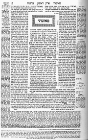 Sparks fly between juxtaposed texts. While hyperlinks enable the reader to leap between textual worlds, they suck you down a wormhole to a distant place. Sometimes it’s better to be in both spaces at the same time (like keeping two browser windows open at once). Think of the Talmud, the great Jewish compendium of law and exegesis. On each page, commentaries are arrayed around a core text. Wikalong may seem insignificant next to this ancient hypertext system, but it points to a related sort of spatial intertextuality that should theoretically be possible in the new medium. If a flat page can be so multi-dimensional, think of how far we might be able to go in a virtual space.
Another handy tool is PurpleSlurple, which provides granular addressability for any existing web page. In other words, it inserts links for paragraphs and headers, allowing you to reference specific sections of text on a given page. Each “slurped” page gets its own URL, as does each individual element that has been anchored with a reference number. It’s primitive, but could come in extremely handy. For bloggers, this provides another way to reference a particular passage in a long web document. Just slurp the page, then link to the specific section.
Nils Peterson, of Washington State University, presented these tools, along with del.icio.us and a visualization application from Tufts called VUE, as a “juxtaposition of technologies” – a toolkit enabling a web reader or writer to more effectively annotate, reference and quote within the web.
Monthly Archives: May 2005
“ubiquitous social encyclopedia”
Cellphedia, a thesis project at the Interactive Telecommunications Program at NYU, is a user-generated encyclopedia composed of text message Q&A from cell phones – a kind of mobile, hyper-abbreviated Wikipedia. But unlike Wikipedia, Cellphedia entries are not open to editing by the community, at least not yet. Inspired by Dodgeball, a popular friend-tracking service, Cellphedia suggests something more along the lines of a massive, multi-user trivia game than a serious knowledge resource. It’s the kind of street research that is becoming more common. Answers on impulse. The web overlayed on the physical world.
mobile web initiative
The World Wide Web Consortium (W3C), the main standards-setting body for the networked world we live and breathe, recently launched the Mobile Web Initiative. From the press release:
“Many of today’s mobile devices already feature Web browsers and the demand for mobile devices continues to grow. Despite these trends, browsing the Web from a mobile device — for example, to find product information, consult timetables, check email, transfer money — has not become as convenient as expected. Users often find that their favorite Web sites are not accessible or not as easy to use on their mobile phone as on their desktop computer. Content providers have difficulties building Web sites that work well on all types and configurations of mobile phones offering Web access.”
The web is moving further and further from being exclusively a desktop system. What began essentially as a set of interlinked brochures, to be read sitting down, has evolved into a dynamic, social multimedia space, increasingly connected to the world around us. I often think of the history of industrialization as a story of estrangement from the physical world. Cities swell, smog billows and the haze of electric light washes out the stars. Mass media forms naturally emerge from the concentration of industry – economies of scale that favor homogeneity, the sweeping gesture. At first, the new media seem to take this estrangement further, confining us to “virtual” spaces. But quite to the contrary, the web is taking us back into the world, not out of it. Even something as simple as Google Maps suggests this return. But to become fully unmoored from our desks, standards have to be set in place to ensure that the web is readable in smaller formats, and that we have faster, more reliable access when we’re on the move. Plus, the devices need to emerge that offer the convenience of a cell phone with the power of a notebook computer. The future of personal computing lies more with cell phones (see the new Sidekick II), iPods and Play Station Portable than with the latest desktop from Dell or Apple.
brush up your shakespeare
In Wired yesterday, Cory Doctorow sums up recent brave efforts by the BBC to adapt to a changing world: BBC Backstage, the Creative Archive, and reader-contributed photos.
“America’s entertainment industry is committing slow, spectacular suicide, while one of Europe’s biggest broadcasters — the BBC — is rushing headlong to the future, embracing innovation rather than fighting it. Unlike Hollywood, the BBC is eager and willing to work with a burgeoning group of content providers whose interests are aligned with its own: its audience.”
Above is a clip from a 1913 silent film version of Hamlet, downloadable for free from the British Film Institute under the aegis of the Creative Archive – one of the few bits of free content made available so far. It feels good to make a video quotation with total impunity. Perhaps others will be inspired to take a page from BBC’s book.
Here also is Rick Prelinger‘s speech to the Creative Archive Seminar in April. Prelinger is one of America’s great activist archivists.
the page as a spandrel (or not)
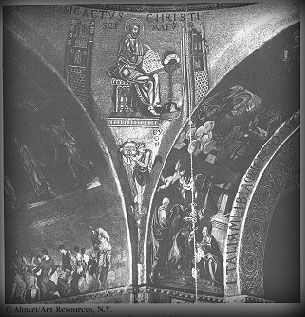
One of the great conceptual jumps of the late evolutionary biologist Stephen Jay Gould (with the equally brilliant, if lesser known, Richard Lewontin) was the idea of the spandrel. In “The Spandrels of San Marco and the Panglossian Paradigm”, they wondered about how the spandrels – in architecture, the roughly triangular area between two perpendicular arches – in the cathedral of San Marco in Venice came to be. Looking at how the spandrels are decorated now, they reasoned, you might imagine that they had been designed to feature prominently in the architecture. But this is not necessarily so from an architectural standpoint: if you want to have perpendicular arches, you have to have spandrels between them. Nobody ever wants spandrels by themselves; they’re a side product. Once you have them, of course, you can decorate them as much as you like.
Analogously, Gould and Lewontin reasoned, you could explain many biological features in the same way: a feature may continue to exist in an organism simply because there’s no reason to take it away. One shouldn’t expect features to have functions: they can simply do things (or not) because they’re there. Male nipples are the canonical example of this: there’s no reason for males to have them, but there’s no compelling reason not to have them. So they’re there.
I’ve been thinking for a while about the problem of pages on the screen. We have pages in a book because they make sense there: pages are the easiest way to divide up a long text into hand-sized chunks. Pages on the screen (as they exist in a PDF, say) seem to me to be something of a spandrel: there’s no physical reason that we need to divide text up into hand-sized chunks on a screen. We don’t always: look at the way a webpage scrolls. But what’s worried me is the paucity of the metaphors being used – note the verb “scroll” – against the tabula rasa that computers present.
Looking at a Flash demonstration (8Mb, but very much worth clicking or downloading) of the late Jef Raskin‘s Archy system suggests a way out of the problem. Here we have a two-dimensional space filling the frame of the browser. But this isn’t a two-dimensional space like that of a sheet of paper. The possibility of zooming in to create an infinite plane takes advantage of the virtual environment in a way that a piece of paper cannot. What if you had a novel in a space like this?
This is exciting to me because it’s active design – trying to change the metaphor – instead of being a side effect of trying to re-implement old ideas in a new context.
NY Times chipping away at free content
Starting in September, the NY Times will charge an annual subscription fee for a “Select” service, including editorials, op-eds, and archives. Basic news content will remain free. Times chair Arthur Sulzberger Jr remarked that though online advertising is undergoing exponential growth, it is just a matter of time until it flattens out and assumes regular cycles, like in print advertising. Is the free content joyride gradually coming to an end? Or is the Times pounding nails into its own coffin?
“transliteracies” conference
“How are people today “reading” in digital, networked environments? For example, what is the relation between reading and browsing, or searching? Or between reading and multimedia? Can innovations in technologies or interfaces increase the productivity, variety, and pleasure of these new kinds of reading? How can the historical diversity of human reading practices help us gauge the robustness of the new digital practices; and, inversely, how can contemporary practices provide new ways to understand the technical, social, and cultural dimensions of historical reading?”
June 17-18 at UC Santa Barbara, kicking off the Transliteracies Project: “Research in the Technological, Social, and Cultural Practices of Online Reading”.
(thanks, Grand Text Auto)
incredible shrinking newspaper
Facing slipping circulation and massive migration to the web by younger news consumers, a number of top tier newspapers are switching from the traditional broadsheet format to the more handy tabloid, including the European and Asian editions of the Wall Street Journal.
But is this enough? One British advertiser remarks: “We want newspapers to come up with a solution to the threat of marginalization in a digitalized world. But they have to do more than just play around with the size of paper they’re printed on.”
The International Herald Tribune ran this story yesterday. I’ve plugged it before, but the IHT is noteworthy as one of the few online newspapers to eschew vertical scrolling for the layout of articles. Instead, they have simple, attractive (and I would argue, much more readable) horizontal scrolling across fixed, three-column plates. With its long vertical fields, you might say that web news, too, is stuck in the broadsheet model. The problem is that, unlike a print newspaper, a computer screen can’t be folded to improve readability, or to isolate a desired area of the page.
student papers with a purpose
One of the most exciting presentations at the recent Share, Share Widely conference was Natalie Jeremijenko‘s student-authored wiki “How Stuff is Made”. According to the website FAQ page, HSIM is a visual encyclopedia documenting the manufacturing processes, labor conditions and environmental accounts of contemporary products. It is collaboratively produced, independent, academic, wiki-based publication. Encyclopedia entries are summative photo essays created by engineering, design and art students guided by faculty who ensure high standards of evidence.
In her conference abstract, “Changing Structures of Participation In New Media Education,” Dr. Jeremijenko claims that the HSIM project provides …evidence that the way we structure participation changes what information is produced, who produces it, and how it circulates. Additionally, the work provides material to question what these changes may mean for learning.
libraries improve the front end
 There’s a nice article in yesterday’s NY Times on how some university libraries are rethinking how they arrange their space – moving, or redistributing print collections to make way for an “electronic information commons.” It’s not about abandoning the books, or relegating them to a lesser status. It’s more about re-positioning them as a sort of physical database. If a library is a big computer, than the database exists toward the back end. These days, digging through the stacks, even if it results in a paper return, is generally done digitally. That’s the front end, or the interface, and this is what smart libraries are seeking to improve. Research and scholarly production may be going digital, but the social, conversational space of the university, and in turn, the library, is still vital. The strategy for the libraries, then, is to restructure and expand that space as a compelling social software environment – one that is both physical and virtual. Sounds good in theory, but I’m not sure that’s how these facilities will actually be used. Turning libraries into a hi-tech rec center might be sacrificing more than it saves.
The article focuses on reorganization efforts at the University of Texas at Austin. Press release here concerning the transformation of the Flawn Academic Center (likely a more durable link than the Times story).
(image: Perry-Castañeda Library at UT Austin)